Pavel Kedzich portfolio website
Published October 13, 2026
By FontsInUse
Contributed by Pavel Kedzich
Source: kedzich.com License: All Rights Reserved.



Source: kedzich.com License: All Rights Reserved.
Source: kedzich.com License: All Rights Reserved.
Source: kedzich.com License: All Rights Reserved.
This post was originally published at Fonts In Use
Source: kedzich.com License: All Rights Reserved.
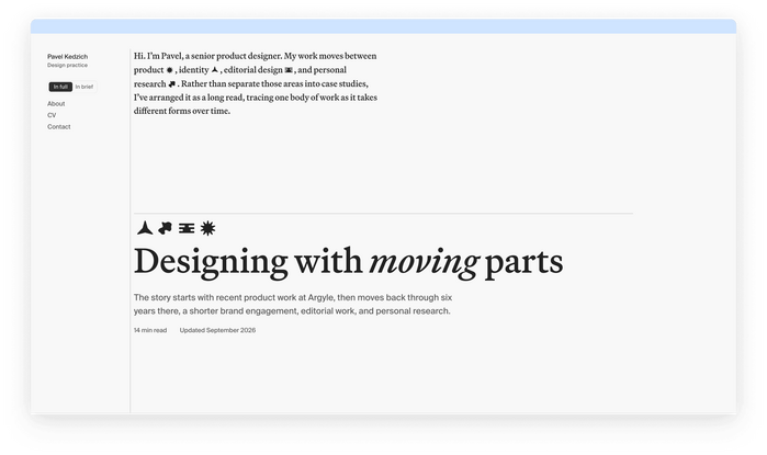
A personal portfolio built as a single long read, bringing together product, identity, editorial work, and personal research.
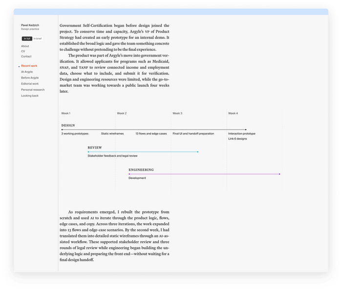
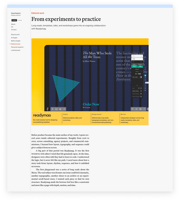
Martina Plantijn by Klim Type Foundry was chosen after looking through several Plantin revivals. Its Medium weight came closest to the dense, pleasant stroke width associated with Plantin in print, while still holding that weight on screen.
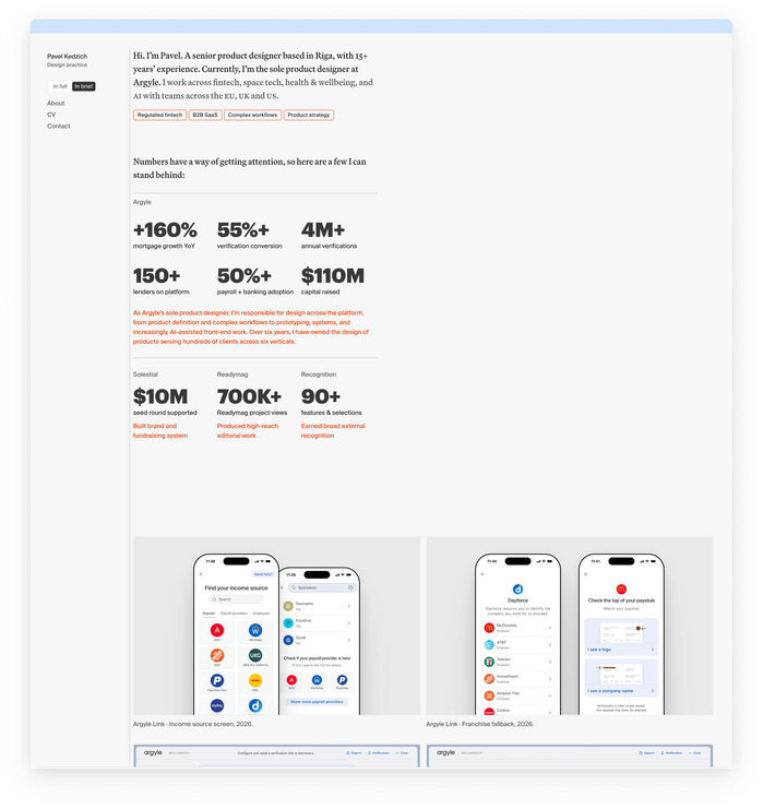
Suisse Int’l Book acts as a supporting grotesque for captions and secondary UI elements. Graphik appears only on the In brief page, outlined and used as SVG for accents – fitting a page that is intentionally more direct, condensed, and slightly awkward than the rest of the site.
Source: kedzich.com License: All Rights Reserved.
Source: kedzich.com License: All Rights Reserved.
Source: kedzich.com License: All Rights Reserved.
This post was originally published at Fonts In Use
Read full story.
WRITTEN BY
FontsInUse
An independent archive of typography.