BonMush visual identity and packaging
Source: wearesuperset.be Superset. License: All Rights Reserved.


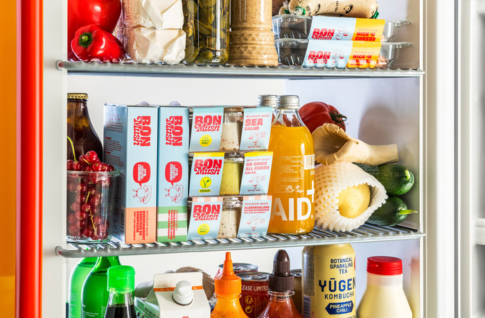
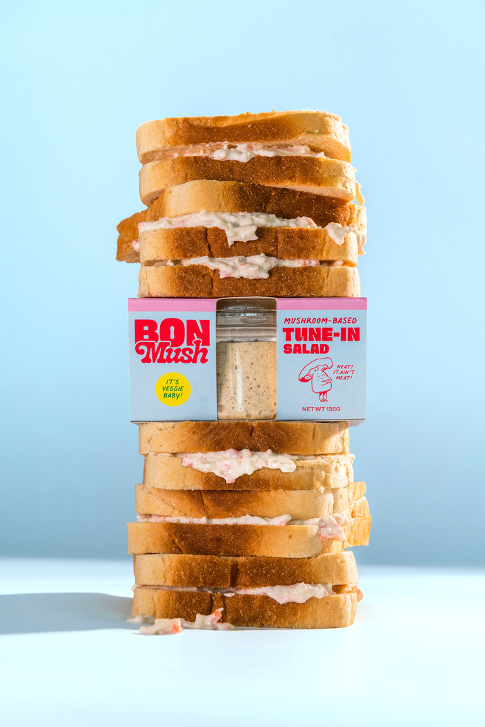
BonMush is a Belgian plant-based food brand that evolved from the family-owned butcher’s business BonRill. For the rebrand, Superset developed a new visual identity and packaging system that moves away from the traditional image of meat alternatives and embraces a more rebellious, playful and positive character.
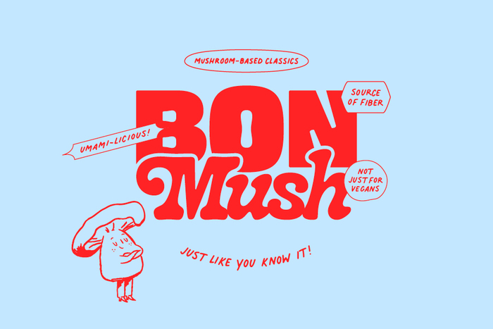
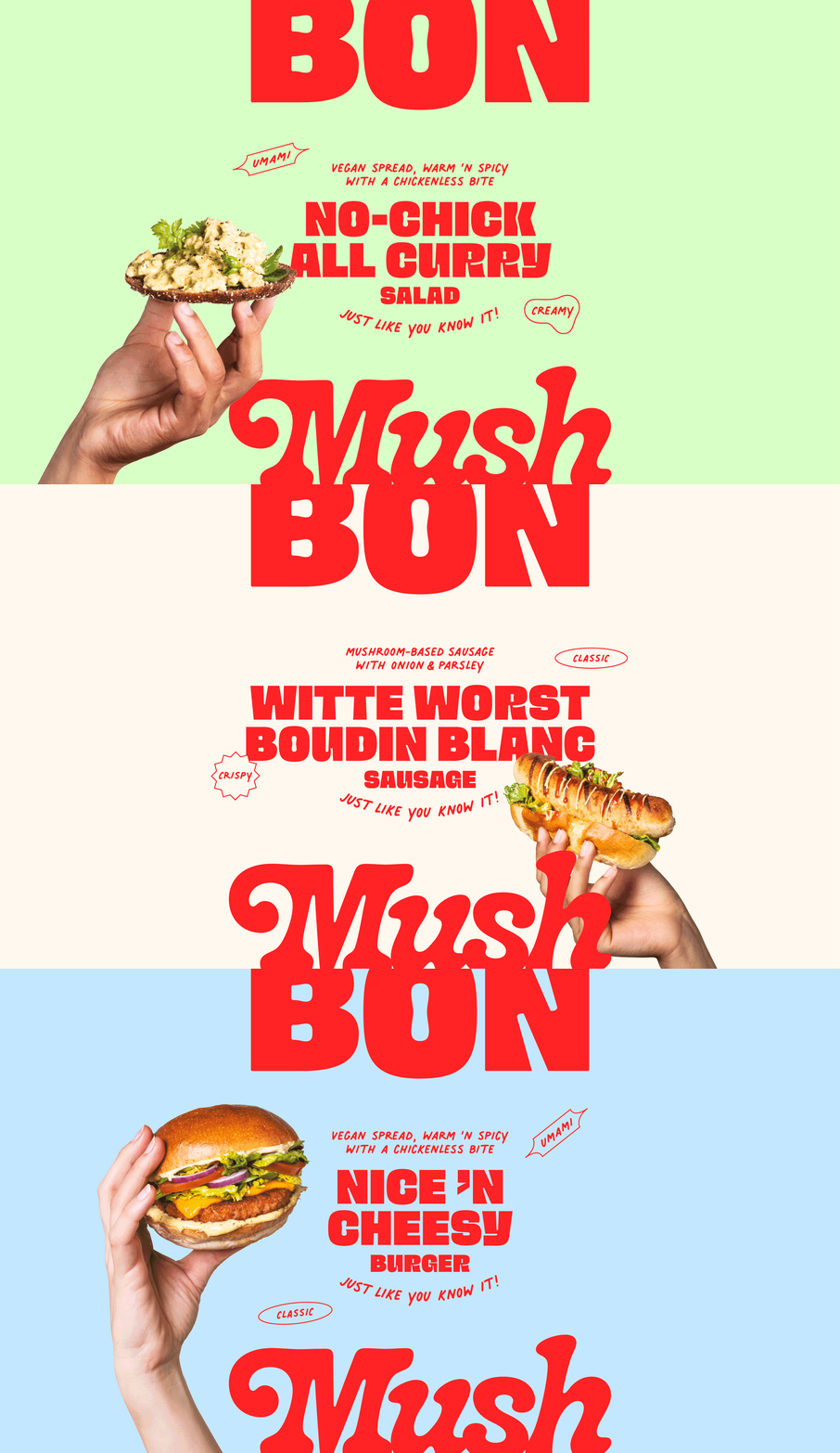
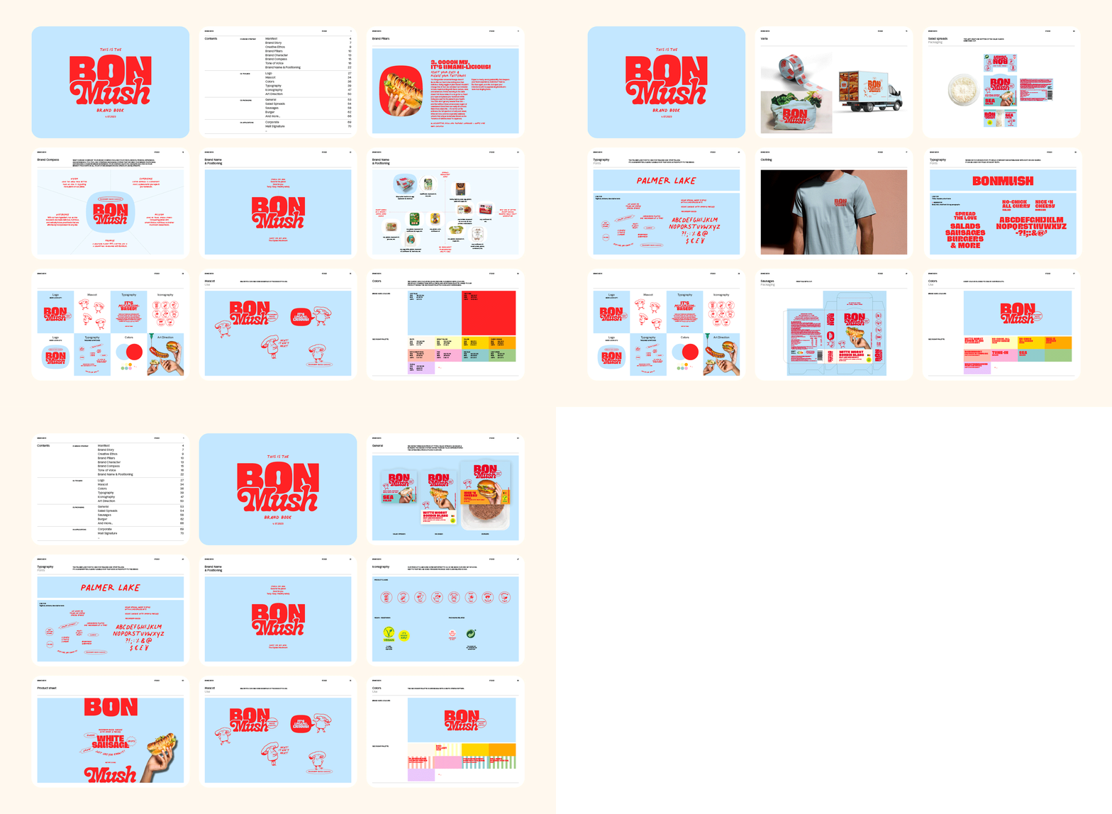
Typography plays a central role in the identity. An adapted version of Super Fat Bob by Phantom Foundry was developed specifically for BonMush, with selected characters adjusted to improve legibility and performance across packaging and brand communications.
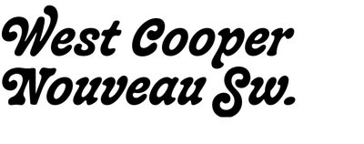
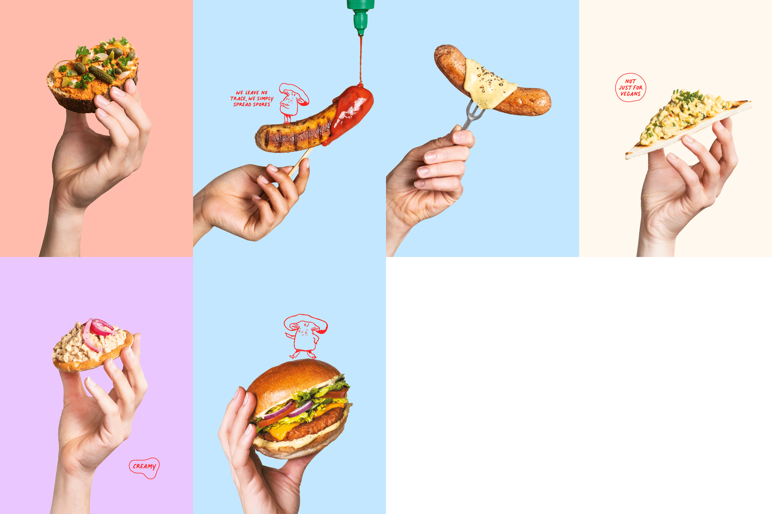
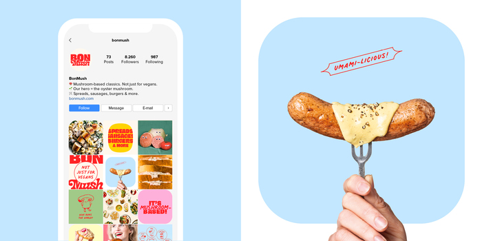
The bold, expressive typeface works alongside a custom pictogram system, playful copy and a distinctive mushroom mascot to create a recognisable identity with a strong shelf presence. It’s paired with a slightly backslanted West Cooper Nouveau Swash in the logo. Smaller text is added in Palmer Lake.
Source: wearesuperset.be Superset. License: All Rights Reserved.
Source: wearesuperset.be Superset. License: All Rights Reserved.
Source: wearesuperset.be Superset. License: All Rights Reserved.
Source: wearesuperset.be Superset. License: All Rights Reserved.
Source: wearesuperset.be Superset. License: All Rights Reserved.
Source: wearesuperset.be Superset. License: All Rights Reserved.
This post was originally published at Fonts In Use