The Operas of Verdi by Julian Budden
Source: www.abebooks.com Kubik Fine Books (edited). License: All Rights Reserved.
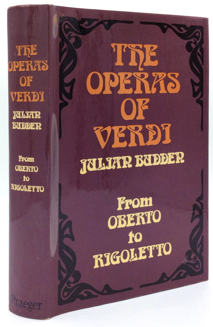
First U.S. edition, Vol. 1, Praeger, New York, 1973


The Operas of Verdi is the magnus opus of British opera scholar and broadcaster Julian Budden (1924–2007). It was published in three volumes in 1973, 1978, and 1981; first by Cassell & Company Ltd., London, and by Praeger Publishers, Inc., New York. It was also published in 1978 by Oxford University Press, New York, who in 1984 were the first to issue the series in paperback.
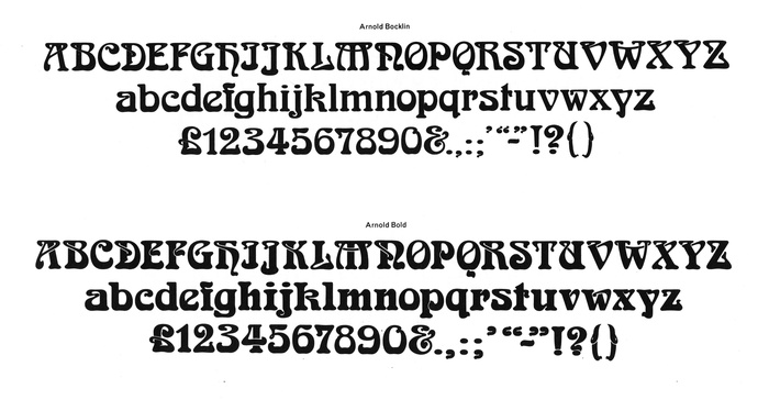
The books feature a version of Arnold Böcklin that’s clearly bolder than usual. This style wasn’t part of the original design as issued by the Weisert foundry in 1904. Named Arnold Bold, it was added at Face Photosetting, a type provider from London that later also went under the name Face Ronchetti.
The jacket designs for the first edition are credited to Tony Geddes. Like Budden, Geddes worked for the BBC where he created program titles and support graphics. On Fonts In Use, he’s best known as the designer of typefaces like Bullion, Milton, and Flamenco Inline. Some of these were available from Face, so it seems likely that Arnold Bold was drawn by Geddes himself.
Scan courtesy of Mathieu Triay. License: All Rights Reserved.
Glyph sets for Arnold Bocklin [sic!] and Arnold Bold as shown in an undated (c.1981) catalog by Face
Source: www.abebooks.com Antiquariat Braun. License: All Rights Reserved.
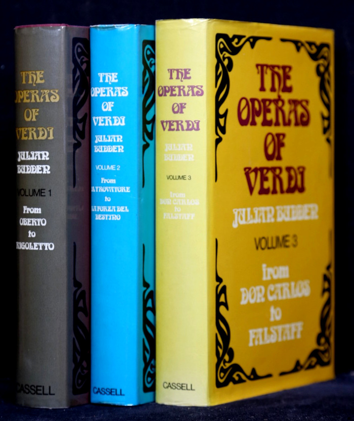
First British edition by Cassell, 1973–1981: Vol. 1. From Oberto to Rigoletto; Vol. 2. From Il Trovatore to La Forza del Destino; Vol. 3. From Don Carlos to Falstaff
Source: archive.org Internet Archive (edited). License: All Rights Reserved.
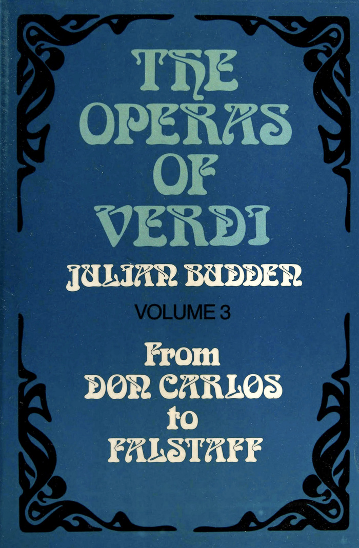
Vol. 3, Oxford University Press, 1978. Note how the I in “Verdi” lost a bit of its hook – unlike the one in “Julian”.

Source: www.abebooks.com Rare Book Cellar (edited). License: All Rights Reserved.
First paperback edition, Oxford University Press, New York, 1984
This post was originally published at Fonts In Use