Ojai Mountain brand identity

License: All Rights Reserved.


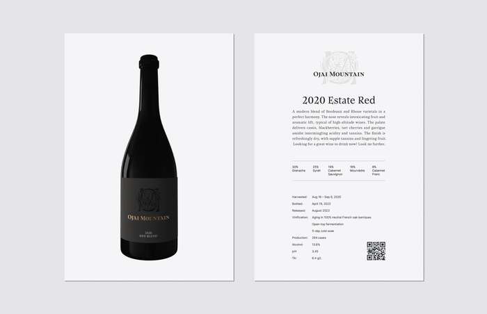
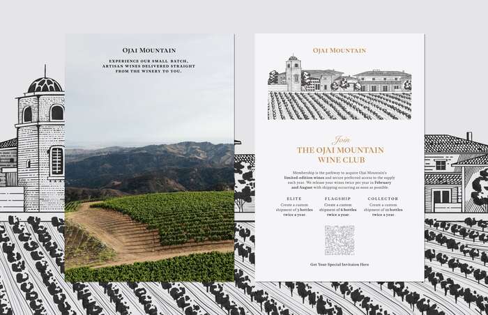
Ojai Mountain is a high-altitude winery known for its artisanal wines nestled in the picturesque Ojai region. The brand's identity strikes a balance between tradition and modernity, featuring elegant typography with traditional elements like end marks, small caps and beautiful true italics, as well as a strict contemporary gray and golden color palette.
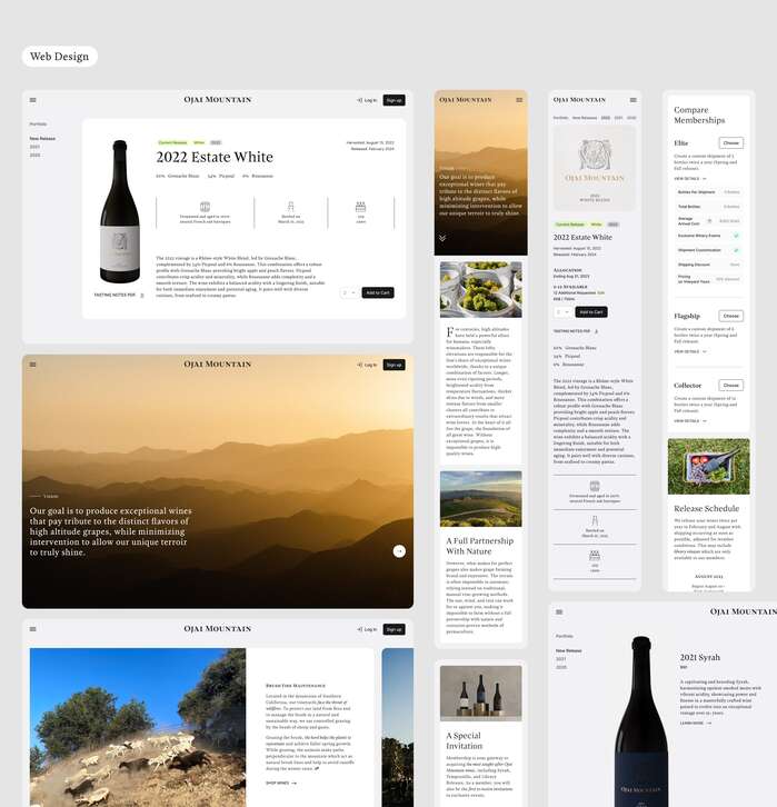
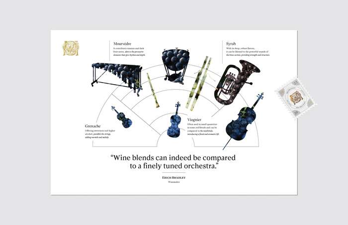
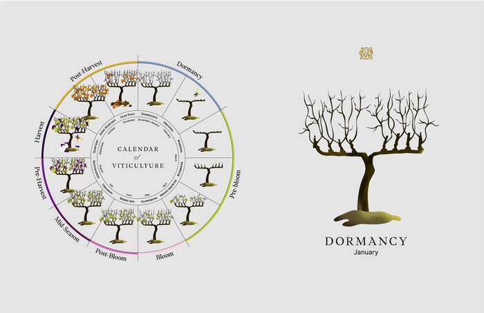
Stunning 3D imagery and infographics play a significant role in the brand's packaging and social media presence. Сarefully crafted, print materials ensure seamless customer communication.
A significant challenge in designing Ojai Mountain’s wine labels was to maintain a luxurious and simple style that harmonizes with the brand's high-end image, while ensuring effortless differentiation between red, white, and Syrah vintages when displayed together in private collections and cellars.
License: All Rights Reserved.

License: All Rights Reserved.
License: All Rights Reserved.
License: All Rights Reserved.
License: All Rights Reserved.
License: All Rights Reserved.
This post was originally published at Fonts In Use