Hotel Chipmunk Suyu

Studio Rayk. License: All Rights Reserved.

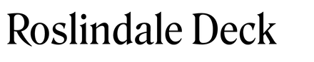

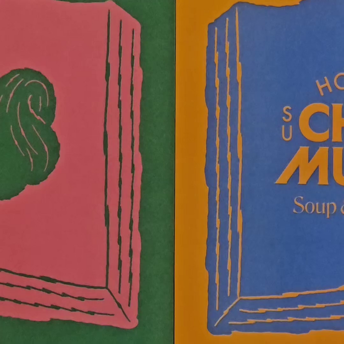
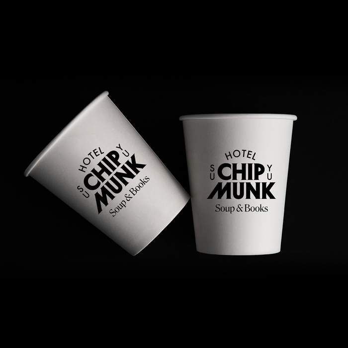
A new brand identity designed by Seoul-based studio Rayk for Hotel Chipmunk Suyu, including signs, posters, risograph printed flyers (by Corners), merch, coasters, cups, etcetera. The new look pairs Herbus Pointy, Roslindale Deck and Futura Medium.
From the design studio (translated by DeepL):
a cozy space for soup and books 🐿️
While designing Chipmunk Hotel, we wanted to convey two things to those who visit the hotel. One is to convey the comfort of an old hotel in a quiet neighborhood, and the other is to convey the happiness felt in the little things that a squirrel collects.
We designed the logotype and emblem based on a typeface that conveys the feeling of an ‘old hotel’ and contains many small details within it. We wanted to express the concept of Chipmunk Hotel through the bold but small serifs that extend to the end, and the characteristic personality of the M and U.
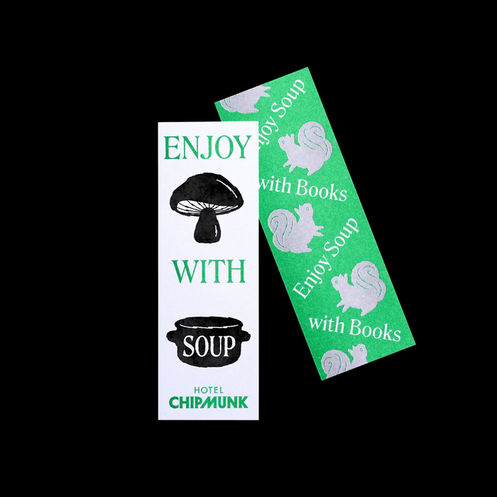
In addition to the logo, the illustrations express various things that a squirrel might have collected. The illustrations are one of the important identities of Chipmunk Hotel. They are actively used in various places such as bookmarks, posters, and stamps, and serve as a medium of communication with many people who visit Chipmunk Hotel. We hope that the small, comfortable happiness of everyday life that Chipmunk Hotel talks about will be conveyed to many people.

Studio Rayk. License: All Rights Reserved.

Studio Rayk. License: All Rights Reserved.

Studio Rayk. License: All Rights Reserved.

Studio Rayk. License: All Rights Reserved.
Source: www.instagram.com Studio Rayk. License: All Rights Reserved.
Studio Rayk. License: All Rights Reserved.

Studio Rayk. License: All Rights Reserved.

Studio Rayk. License: All Rights Reserved.

Studio Rayk. License: All Rights Reserved.
Source: www.instagram.com Studio Rayk. License: All Rights Reserved.

Source: www.instagram.com Studio Rayk. License: All Rights Reserved.

Source: www.instagram.com Studio Rayk. License: All Rights Reserved.
This post was originally published at Fonts In Use