Not Easy running caps

Marian Misiak. License: All Rights Reserved.

Not Easy — a running cap for social impact
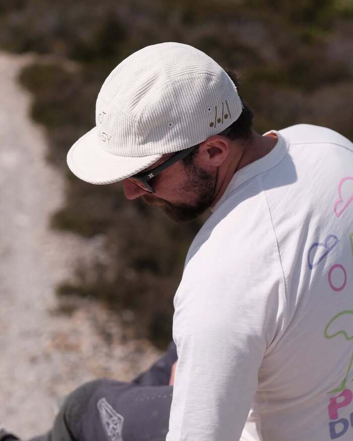
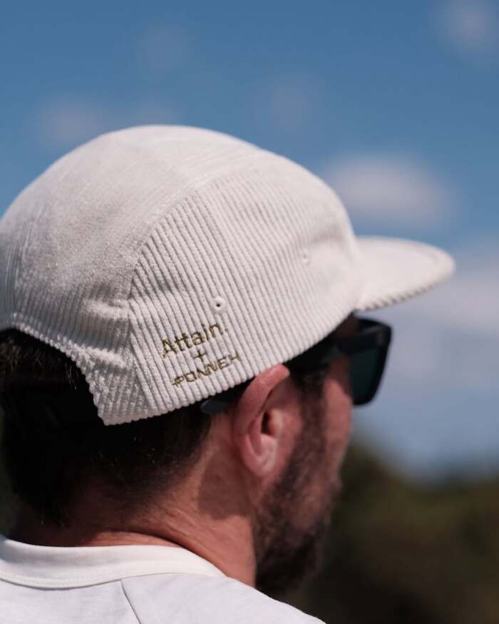
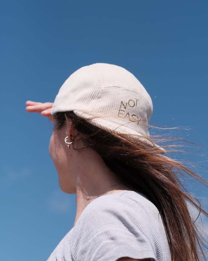
Designed as part of a collaboration between Attain, a not-for-profit running-cap brand, and Ponnek, the Not Easy cap reduces its graphic language to a single embroidered phrase.
Attain was founded to use running as a way to encourage connection, conversation, and greater openness around mental health. Its collaboration with Campaign Against Living Miserably (CALM) supports the charity’s work to unite people across the UK against suicide, giving the cap a social purpose beyond its function as an item of clothing. The direct typographic statement works simultaneously as decoration, slogan, and social commentary, using a few carefully chosen words to communicate an attitude while drawing attention to the challenges addressed by Attain’s work.
The project demonstrates how typography (Rubin Sans designed by Honza Zajmojski) can carry meaning beyond visual expression, turning a simple piece of clothing into a compact vehicle for identity, solidarity, and social communication.
Marian Misiak. License: All Rights Reserved.
Marian Misiak. License: All Rights Reserved.
Marian Misiak. License: All Rights Reserved.
This post was originally published at Fonts In Use