NBA Europe Tour

Hoopbus. License: All Rights Reserved.


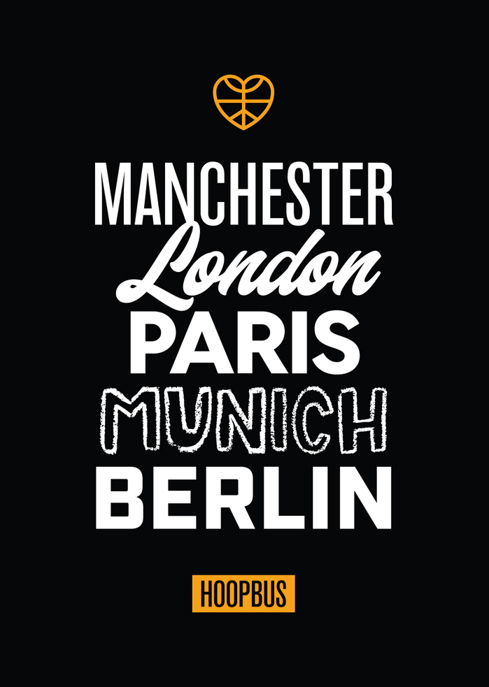
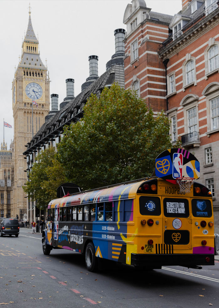
The NBA Europe Tour was a traveling tour across Manchester, London, Paris, Munich, and Berlin. Rather than creating a single static mark, Ben Loiz Studio built a flexible visual language capable of adapting across movement, crowds, public space, social content, and multiple city environments while still feeling cohesive.
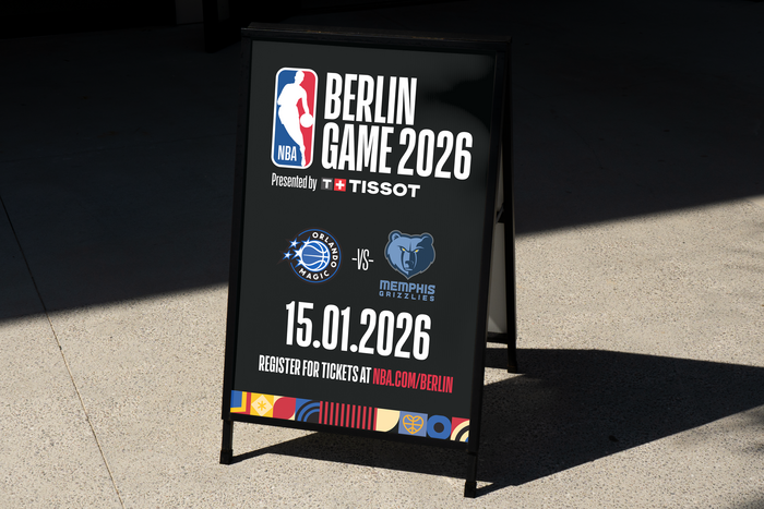
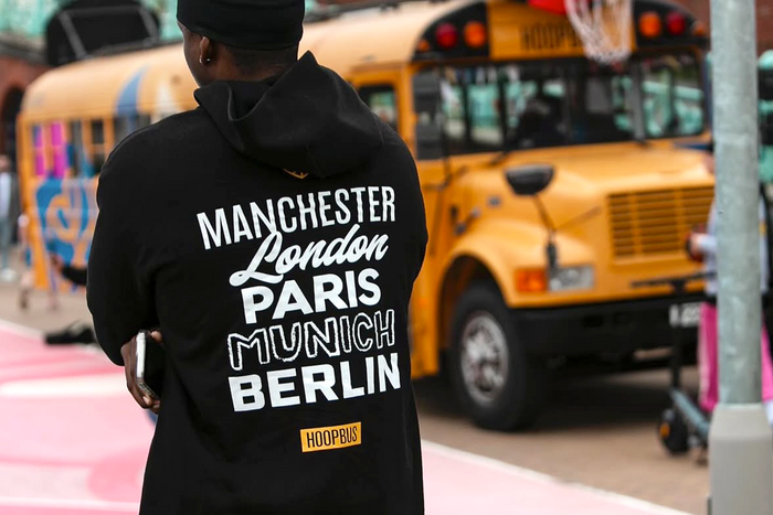
The identity integrated NBA graphics with Hoopbus’ existing visual identity, combining league marks, custom symbols, typography, geometric forms, and bold color into a unified system built for movement and public activation. Across the bus, signage, apparel, backboards, social graphics, and event materials, the system used oversized forms, directional shapes, and high-contrast color relationships to create visibility and energy at city scale while moving through different environments and activations.
Typography played a central role throughout the system. A customized NBA version of Commercial Type’s Action Condensed was used across schedules, dates, URLs, environmental signage, and informational graphics, helping create urgency, clarity, and consistency across the international rollout. Supporting typefaces already associated with the broader Hoopbus identity system – including Industry, Standard CT, Cina GEO, Tuck Shop and Grand Slam – introduced contrast between functional information and more expressive identity moments, allowing each city and activation to maintain its own character while remaining connected to the larger visual language.
Ben Loiz Studio. License: All Rights Reserved.

Ben Loiz Studio. License: All Rights Reserved.
Ben Loiz Studio. License: All Rights Reserved.

Hoopbus. License: All Rights Reserved.

Hoopbus. License: All Rights Reserved.
Hoopbus. License: All Rights Reserved.
Hoopbus. License: All Rights Reserved.
This post was originally published at Fonts In Use