Coqodaq

Source: www.pentagram.com Pentagram.


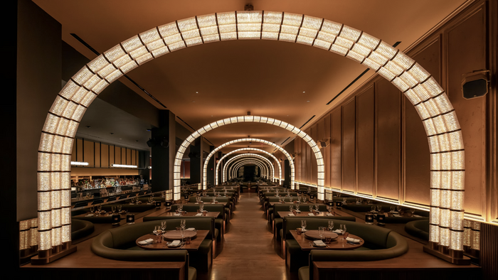
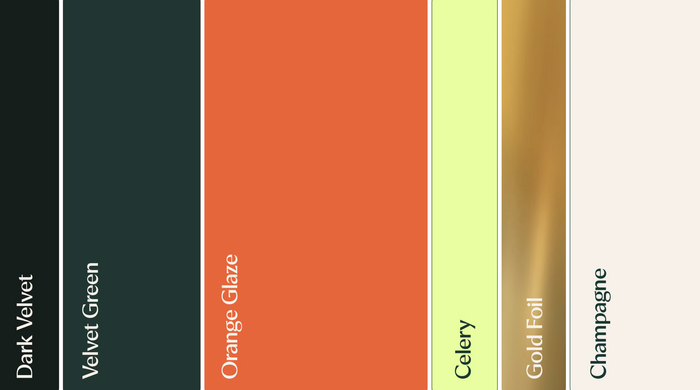
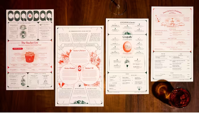
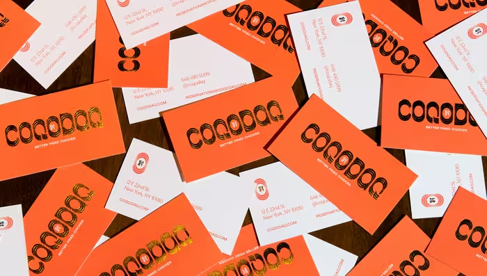
Coqodaq is a New York restaurant by Simon Kim and Gracious Hospitality Management that reimagines Korean fried chicken as a fine-dining experience. Designed by Emily Oberman and the Pentagram team, the identity draws from the visual language of Korean and American chicken joints, then elevates it into something more luxurious, playful, and precise.
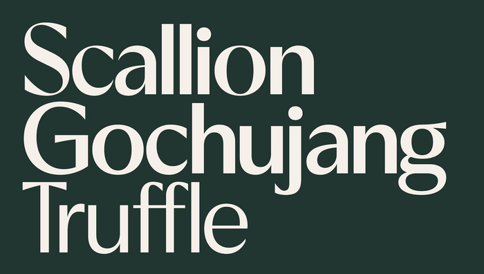
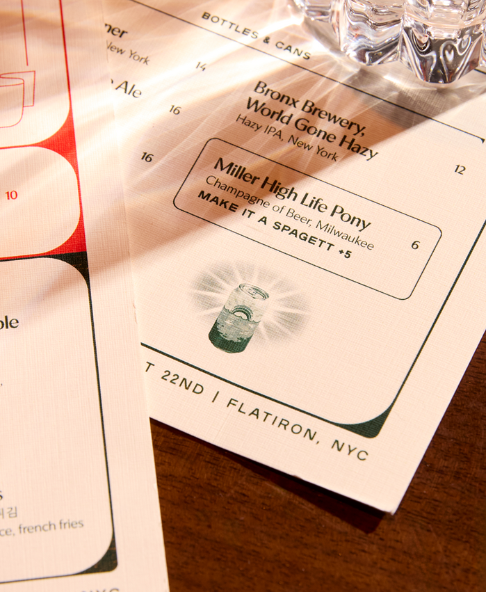
Typography plays a central role in balancing these tones. The brand pairs the expressive custom Coqodaq logotype (inspired by Lucky?) with a rich supporting type system that combines EK Notice Classic, EK Notice Decor – designed by Erkin Karamemet – and Plaak by 205TF. The center O in the logo contains the Korean character 닭 (“chicken”).
EK Notice appears in Classic Regular, Classic Medium, and Decor Medium, bringing a distinctive mix of historical reference, contrast, and display character to menus, messaging, packaging, and environmental graphics. Its Florentine-inspired sans-serif structure and subtly decorative qualities help bridge the restaurant’s indulgent, high-design atmosphere with the witty, approachable language of a chicken joint.
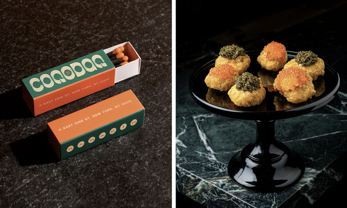
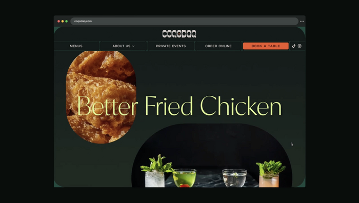
The typography is carried across the restaurant’s full experience, from printed and digital menus to takeout packaging, signage, social media animations, and interior details.
Alongside EK Notice, Plaak 26 Light, 36 Regular, 46 Bold, and 56 Heavy provide a strong, compact typographic counterpoint. The combination gives the identity both elegance and impact: Notice contributes texture, contrast, and personality, while Plaak supports the system with confident hierarchy and graphic clarity.
Source: www.pentagram.com Pentagram.
Source: www.pentagram.com Pentagram.
Source: www.pentagram.com Pentagram.
Source: www.pentagram.com Pentagram.

Source: www.pentagram.com Pentagram.
Source: www.pentagram.com Pentagram.
Source: www.pentagram.com Pentagram.
Source: www.pentagram.com Pentagram.
Source: www.pentagram.com Pentagram.
This post was originally published at Fonts In Use