N’de Jos’r and U Ndond’r
Courtesy of Gabriele Falcinelli. License: All Rights Reserved.


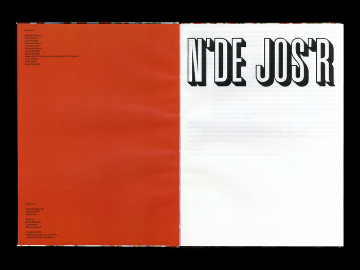
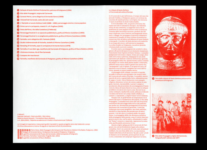
N’de Jos’r is the thesis project of Gabriele Falcinelli (MA in Illustration, ISIA Urbino, March 2026), a work that sits between anthropological analysis, field research, and archival investigation. At its core is the Carnival of Putignano (Italy), observed not as a simple folkloric event but as a complex cultural device, layered and deeply rooted in the social dimension.
The theoretical framework, drawing on Mikhail Bakhtin, Arnold van Gennep, and Victor Turner, does not remain confined to a purely academic level, but translates into a concrete practice of in situ research. Falcinelli literally goes n’de jos’r (i.e. “inside the house” in the Putignano dialect), entering the domestic and private spaces of the festival and adopting an internal point of view that allows him to present carnival as a lived experience rather than a represented one. The result is a research publication that is dense yet accessible, where heterogeneous materials – texts, archival images, interviews, and illustrations – are organized into a solid structure capable of sustaining the complexity of the subject without becoming heavy.
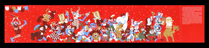
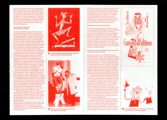
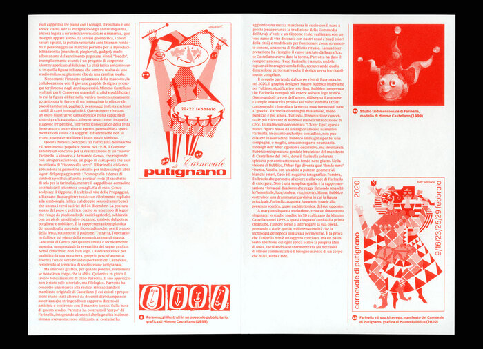
This first artefact is accompanied by the illustrated leporello U Ndond’r (a dialect term evoking a swaying, unstable movement typical of a crowd in a state of collective euphoria), which performs a significant shift: from documentation to staging. Here, carnival is translated into a continuous processional dimension, an allegorical sequence that condenses symbols, rituals, and figures into a single visual narrative. The format itself – expandable and non-linear – becomes a narrative device consistent with the idea of a collective and chaotic flow that characterizes the final ritual of the Carnival.
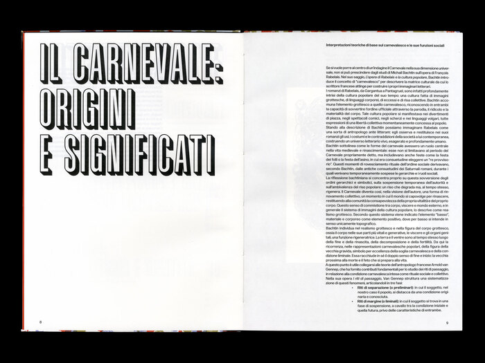
It is, however, on the typographic level that the project reveals one of its most interesting aspects. In the research publication, the pairing of Forma DJR Text (by David Jonathan Ross) with Graphique Pro (by profonts / URW) establishes a controlled balance between an academic register and a contemporary openness. Forma is used rigorously and consistently as the backbone of the text: a discreet presence that ensures readability and stability throughout the editorial structure. Graphique Pro, on the other hand, introduces a more pronounced variation, helping to define hierarchies and moments of discontinuity. The system works precisely because it maintains a clear distinction between these two levels, avoiding overlaps or ambiguities.
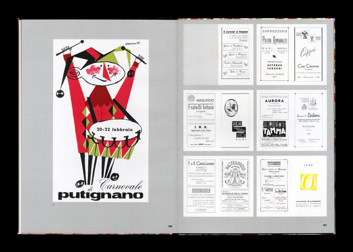
The leporello U Ndond’r features, on its front side, a screen-printed illustration of a procession in which the various symbols of the Carnival parade: from the arrival of the relics of Saint Stephen, through the Carnival Thursdays, the parade of floats, and the final rites, interspersed with iconic characters and events, including the many interpretations of the Farinella mask.
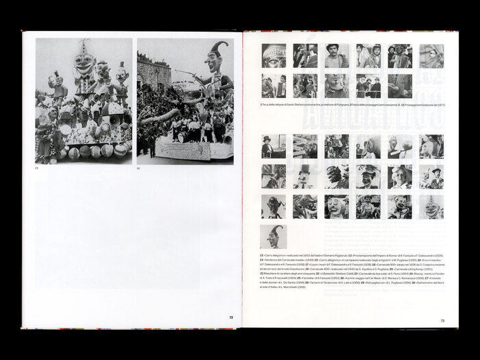
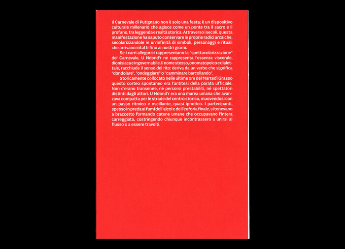
On the reverse, a text provides further insight into the history, rituals, and key figures of the Carnival of Putignano. This is accompanied by archival images reworked from those represented on the front. The project is thus structured on a double level, where visual synthesis and documentary depth coexist without overlapping.
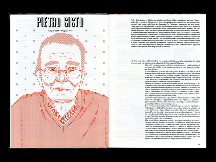
Within this framework, Sole Sans and Sole Serif (by CAST) support the informational layer with a measured use, ensuring clarity and continuity without competing with the illustrative component, which remains the primary narrative focus.
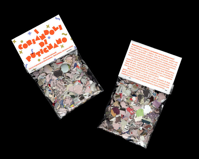
In the confetti packaging, Falcinelli uses AM Assab (from the Alfabeti Modernisti collection) based on a direct association between typographic form and object: the character’s simple, geometric shapes echo the small, serial nature of confetti, establishing an immediate visual correspondence.
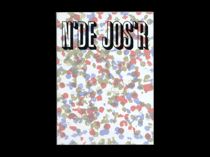
On the cover, a custom lettering designed by the designer appears, explicitly inspired by the one created by Mario Cresci in 1976 for the book Isabella Morra e la società meridionale del Cinquecento by Giovanni Caserta (Edizioni Meta).
Overall, the thesis project demonstrates a solid methodological awareness and the ability to hold together research, narrative, and design. The typographic choices fit coherently within this framework, avoiding obvious solutions and contributing to the definition of a layered yet controlled visual language.
Courtesy of Gabriele Falcinelli. License: All Rights Reserved.
Courtesy of Gabriele Falcinelli. License: All Rights Reserved.
Courtesy of Gabriele Falcinelli. License: All Rights Reserved.
Courtesy of Gabriele Falcinelli. License: All Rights Reserved.
Courtesy of Gabriele Falcinelli. License: All Rights Reserved.
Courtesy of Gabriele Falcinelli. License: All Rights Reserved.
Courtesy of Gabriele Falcinelli. License: All Rights Reserved.
Courtesy of Gabriele Falcinelli. License: All Rights Reserved.
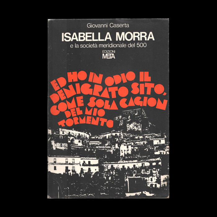
Cover design by Mario Cresci (1976). License: All Rights Reserved.
The cover for Isabella Morra e la società meridionale del Cinquecento by Giovanni Caserta (Edizioni Meta) was a reference for Falcinelli’s lettering.

Courtesy of Gabriele Falcinelli. License: All Rights Reserved.
Courtesy of Gabriele Falcinelli. License: All Rights Reserved.
Courtesy of Gabriele Falcinelli. License: All Rights Reserved.
Courtesy of Gabriele Falcinelli. License: All Rights Reserved.
Courtesy of Gabriele Falcinelli. License: All Rights Reserved.
Courtesy of Gabriele Falcinelli. License: All Rights Reserved.
This post was originally published at Fonts In Use