Mystique Palmistry
Source: www.peculiarmanicule.com Peculiar Manicule. License: All Rights Reserved.


During the 1970s, cultural shifts saw a rise in the popularity of the occult and the psychedelic. This wasn't just a movement confined to underground scenes or countercultural pockets—it permeated mainstream consumer goods too, even those targeted towards children.
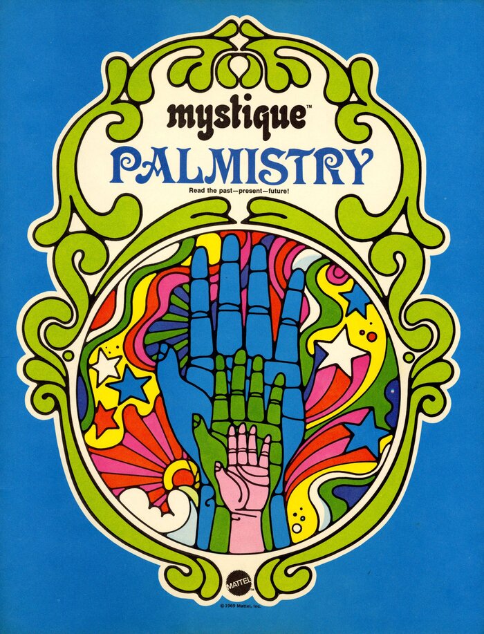
This Palmistry kit was part of Mattel’s fortune-telling line, “Mystique”, that use an eclectic mix of colors and typefaces to create a sense of play and magic. The series logo is in lowercase Neptun. Palmistry uses Victoria for the title.
This blend of commercialism and countercultural wasn't exclusive to Mattel during this era; brands like Hallmark, Burger King, Heinz, and even Shell adopted themes and aesthetics resonant with an interest in the esoteric!
See also Mystique Fortell Cards and Mystique Astrology.
Source: www.peculiarmanicule.com Peculiar Manicule. License: All Rights Reserved.
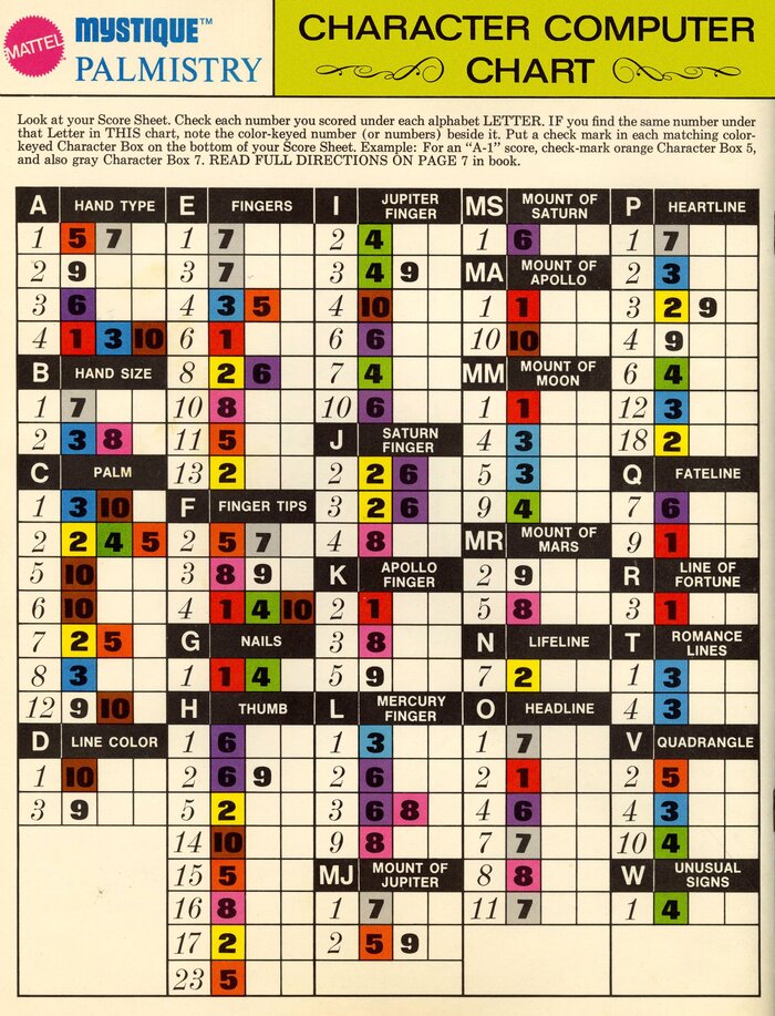
The Character Computer Chart uses Folio breitmager for the title. “Mystique Palmistry” combines Othello and Times New Roman. The copy is set in Century Schoolbook. Labels are in Helvetica caps, numerals come from Folio Extra Bold and Torino Italic.
Source: www.ebay.com agelesstoys. License: All Rights Reserved.
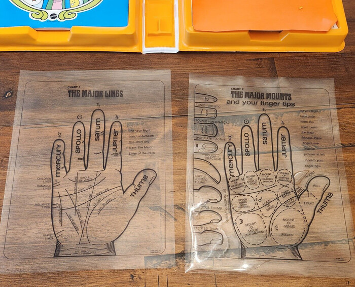
The transparent hand sheets are labeled in Folio with biform alternates. Headlines are in Marschall.

Source: www.etsy.com ChasingNostalgia. License: All Rights Reserved.
This post was originally published at Fonts In Use