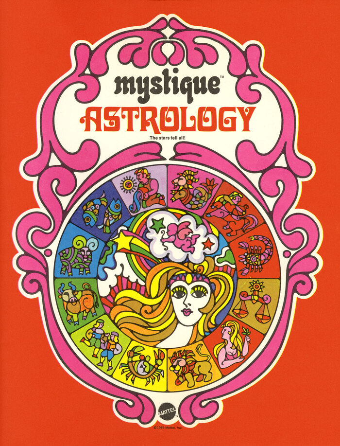
Mystique Astrology
Source: www.peculiarmanicule.com Peculiar Manicule. License: All Rights Reserved.


During the 1970s, cultural shifts saw a rise in the popularity of the occult and the psychedelic. This wasn't just a movement confined to underground scenes or countercultural pockets—it permeated mainstream consumer goods too, even those targeted towards children.
This Astrology kit was part of Mattel’s fortune-telling line, “Mystique”, and uses an eclectic mix of colors and typefaces to create a sense of play and magic. The series logo is in lowercase Neptun. Astrology uses Davida for the title.
This blend of commercialism and countercultural wasn't exclusive to Mattel during this era; brands like Hallmark, Burger King, Heinz, and even Shell adopted themes and aesthetics resonant with the interest in the esoteric.
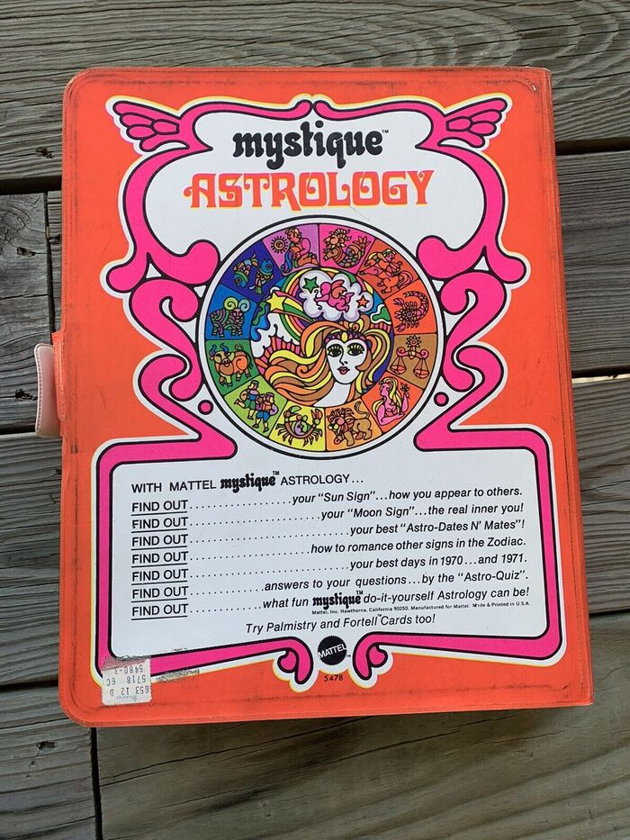
See also Mystique Fortell Cards and Mystique Palmistry.
Source: www.peculiarmanicule.com Peculiar Manicule. License: All Rights Reserved.
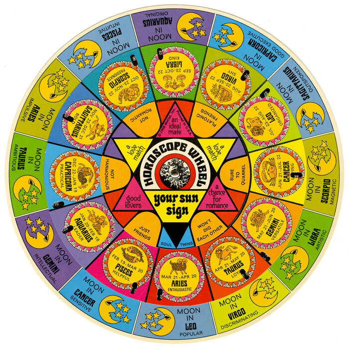
The horoscope wheel features Neptun, two weights of Marschall, Gutenberg, Folio, and Univers.
Source: www.peculiarmanicule.com Peculiar Manicule. License: All Rights Reserved.
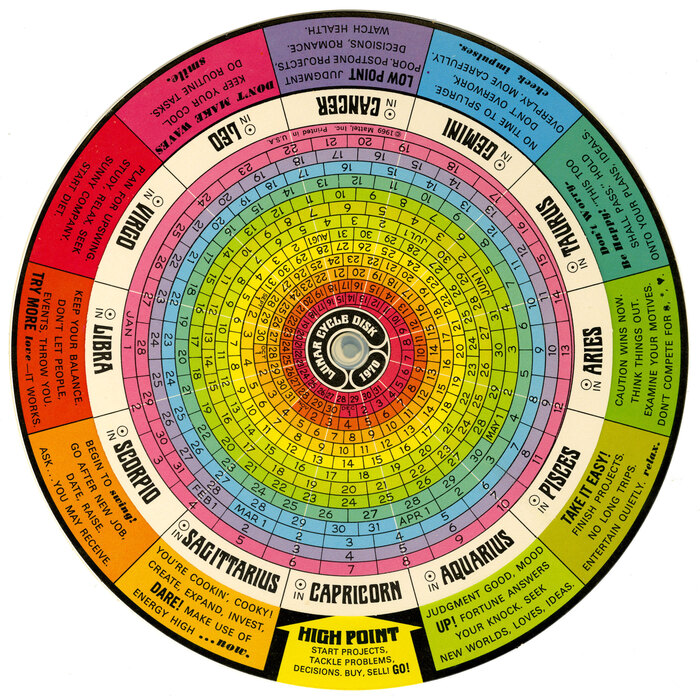
In addition to some of the previously mentioned typefaces, the Lunar Cycle Disk has Ultra Bodoni Italic and what looks like Alternate Gothic.

Source: www.ebay.com helmk8. License: All Rights Reserved.
Source: www.ebay.com helmk8. License: All Rights Reserved.
This post was originally published at Fonts In Use