A morte de Ivan Ilitch e outras histórias by Leo Tolstoy, Editora Martin Claret

Photo: Rodrigo. Editora Martin Claret. License: All Rights Reserved.


This book, a Portuguese edition of Leo Tolstoy’s The Death of Ivan Ilyich and Other Stories by Brazilian publisher Martin Claret, caught my eye a while ago for using certain elegant graphic solutions, but making a dubious typographic choice for the body text.
Note that the font used in the body text is Orpheus, which is commonly regarded as a display font. The sans serif – which never appears in uppercase – is LL Replica.
The problem with using Orpheus in body text is that, for example in footnotes, the font becomes very fragile – especially on the intertitle pages, when the color of the page is a not-too-dark orange and the text is in white (see the second headline image). There are two aspects to the folio: on the even-numbered pages, LL Replica is used in a dark color (black); on the odd-numbered pages, the title of the novel in question is the same color as the orange used for the rest of the book, a choice that again does not make the text legible, especially at a small size.

Photo: Rodrigo. Editora Martin Claret. License: All Rights Reserved.

Photo: Rodrigo. Editora Martin Claret. License: All Rights Reserved.
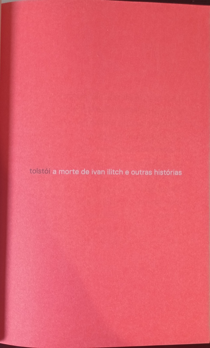
Photo: Rodrigo. Editora Martin Claret. License: All Rights Reserved.
Headline from the intertitle page

Photo: Rodrigo. Editora Martin Claret. License: All Rights Reserved.
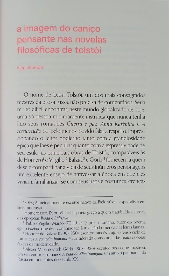
Photo: Rodrigo. Editora Martin Claret. License: All Rights Reserved.

Photo: Rodrigo. Editora Martin Claret. License: All Rights Reserved.
On the first page of the first novel, text is set in a larger font size than on the following pages

Photo: Rodrigo. Editora Martin Claret. License: All Rights Reserved.

Photo: Rodrigo. Editora Martin Claret. License: All Rights Reserved.
This post was originally published at Fonts In Use