Batman Forever movie posters, titles and credits
Source: www.originalfilmart.com License: All Rights Reserved.
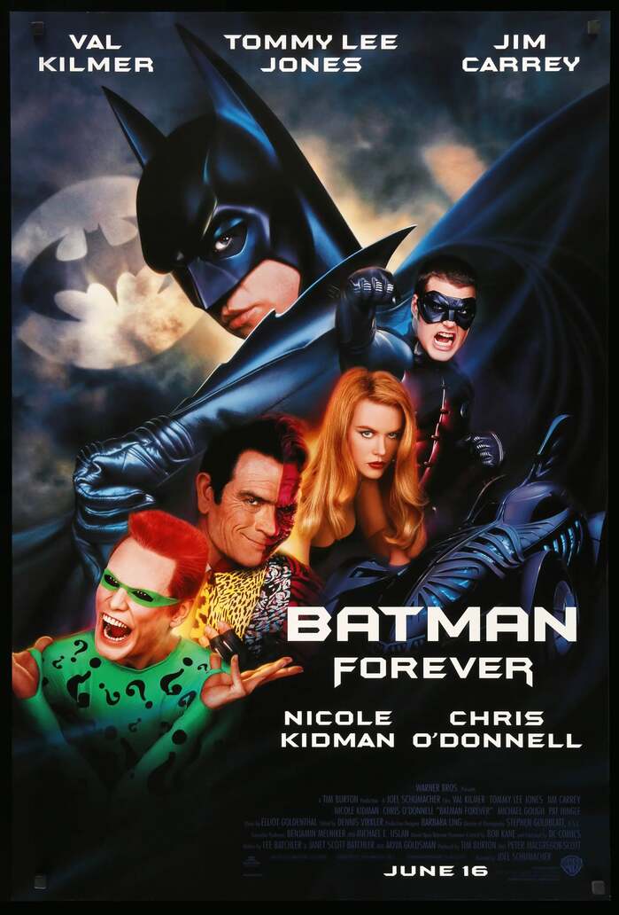
Poster. The credits use Futura Condensed.


From Wikipedia:
Batman Forever is a 1995 American superhero film based on the DC Comics character Batman by Bob Kane and Bill Finger. It is the third installment of Warner Bros.’ initial Batman film series and a sequel to Batman Returns (1992). […] Batman Forever was released on June 16, 1995, to mixed reviews from critics, who praised the visuals, action sequences, soundtrack, but criticized the screenplay and tonal departure from previous two films. The film was a box office success, grossing over $336 million worldwide and becoming the sixth-highest-grossing film of 1995.
The Batman Forever font was specifically created for the film by Massey Rafani of The Idea Place (the in-house ad agency of Warner Bros.) and Mark van Bronkhorst of MvB Design. It is used in the opening titles of the film, on posters, and in other advertising.
After the main opening titles, further opening credits use Trajan. The end credits of the film use Caxton.

License: All Rights Reserved.
Beginning of the opening titles of the film

License: All Rights Reserved.
The actors’ names move towards the camera in 3D

License: All Rights Reserved.
More opening credits, using Trajan

License: All Rights Reserved.
End credits, using Caxton

Source: filmartgallery.com License: All Rights Reserved.
Teaser poster. Legal text uses Times New Roman. “PRINTED IN U.S.A.” is in Helvetica.

Source: www.originalfilmart.com License: All Rights Reserved.
Poster. The credits use Bee.

Source: www.originalfilmart.com License: All Rights Reserved.
Poster

Source: www.originalfilmart.com License: All Rights Reserved.
Poster

Source: www.originalfilmart.com License: All Rights Reserved.
Poster

Source: www.originalfilmart.com License: All Rights Reserved.
Poster
Source: www.reddit.com License: All Rights Reserved.
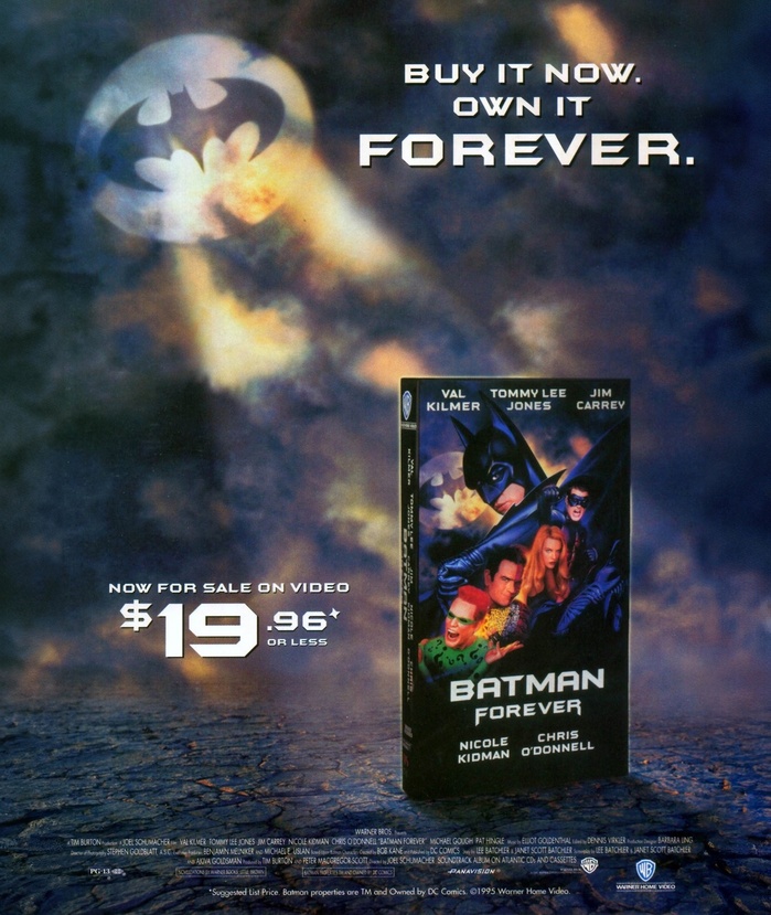
Home video ad. The credits squeezed caps from Futura. The line at the bottom shows the normal proportions.
This post was originally published at Fonts In Use