Les McCann – Talk to the People album art
Source: archive.org Internet Archive. License: All Rights Reserved.


Paul Renner’s Futura famously was released by the Bauer foundry in 1927. In 1954, Edwin W. Shaar at Intertype added Futura Script, capitalizing on the prestigious name. Apart from the low contrast, the unconnected cursive didn’t have much in common with Renner’s geometric sans.
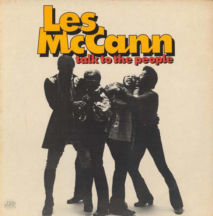
A designer at Photo-Lettering apparently had a different idea for a “Futura Script”. One that is less chirographic and more in tune with the static geometry of Futura – and also easier to make. Enter Thomac, which basically is Futura, but with joined-up letterforms. The typeface family is shown in four numbered weights in PLINC’s 1971 catalog, without designer info. (Nick Curtis, who explored a similar concept with his Kallilu NF, credits it to George Piscitelle, but that’s unconfirmed.)
The boldest weight, Thomac 10, is used outlined and with drop shadow for Talk to the People, an album by pianist Les McCann (1935–2023) released with Atlantic Records in 1972.
Source: archive.org Internet Archive. License: All Rights Reserved.
This post was originally published at Fonts In Use