Mix Interiors
Source: www.behance.net Photo: Marçal Prats. Marçal Prats. License: All Rights Reserved.
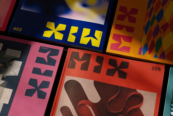
Hero image


Mix Interiors, the leading UK title for commercial interior design and architecture, published bi-monthly since 2000, has been given a full editorial redesign. The project reworks the magazine’s covers, typography and grid while keeping the signature features that have defined it for more than two decades.
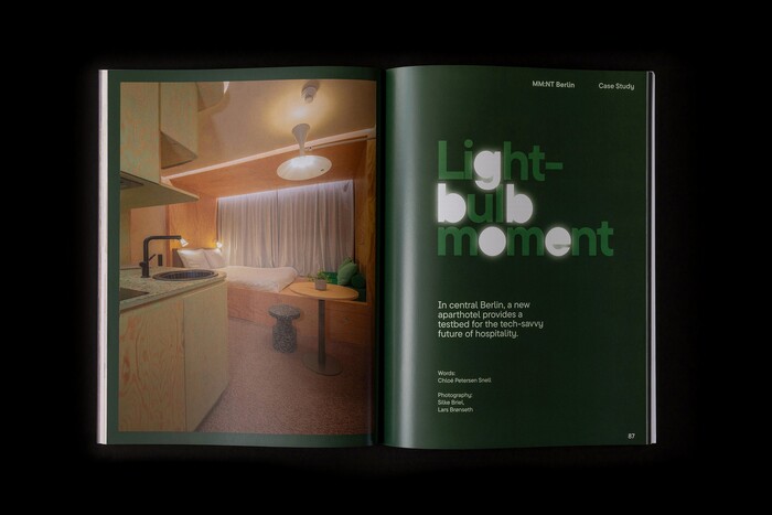
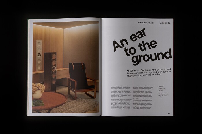
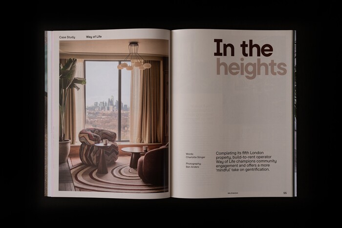
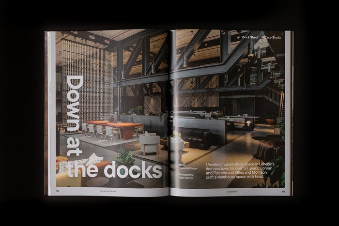
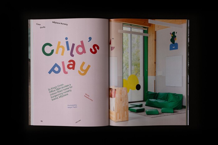
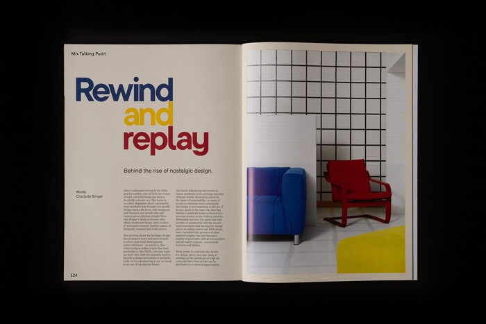
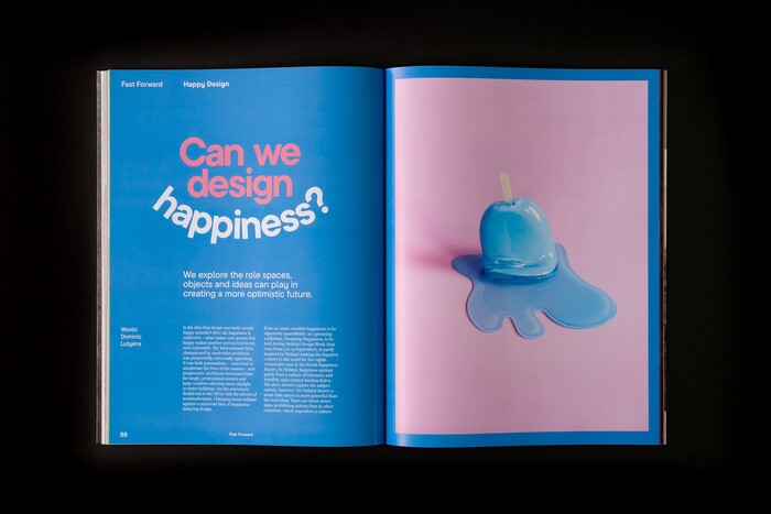
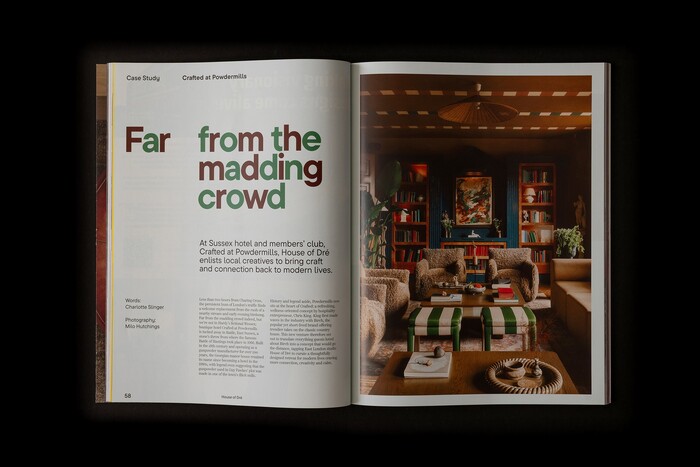
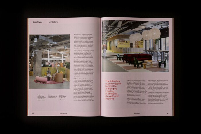
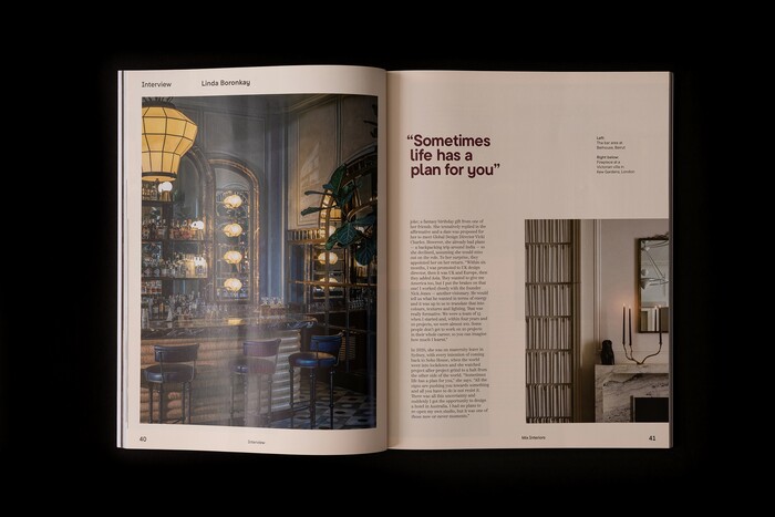
In the redesign, three key editorial elements are playfully responsive to content: headers, colour and composition. Headers and colour function as typographic and chromatic responses to the tone and content of each article, while composition shifts spread to spread – scale, placement and pacing each responding to the editorial character of the piece.
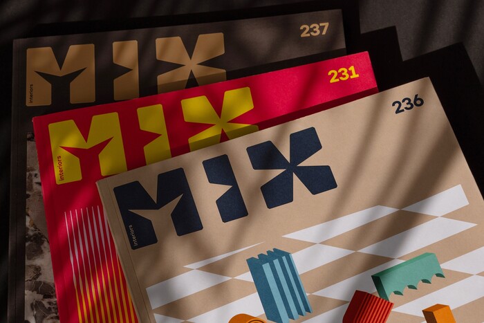
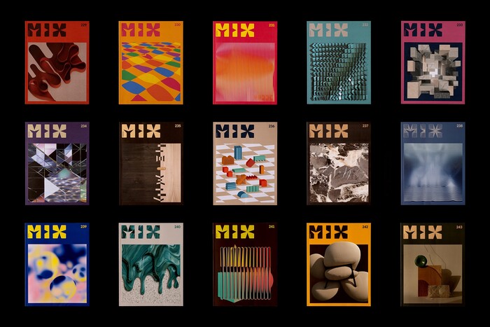
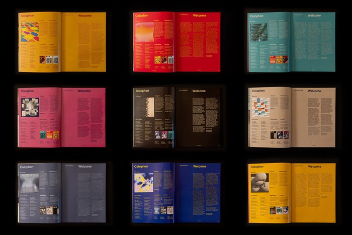
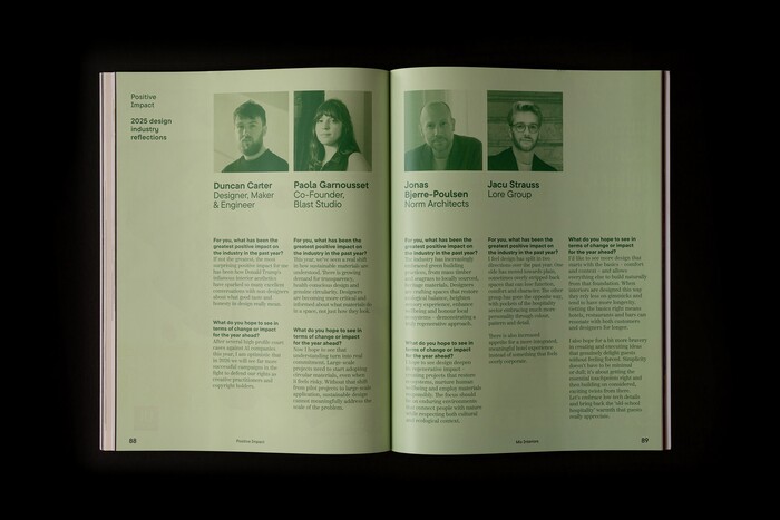
The cover keeps the magazine’s signature feature and gives it a deliberate frame. For twenty-six years, no two Mix covers have been alike: each issue, a leading interior design studio – past contributors include Zaha Hadid Architects, Gensler, Conran and Partners and M Moser – creates a bespoke artwork inspired by a surface, a material or a fabrication process. The redesigned cover grid is constructed on the perfect square geometry shared by the artwork and the Mix logotype. Two hues are drawn from each cover artwork and carried through to the issue’s recurring sections – contents, colophon, masthead and cover story – giving each new issue a distinctive, unpredictable personality.
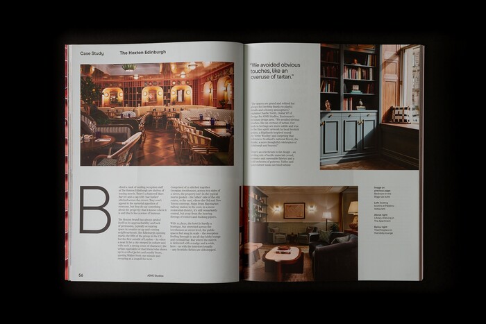
The typography pairs two contrasting families by function. TypeType’s TT Commons Pro, a sans with honest geometry, carries the magazine’s headers, standfirsts, captions, folios and running text. Positype’s Scotch Text Condensed, a revival of the Scotch tradition with old-style proportions and fully drawn italics, allows a larger body for enhanced readability – a typographic identity that reads as contemporary yet trend-proof.
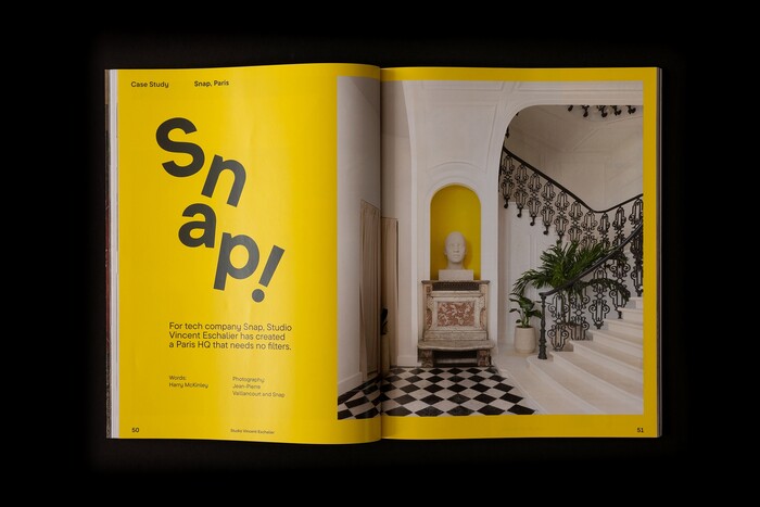
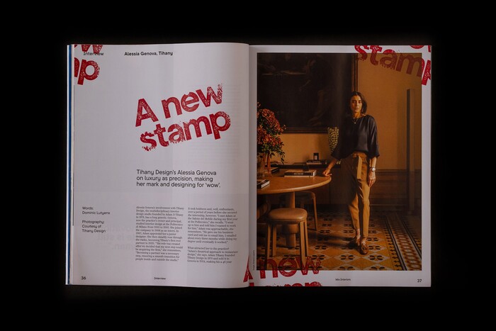
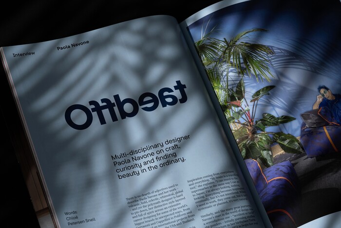
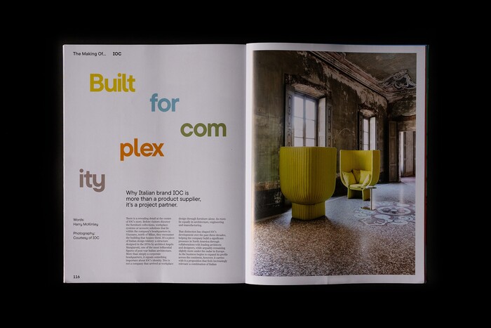
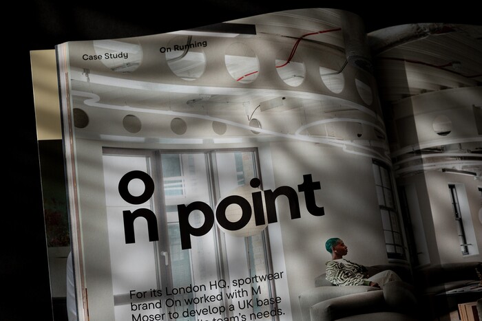
Headers are where the typographic personality stands out: each feature title is treated as a typographic response to its article – sometimes a literal visual translation of meaning, sometimes a portrait of the interviewee in letterforms, sometimes a subtle irony, or a title alive under its own physics.
The layout is built on a twelve-column, print-first grid in the tradition of Josef Müller-Brockmann. Its underlying logic is a single proportional unit: where two gutters cross, a perfect square. The twelve columns subdivide cleanly into one, two, three, four, six and eight – flexible enough for full-bleed photography, two- and three-column copy, and gridded product indexes, with generous bleeds, full-page openers and modular configurations that hold extended photo essays.
See more images in the case study.
Source: www.behance.net Photo: Marçal Prats. Marçal Prats. License: All Rights Reserved.
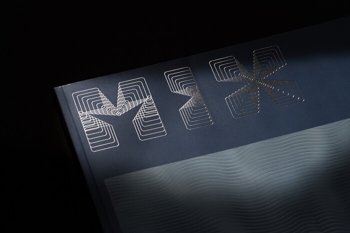
Hot foil logo close-up
Source: www.behance.net Photo: Marçal Prats. Marçal Prats. License: All Rights Reserved.
Interior spread – Snap
Source: www.behance.net Photo: Marçal Prats. Marçal Prats. License: All Rights Reserved.
Interior spread – Tihanny Design’s Alessia Genova
Source: www.behance.net Photo: Marçal Prats. Marçal Prats. License: All Rights Reserved.
“Offbeat” header closeup
Source: www.behance.net Photo: Marçal Prats. Marçal Prats. License: All Rights Reserved.
Source: www.behance.net Photo: Marçal Prats. Marçal Prats. License: All Rights Reserved.
Source: www.behance.net Photo: Marçal Prats. Marçal Prats. License: All Rights Reserved.
Source: www.behance.net Photo: Marçal Prats. Marçal Prats. License: All Rights Reserved.
Source: www.behance.net Photo: Marçal Prats. Marçal Prats. License: All Rights Reserved.
Source: www.behance.net Photo: Marçal Prats. Marçal Prats. License: All Rights Reserved.
Source: www.behance.net Photo: Marçal Prats. Marçal Prats. License: All Rights Reserved.
Source: www.behance.net Photo: Marçal Prats. Marçal Prats. License: All Rights Reserved.
Source: www.behance.net Photo: Marçal Prats. Marçal Prats. License: All Rights Reserved.
Source: www.behance.net Photo: Marçal Prats. Marçal Prats. License: All Rights Reserved.
Source: www.behance.net Photo: Marçal Prats. Marçal Prats. License: All Rights Reserved.
Source: www.behance.net Photo: Marçal Prats. Marçal Prats. License: All Rights Reserved.
Source: www.behance.net Photo: Marçal Prats. Marçal Prats. License: All Rights Reserved.
Source: www.behance.net Photo: Marçal Prats. Marçal Prats. License: All Rights Reserved.
Source: www.behance.net Photo: Marçal Prats. Marçal Prats. License: All Rights Reserved.
Source: www.behance.net Photo: Marçal Prats. Marçal Prats. License: All Rights Reserved.
Source: www.behance.net Photo: Marçal Prats. Marçal Prats. License: All Rights Reserved.
This post was originally published at Fonts In Use