Mitteldeutsche Funk- und Phono-Schau 1932 guide
Source: archive.org License: All Rights Reserved.
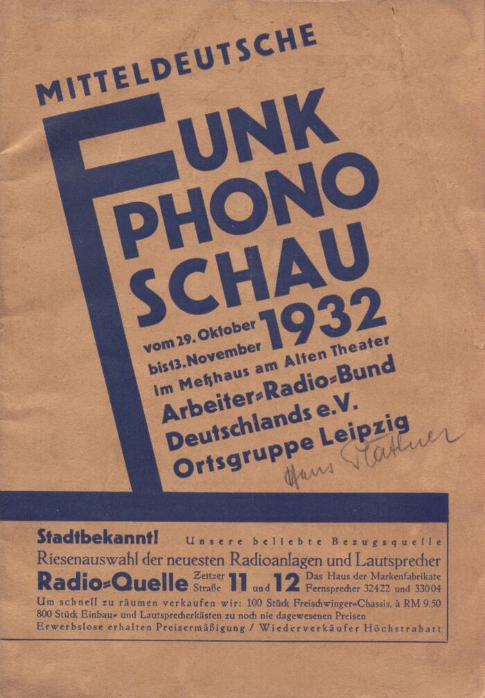
Most of the cover type is set in Erbar-Grotesk halbfett – with the exception of the year 1932 and the house numbers 11 and 12: these are added from Futura fett. Maybe the printer didn’t have numerals in these sizes at hand. The oldstyle roman is Tiemann-Mediäval.


This posts features selected pages from the guide published for the Mitteldeutsche Funk- und Phono-Schau that took place in Leipzig in the fall of 1932, including the front and back covers and a number of interior pages, with infographics and adverts.
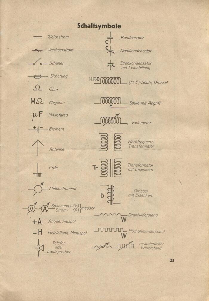
We get to see a range of period typefaces, all released by German foundries in the first third of the 20th century. The oldest one among them is Aviso, which appears for the labels on page 23, listing commonly used electrical circuit symbols. Aviso was first cast by Berthold in 1903. The monolinear italic might have been chosen for its similarity to DIN 16, the standard letterforms used in technical drawings. See the captions for more notes on the type.
The printing – and probably also the design – was done by Leipziger Buchdruckerei AG, a local company with ties to the Social Democrats.
The “Central German Radio and Phono Show” was the third major radio exhibition by the Leipzig chapter of the Arbeiter-Radio-Bund Deutschlands (ARB, “Workers’ Radio Federation of Germany”). In the foreword, the organizers write (translated):
Despite the severe economic crisis, the ARB has taken it upon itself to organize this exhibition. Since the last major exhibition (ARA 1928), transmission and reception technology have seen an upward trend that shows no signs of slowing down. This exhibition is intended to be more than just a promotional and sales event. It aims to introduce the layperson to the wide-ranging and fascinating field of radio technology. The technical processes are explained to visitors in a simple manner, organized into educational groups, using models and practical demonstrations. For the ARB, the goal is to familiarize listeners with the technical processes involved in radio broadcasting. The dissemination of technical knowledge is a cultural endeavor that should not be underestimated and forms the foundation for the ARB’s cultural mission.
Source: archive.org License: All Rights Reserved.
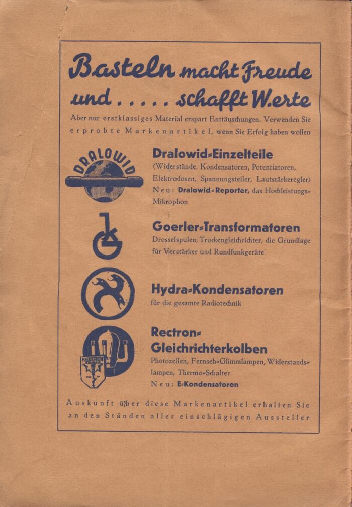
The inner cover advertises capacitors, transformers and other parts to DIYers who build their own radios. It uses the same typefaces, with a headline in Energos.
Source: archive.org License: All Rights Reserved.
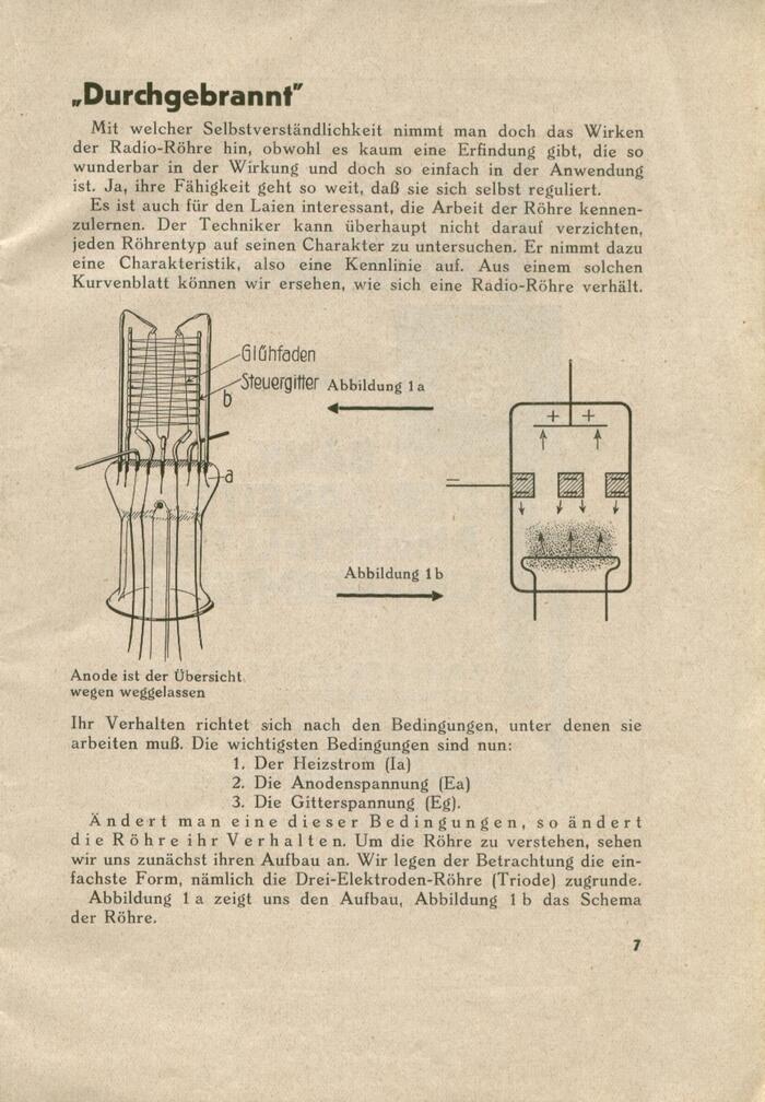
The text typeface is Säculum. Note the use of tracking for emphasis at the beginning of the last paragraph. The heading uses Erbar-Grotesk with a ch ligature and the standard German quote marks.
Source: archive.org License: All Rights Reserved.
The ad by Ludwig Fries relies on Erbar-Grotesk’s space-saving schmalhalbfett style.
Source: archive.org License: All Rights Reserved.
The electrical symbols, labeled in Aviso
Source: archive.org License: All Rights Reserved.
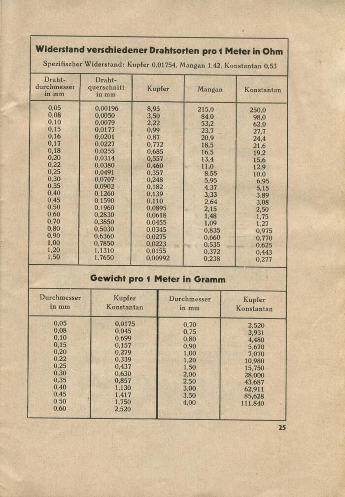
Tables with values for the electrical resistance of various types of wire and the weight of one meter of wire
Source: archive.org License: All Rights Reserved.
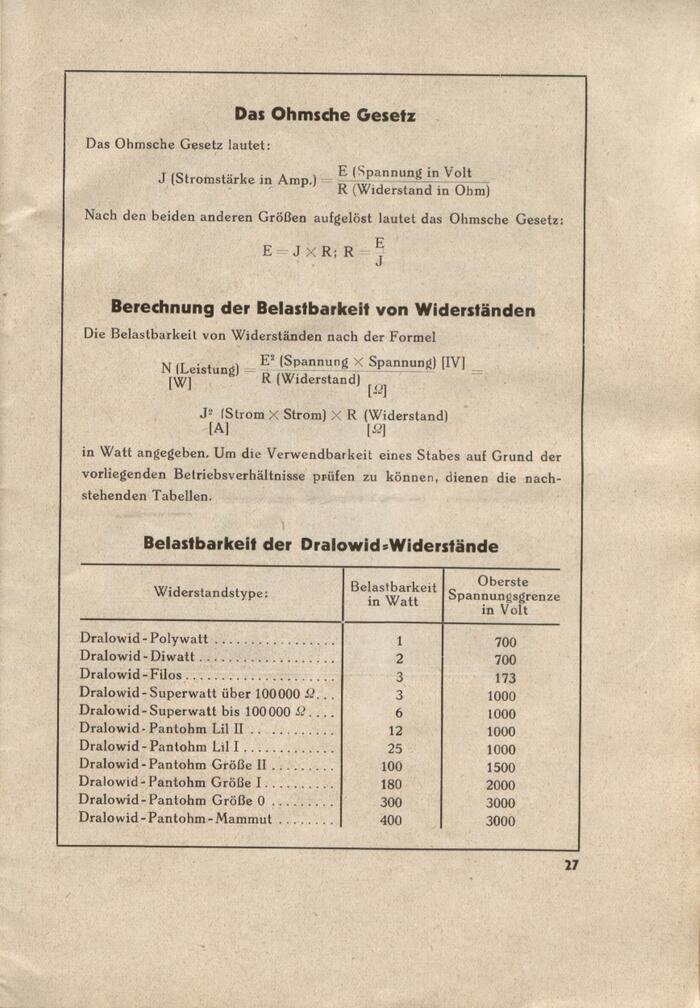
Ohm’s law and a formula for calculating the power handling capacity of resistors
Source: archive.org License: All Rights Reserved.
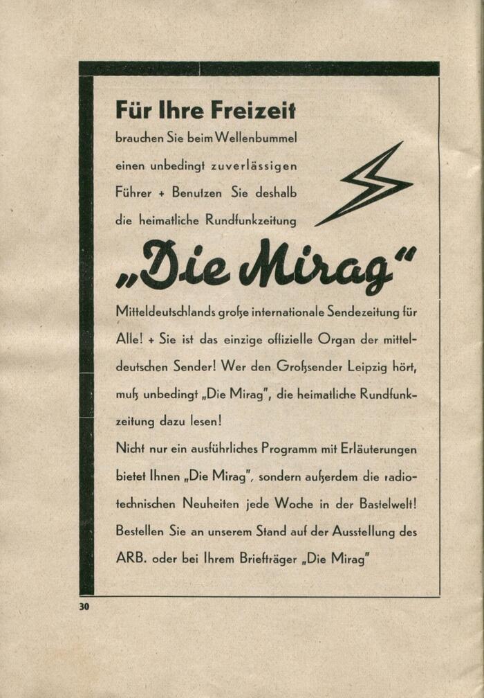
The ad for radio journal Die Mirag pairs Energos with two weights of Erbar-Grotesk. The copy is in the Zweite Garnitur that is distinguished by a shorter x-height.
Source: archive.org License: All Rights Reserved.
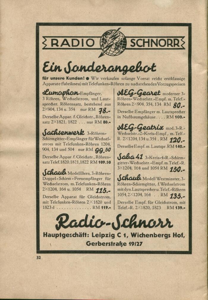
More Energos with Erbar and Tiemann-Mediäval for an by Radio-Schnorr. The logo at the top has handdrawn letters.
Source: archive.org License: All Rights Reserved.
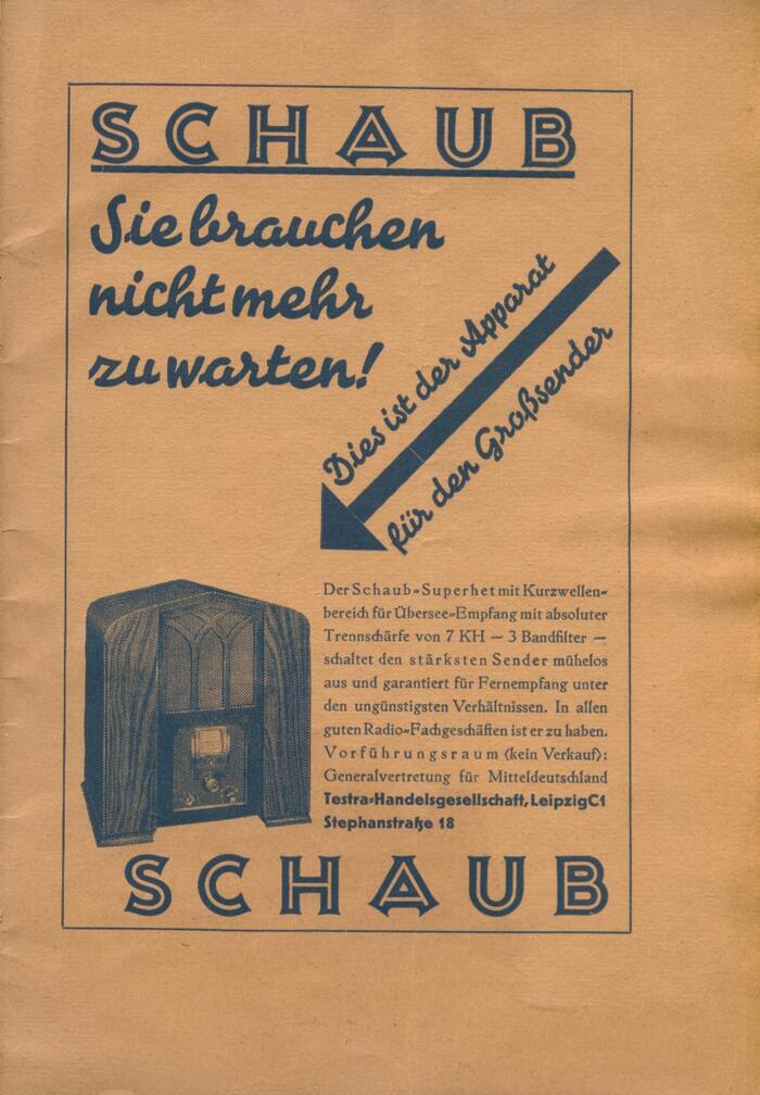
Schaub’s ad introduces Kreß-Versalien. The arrow was composed from several sorts, see the small gaps between them.
Source: archive.org License: All Rights Reserved.
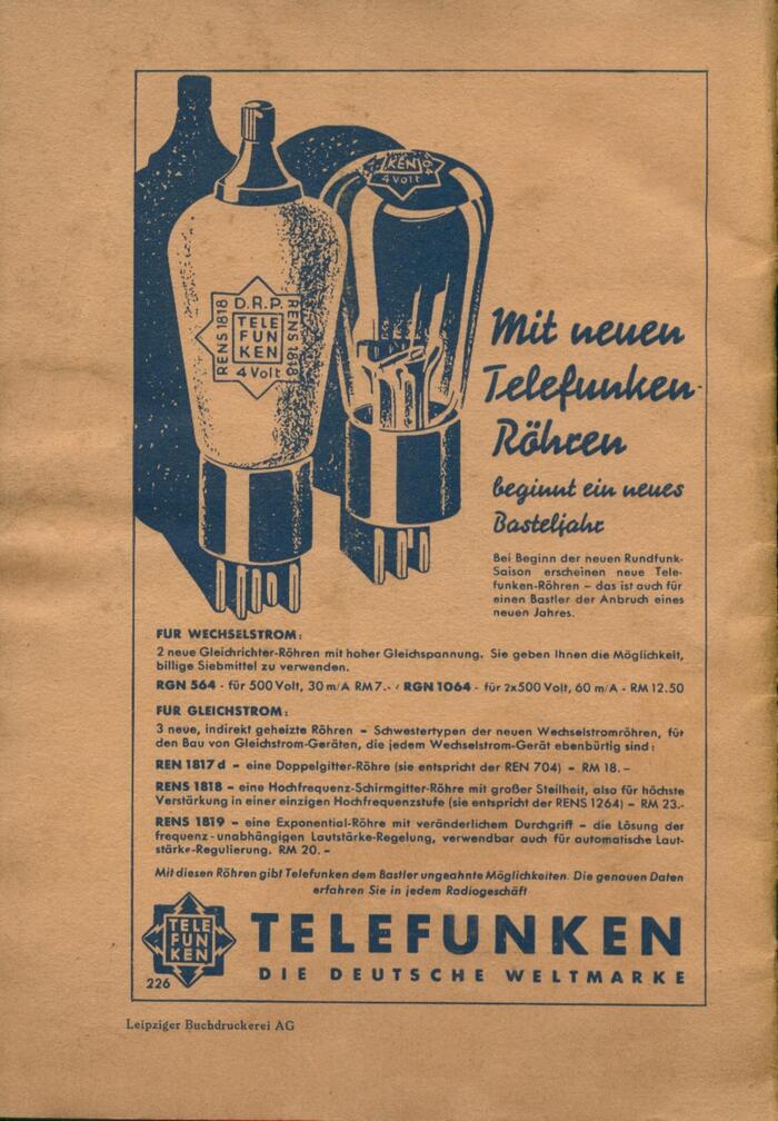
The Telefunken ad on the back cover uses Futura together with Signal. This script typeface was first cast by Berthold in 1931, making it the youngest one used in this booklet.
This post was originally published at Fonts In Use