Archiv für Buchgewerbe und Gebrauchsgraphik, Vol. 67, No. 5
Source: www.flickr.com Uploaded to Flickr by Kirsten Solveig Schneider and tagged with “jostkursiv” and “jostmediaeval”. License: All Rights Reserved.

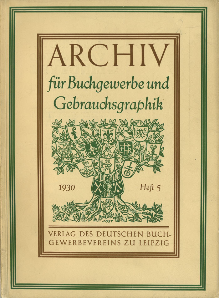
The cover of Archiv für Buchgewerbe und Gebrauchsgraphik 5/1930 was designed by Heinrich Jost (1889–1948), typographer, type designer, and long-time art director of the Bauer Type Foundry in Frankfurt/Main. His illustration of a tree adorned with various heraldic emblems and other symbols is paired with text set in Jost-Mediaeval (with Jost-Kursiv). Interestingly, this oldstyle wasn’t released with Jost’s employer, but with local competitor Ludwig & Mayer. It was first cast in 1927, four years after he started working for Bauer. In 1955, the typeface was relaunched under the name Aeterna.
From the contents (translated from the German):
Essays — Eberhard Hölscher, Berlin: Trademarks and Logos. On Their Origins and Evolution of Form (with illustrations) — Emil Wetzig, Leipzig: The Text Typefaces of the Fifty Most Beautiful Books of 1929 — A New History of the Art of Book Printing — Reviews of New Publications
Supplements — Student works from the State and Municipal School of Crafts and Applied Arts in Hanover
Typesetting and printing by Breitkopf & Härtel, paper by Ferdinand Flinsch, inks by Berger & Wirth, bookbinding by the Fritzsche-Hager Bookbinding Workshop, all in Leipzig.
This post was originally published at Fonts In Use