Malto
Source: m-n.associates M — N Associates. License: All Rights Reserved.


In a market saturated with “teen leader” and “healthy teen” themes, Malto has emerged as a standout player with its distinctive approach. Under the umbrella of the LOF mother brand's overarching strategy, “Choosing your happiness,” Malto has transformed into a brand that resonates with the phrase “happy teen choice”. This unique identity is thoughtfully crafted to align with Asian teen culture, radiating a cute and relatable aura that encapsulates the essence of youthful joy and satisfaction.
While competitors in the Vietnamese teen milk market have adhered to conventional themes, Malto has broken the mold by embracing a fresh perspective that truly connects with today's youth.
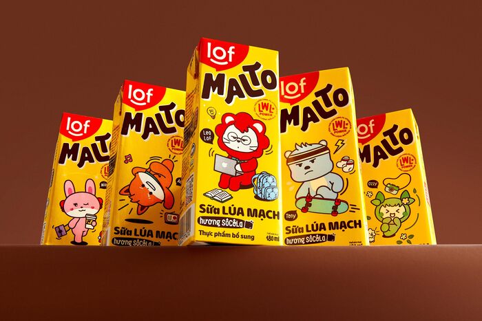
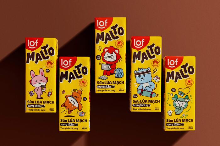
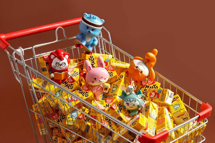
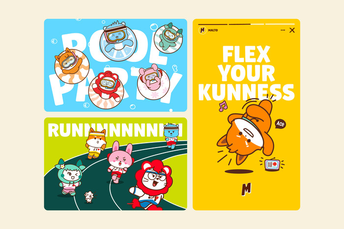
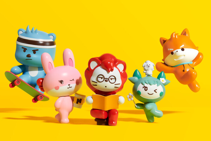
Central to this transformation are the endearing Malto Gang characters, which have transcended their roles as mere emoticons on Malto packaging to become cultural icons. These characters have found their way into merchandise, animations, and exciting collaborations, captivating the hearts of teenagers with their relatable personalities and charming designs. The Malto Gang characters embody a brand narrative that celebrates friendship, diversity, and the simple joys of life.
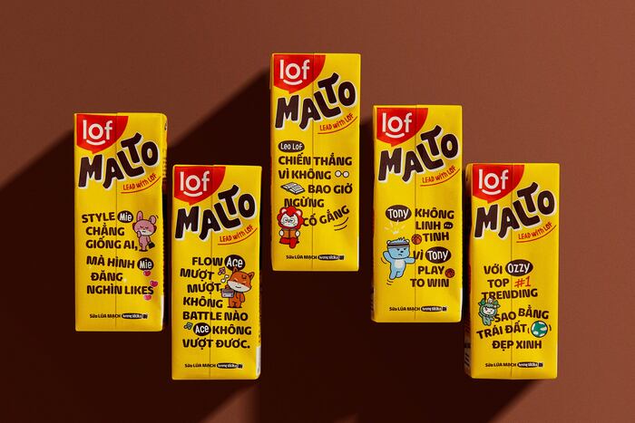
Malto's logotype boasts a distinct visual flair with curvy forms that symbolize growth and the aspiration to “fly high.” This design element takes center stage on packaging, instantly drawing attention with its natural and friendly feel.
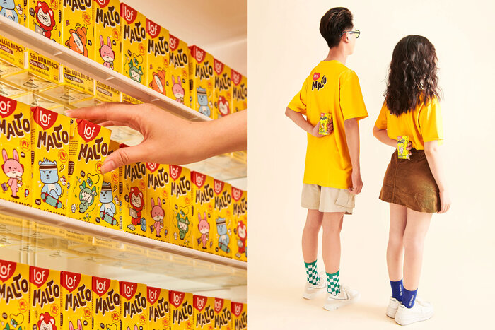
The color palette is a bold departure from competitors, featuring vibrant yellow as the malt color. This choice aligns with today's teenagers' desire to stand out and express themselves, symbolizing their vibrancy and positivity.
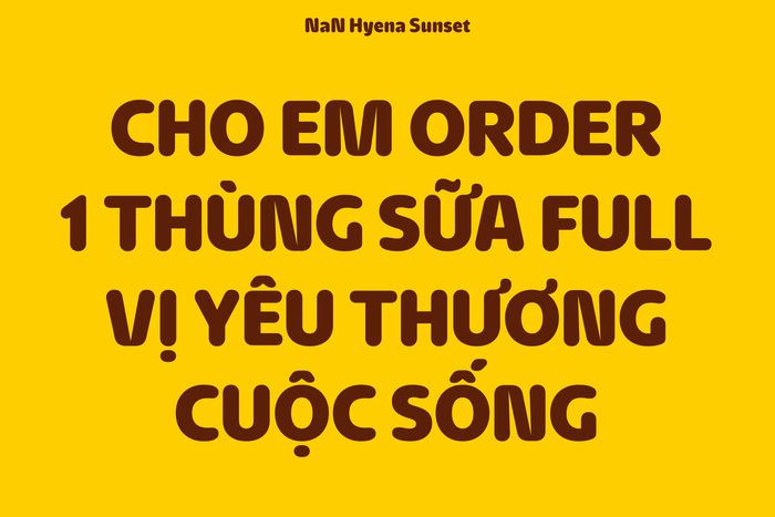
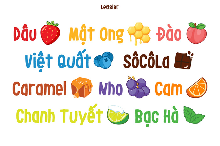
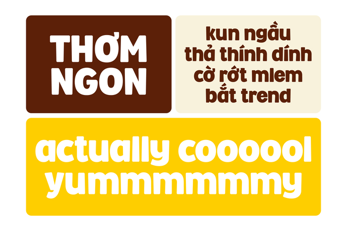
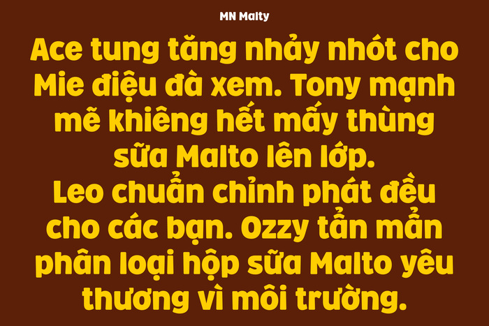
The custom MN Malty font visually represents the concept of “growth” with rounded trapezoid stems. NaN Hyena Sunset and LeOsler complement the typographic ensemble, adding sophistication and prominence.
Malto’s brand voice embraces the latest linguistic trends and wordplay, injecting humor into content to make it relatable and engaging for today's youth.
Read more about the Malto Gang, the packaging, and other aspects of the brand design in the full case study on Behance.
Source: m-n.associates M — N Associates. License: All Rights Reserved.
Source: m-n.associates M — N Associates. License: All Rights Reserved.
Source: m-n.associates M — N Associates. License: All Rights Reserved.
Source: m-n.associates M — N Associates. License: All Rights Reserved.
Source: m-n.associates M — N Associates. License: All Rights Reserved.
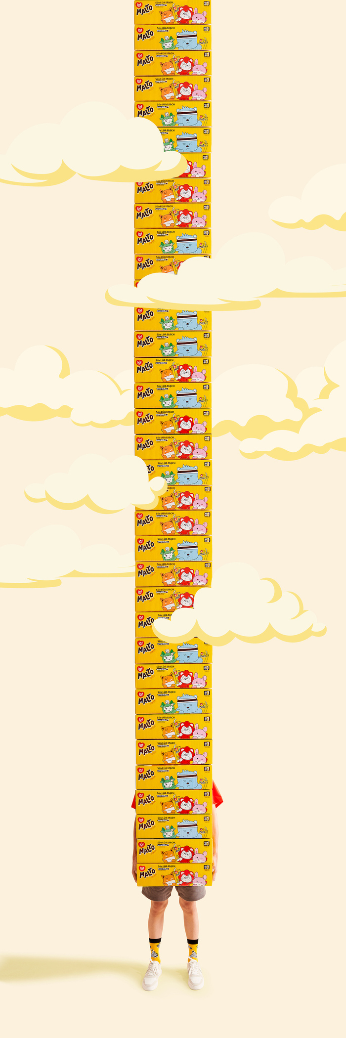
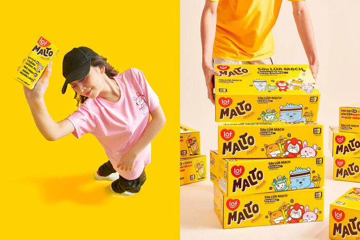
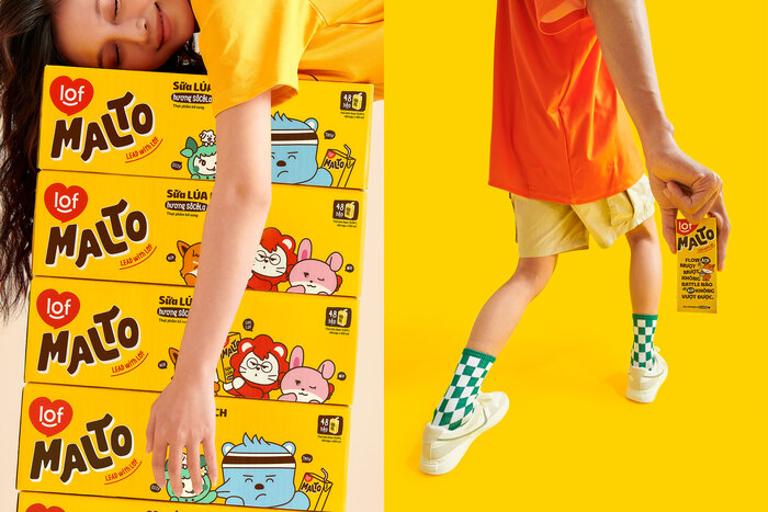
Packaging design
Source: m-n.associates M — N Associates. License: All Rights Reserved.
Packaging design
Source: m-n.associates M — N Associates. License: All Rights Reserved.
The Malto Gang action figures
Source: m-n.associates M — N Associates. License: All Rights Reserved.
The Malto Gang in combination with MN Malty
Source: m-n.associates M — N Associates. License: All Rights Reserved.
Vietnamese text in NaN Hyena Sunset
Source: m-n.associates M — N Associates. License: All Rights Reserved.
LeOsler as used for the flavors

Source: m-n.associates M — N Associates. License: All Rights Reserved.
The custom brand typeface, MN Malty
Source: m-n.associates M — N Associates. License: All Rights Reserved.
The custom brand typeface, MN Malty
Source: m-n.associates M — N Associates. License: All Rights Reserved.
Vietnamese text in MN Malty
Source: m-n.associates M — N Associates. License: All Rights Reserved.
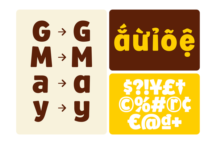
Alternate glyphs in MN Malty
Source: m-n.associates M — N Associates. License: All Rights Reserved.
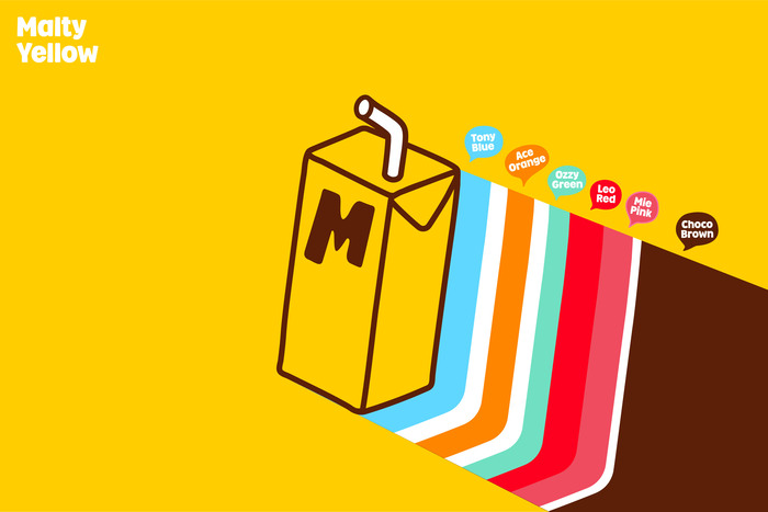
Color palette
Source: m-n.associates M — N Associates. License: All Rights Reserved.
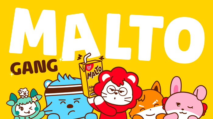
The Malto Gang, illustrated
Source: m-n.associates M — N Associates. License: All Rights Reserved.
The Malto Gang as toys, manufactured by 8K Creative
This post was originally published at Fonts In Use