Metra tickets, 1990–1991


Source: www.c82.net C82 / Nicholas Rougeux. License: All Rights Reserved.
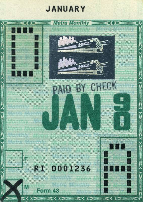
January 1990, ft. an unidentified rounded sans
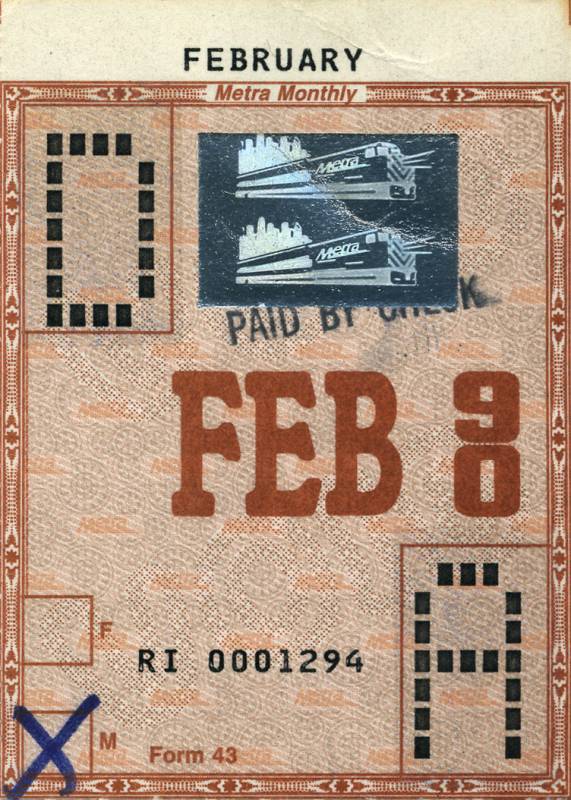
Source: www.c82.net C82 / Nicholas Rougeux. License: All Rights Reserved.
February 1990 ft. Italia Bold
C82 is the website of Nicholas Rougeux, a Chicago-based designer and data artist. One of the many great things one can find on C82 is his collection of train tickets sold by Metra. Every month, the commuter rail system in the Chicago metropolitan area releases a new ticket design. In 2004, Nick started collecting. Over the years, and with the help from other ephemera enthusiasts as well as of Metra, the archive considerably grew in size. At the time of writing, it includes an impressive 1,395 tickets, spanning more than fifty years of commuter history.
This post highlights the monthly tickets from 1990 and 1991. In a recent blog update, Nick comments:
In the early 90s, ticket designs varied significantly with new typography and visual styles appearing each month. I can’t say these are some of my favorites but I recognize that this may have been in an effort to curb counterfeiting. However, I do enjoy some of the typography from the 1990s tickets. I owe a big thanks to fellow collector John for these and others.
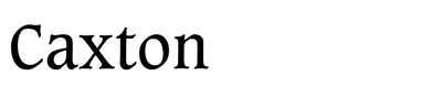
Each of the tickets features a different typefaces. Many of the chosen fonts stem from the libraries of ITC (Korinna, Quorum, Serif Gothic, Zapf Chancery, …) and Letraset (Caxton, Italia, Romic, …). There are also classics that go back to the era of foundry type, like Beton, City, or Optima, and Monotype originals like Albertus and Plantin. The typographic smorgasbord is completed by designs as diverse as Moderne Schwabacher, a turn-of-the-century blackletter; Salut, an upright script first cast by Gebr. Klingspor in the 1930s; and Checkmate, a futuristic sans with chamfered corners, dreamt up at Schaedler in the 1970s – all of which were either used still as phototype, or in the form of early digitizations.
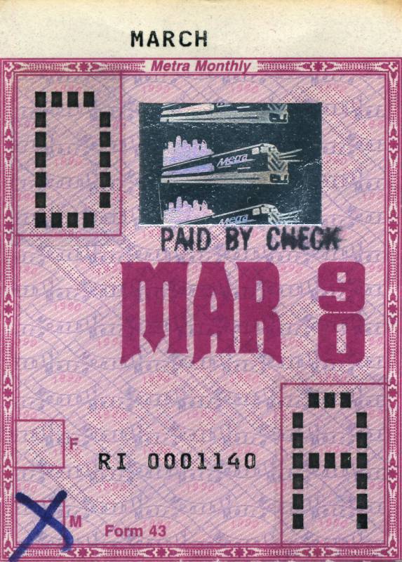
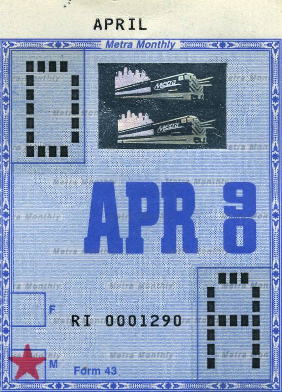
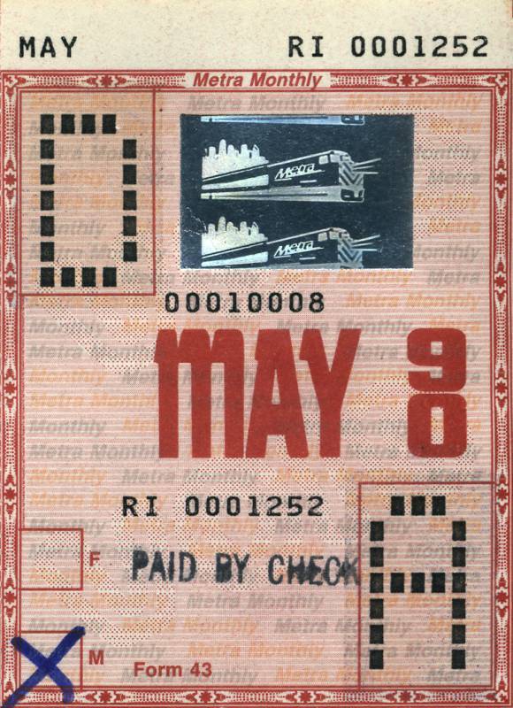
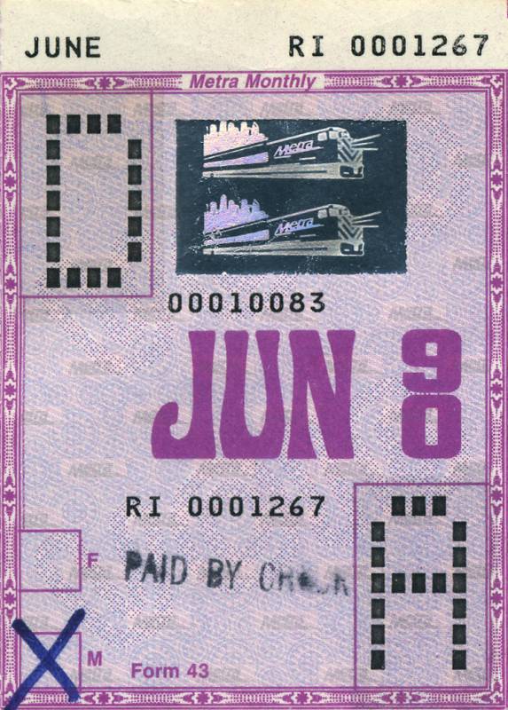
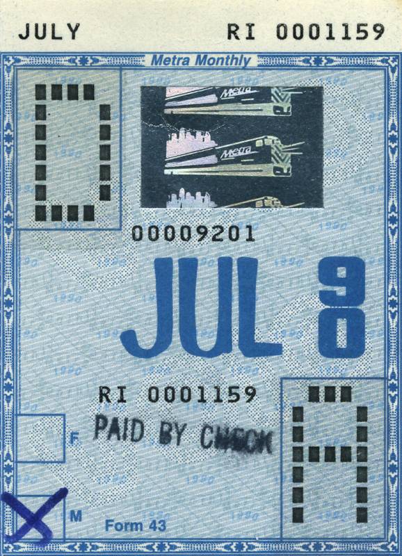
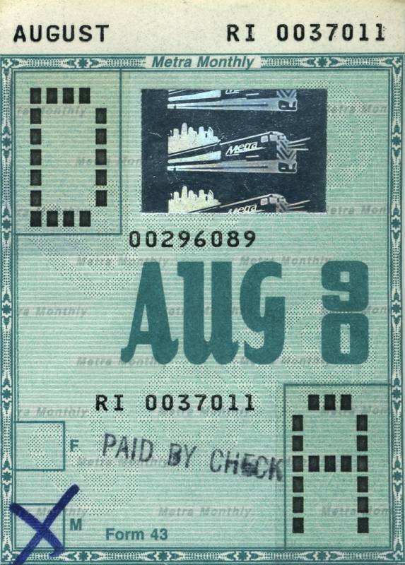
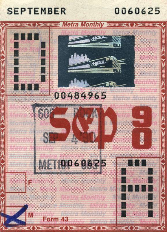
For the year 1990, all abbreviated month names are shown in vertically stretched letterforms. The source of the stacked numerals (“90”) is unidentified. The bitmap caps (“D/A”) are likely custom. While the spelled-out month names and the ticket numbers are similar to OCR-B, the specific font appears to be a proprietary design with some differences, probably from a specialized printing machine.
The Metra logo seen on the depicted train as well as on some of the tickets is Crillee. See also the dedicated post about it.
Source: www.c82.net C82 / Nicholas Rougeux. License: All Rights Reserved.
July 1990 ft. what appears to be a version of Filmotype Amber (or a similar face)
Source: www.c82.net C82 / Nicholas Rougeux. License: All Rights Reserved.
September 1990 ft. Moderne Schwabacher a.k.a. Chalet Text
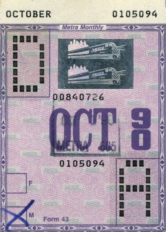
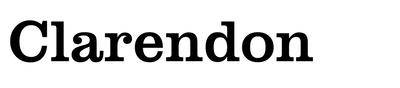
Source: www.c82.net C82 / Nicholas Rougeux. License: All Rights Reserved.
October 1990 ft. Clarendon Condensed
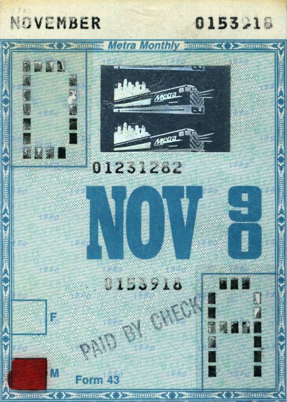
Source: www.c82.net C82 / Nicholas Rougeux. License: All Rights Reserved.
November 1990 ft. Beton Bold Condensed
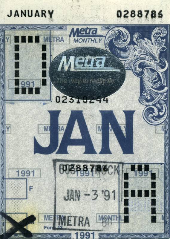
Source: www.c82.net C82 / Nicholas Rougeux. License: All Rights Reserved.
January 1991 ft. ITC Quorum Bold
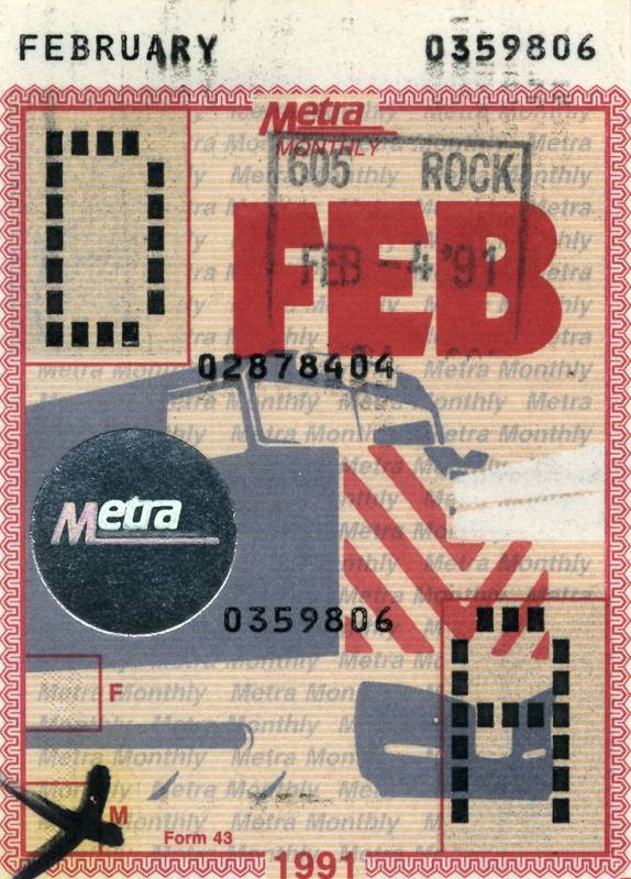
Source: www.c82.net C82 / Nicholas Rougeux. License: All Rights Reserved.
February 1991 ft. ITC Kabel Ultra
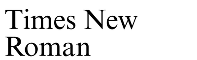
Source: www.c82.net C82 / Nicholas Rougeux. License: All Rights Reserved.
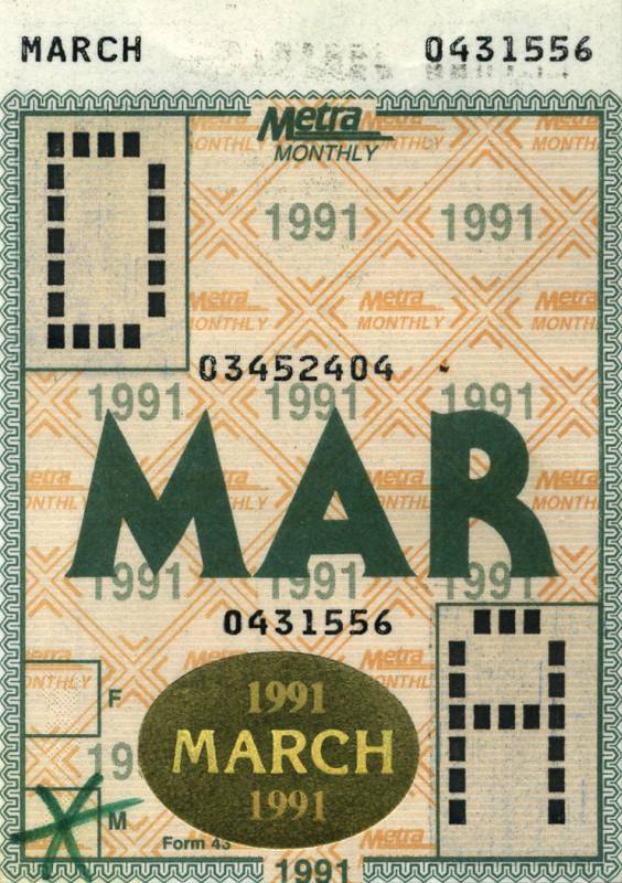
March 1991 ft. ITC Serif Gothic Heavy with the pointed forms for M and A that were omitted from the digital version. “March 1991” uses ITC Korinna and Times New Roman.
Source: www.c82.net C82 / Nicholas Rougeux. License: All Rights Reserved.
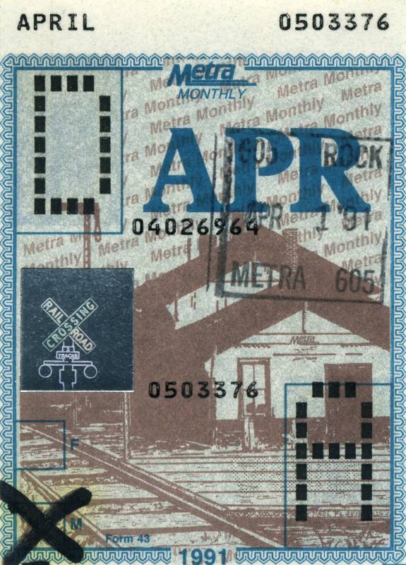
April 1991 ft. a bold variant of Plantin
Source: www.c82.net C82 / Nicholas Rougeux. License: All Rights Reserved.
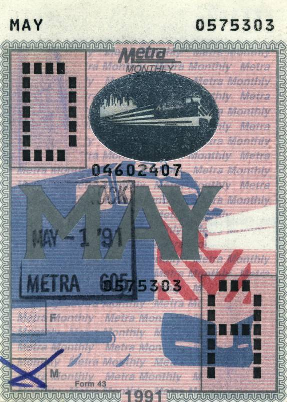
May 1991 ft. a bold variant of Albertus


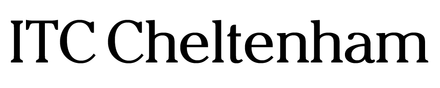
Source: www.c82.net C82 / Nicholas Rougeux. License: All Rights Reserved.
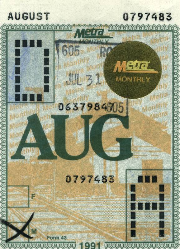
August ft. ITC Cheltenham Bold
Source: www.c82.net C82 / Nicholas Rougeux. License: All Rights Reserved.
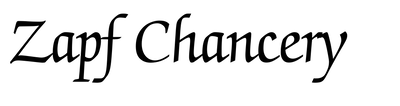
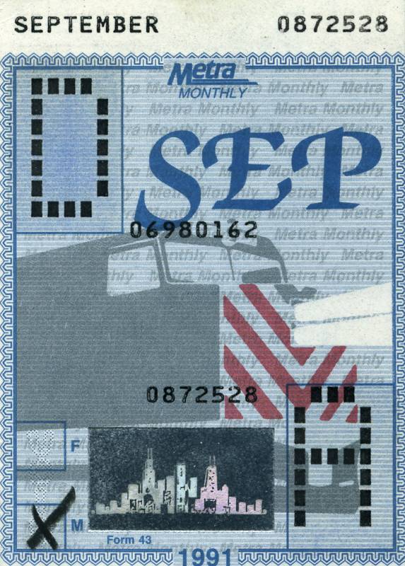
September 1991 ft. ITC Zapf Chancery Bold with the alternate swash caps

Source: www.c82.net C82 / Nicholas Rougeux. License: All Rights Reserved.
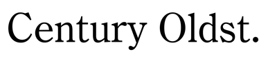
October 1991 ft. a bold variant of Century Oldstyle
Source: www.c82.net C82 / Nicholas Rougeux. License: All Rights Reserved.
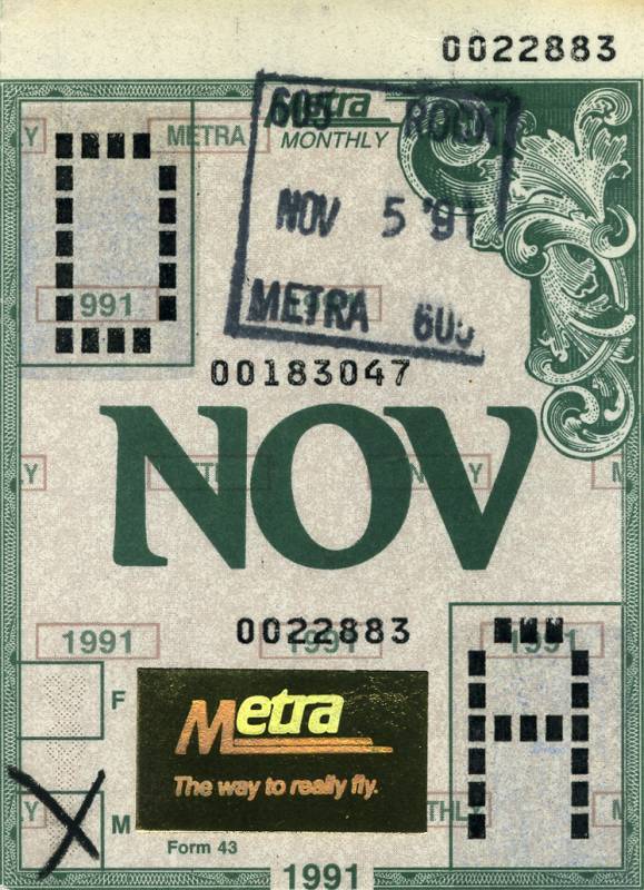
November 1991 ft. Romic Bold
Source: www.c82.net C82 / Nicholas Rougeux. License: All Rights Reserved.
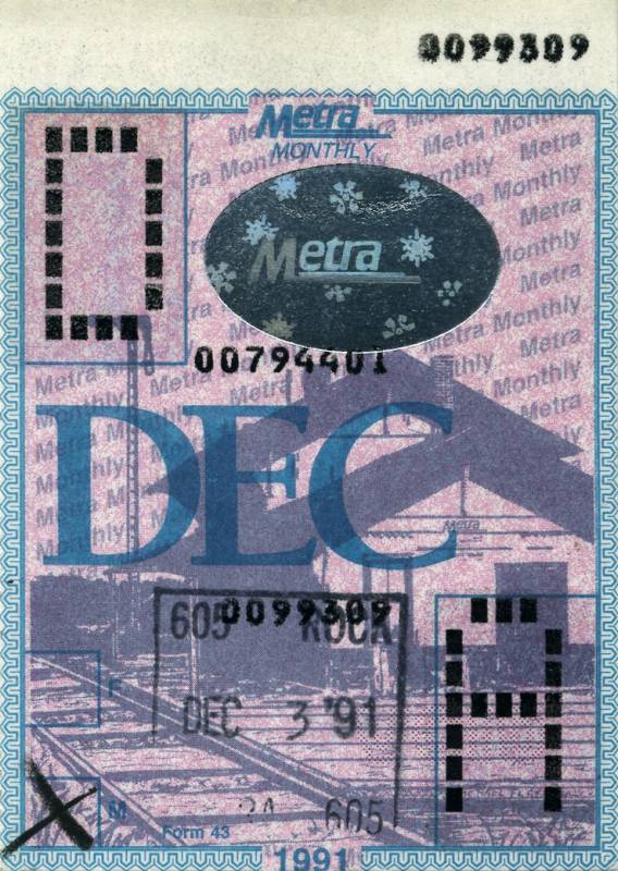
December 1991 ft. ITC Berkeley Oldstyle
This post was originally published at Fonts In Use