Maldon Salt
Published October 19, 2026
By FontsInUse
Contributed by Netta Szabo
Source: bigfish.co.uk Big Fish. License: All Rights Reserved.


Source: bigfish.co.uk Big Fish. License: All Rights Reserved.
Source: bigfish.co.uk Big Fish. License: All Rights Reserved.
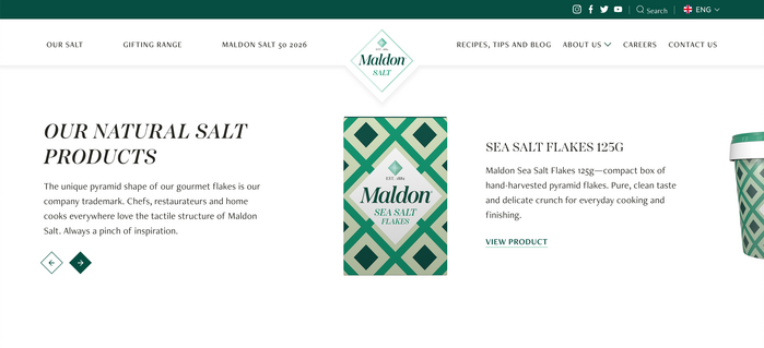
Source: maldonsalt.com Maldon Salt. License: All Rights Reserved.
This post was originally published at Fonts In Use
Source: bigfish.co.uk Big Fish. License: All Rights Reserved.
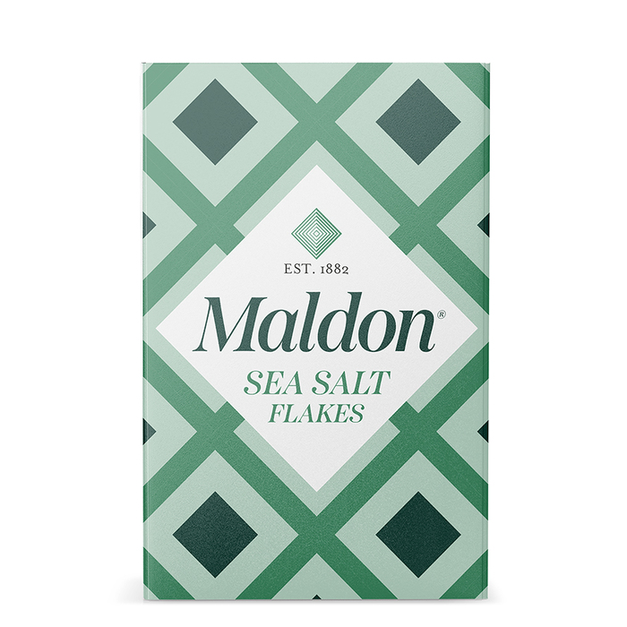
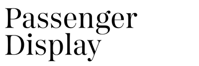
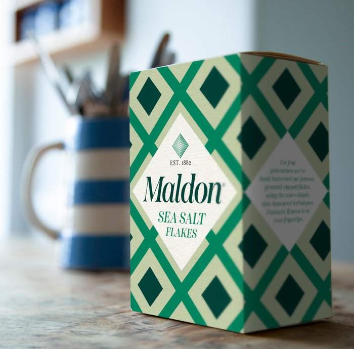
Maldon Salt uses Passenger Display as their brand typeface, supported by Mrs Eaves for “Est. 1882” on the packaging and Freight Neo for website text.
Perry Haydn Taylor, Creative Director at Big Fish, comments:
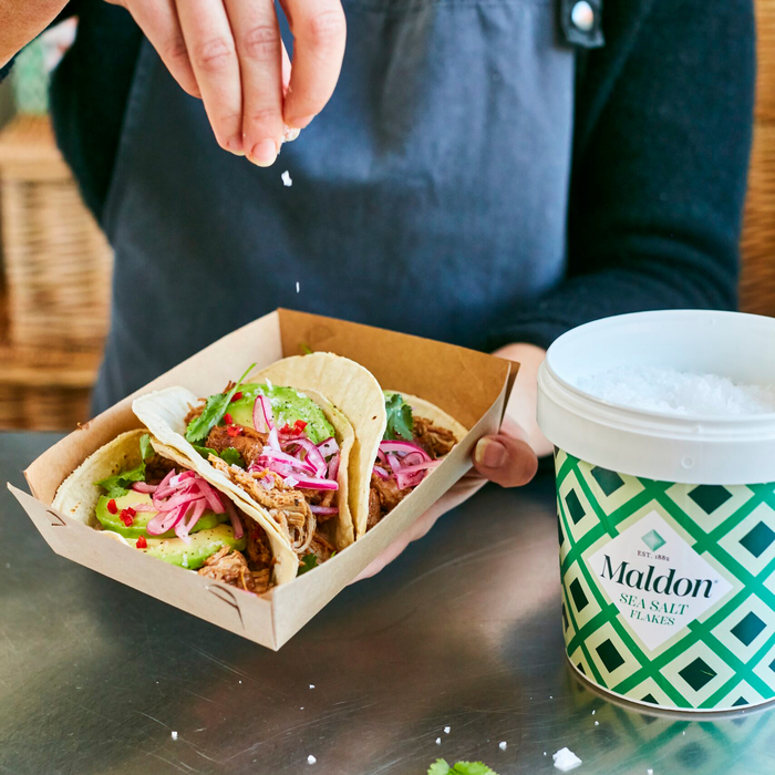
The aim of this new design was to bring it into everyday lives and get people to season their food more. And, to ‘Seize the Seasoning’ you need to be able to ‘see’ the seasoning, so we hope that the new louder and prouder packaging will do just that. Making the brand more accessible and something that people will proudly display on their kitchen tables will certainly help to increase usage too.
Read more on maldonsalt.com.
Source: bigfish.co.uk Big Fish. License: All Rights Reserved.
Source: bigfish.co.uk Big Fish. License: All Rights Reserved.
Source: maldonsalt.com Maldon Salt. License: All Rights Reserved.
This post was originally published at Fonts In Use
Read full story.
WRITTEN BY
FontsInUse
An independent archive of typography.
More from FontsInUse