LPO (Ligue pour la Protection des Oiseaux) brand identity
Published June 30, 2023
By FontsInUse
Contributed by BrandBox
Source: www.behance.net License: All Rights Reserved.

Source: www.behance.net License: All Rights Reserved.

Source: www.behance.net License: All Rights Reserved.
Source: www.behance.net License: All Rights Reserved.
Source: www.behance.net License: All Rights Reserved.
Source: www.behance.net License: All Rights Reserved.

Source: www.behance.net License: All Rights Reserved.
Source: www.behance.net License: All Rights Reserved.
This post was originally published at Fonts In Use
Source: www.behance.net License: All Rights Reserved.
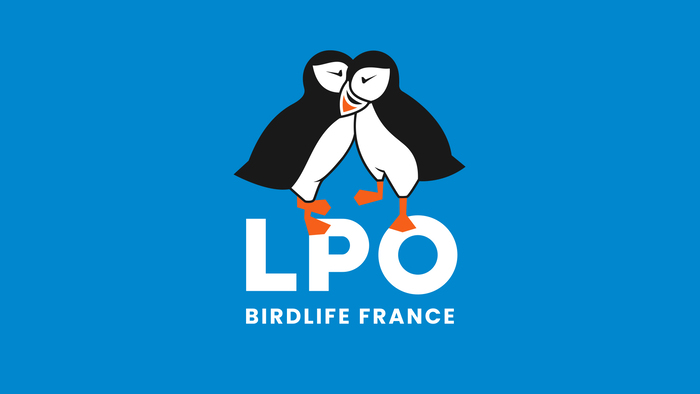
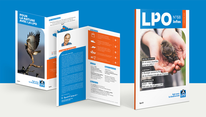
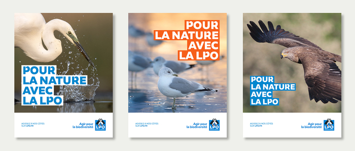
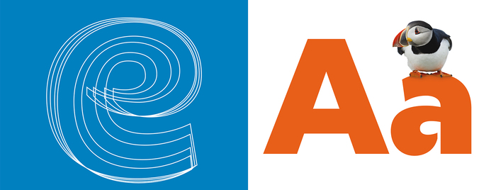
Celebrating its 110th anniversary, LPO (Ligue de Protection des Oiseaux, “Bird protection league”) has unveiled a new logo, a new visual territory, and a new exclusive typeface.
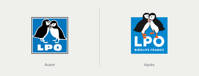
The puffin couple has been redrawn and the logo was rebalanced to maximize its readability. The new color palette brings natural, yet vivid colors, inspired by birds and their environment.
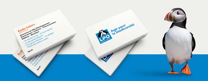
The custom typeface, LPO, was tailor-designed by Éric de Berranger. It incorporates cuts in its classic letters, for an organic, clear and legible alphabet, fitting for both title and paragraph.
Source: www.behance.net License: All Rights Reserved.
Source: www.behance.net License: All Rights Reserved.
Source: www.behance.net License: All Rights Reserved.
Source: www.behance.net License: All Rights Reserved.
Source: www.behance.net License: All Rights Reserved.
Source: www.behance.net License: All Rights Reserved.
Source: www.behance.net License: All Rights Reserved.
This post was originally published at Fonts In Use
Read full story.
WRITTEN BY
FontsInUse
An independent archive of typography.