Löyly Pure Nordic Spa & Co
Source: www.instagram.com License: All Rights Reserved.


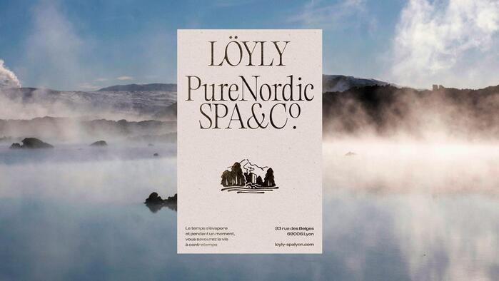
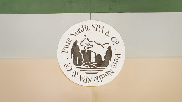
Through hand-drawn branding, Löyly’s visual identity subtly evokes Scandinavian traditions, where nature and serenity are at the heart of relaxation rituals.
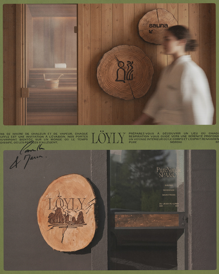
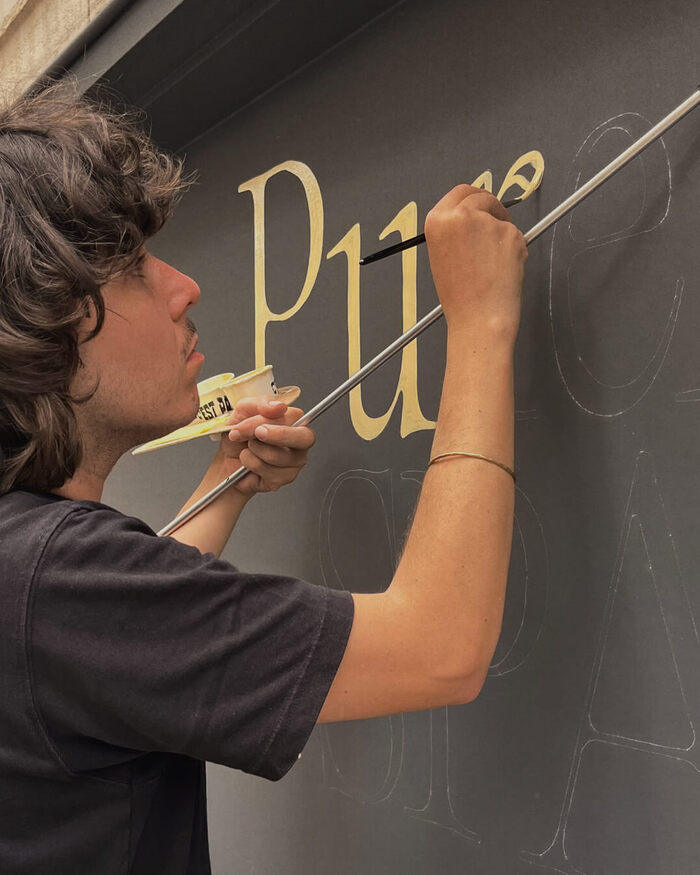
Beyond the logo, the collaboration included full artistic direction: creating a wood-engraved icon system for signage, defining the editorial tone, designing both physical and digital atmospheres, and conceiving the storefront adorned with hand-painted letters by C’est par là.
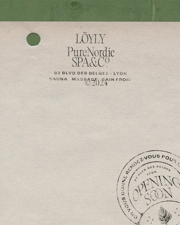
The identity pairs Editorial Old’s refined elegance with Avgarde’s robust, authentic character. Together, they balance sophistication and strength, creating a distinctive and versatile typographic voice.
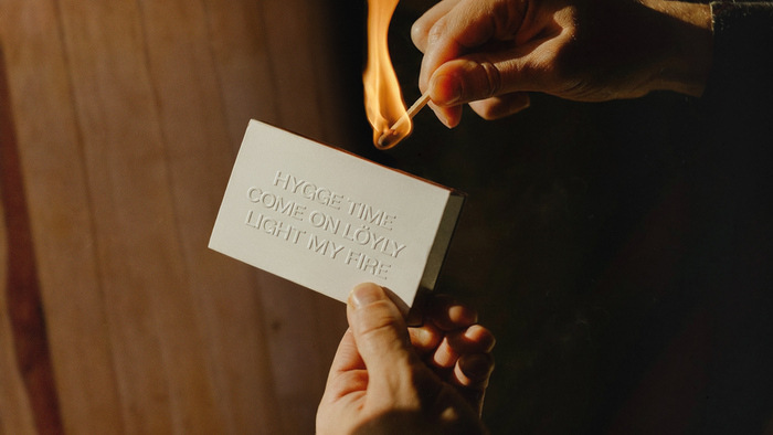
The identity thus becomes a guiding thread, leading visitors into a warm and immersive atmosphere, true to the spirit of Nordic baths and the unique welcome Löyly aims to offer.
Source: www.instagram.com License: All Rights Reserved.
Source: www.instagram.com License: All Rights Reserved.
Source: www.instagram.com License: All Rights Reserved.
Source: www.instagram.com License: All Rights Reserved.
Source: www.instagram.com License: All Rights Reserved.
This post was originally published at Fonts In Use