Farmàcia Bonmatí labels
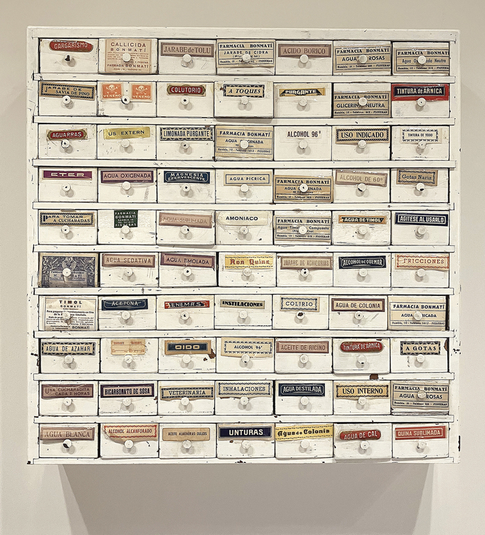
Photo: Lluís Serra. License: All Rights Reserved.


An advert from the early 1940s places the Bonmatí pharmacy at the upperside of the Rambla in Figueres, in the Catalonian region of Girona. Although the pharmacy moved to a new address few years ago, the old signage is still preserved at its original location. At the new address, the Bonmatí family preserves a ceramic sign and the cabinet that was used to store the labels for the pharmacy’s products. Typography and lettering, letterpress and lithography. A few millimetres of paper were used to create small graphic universes to organise the categories of pharmaceutical products.
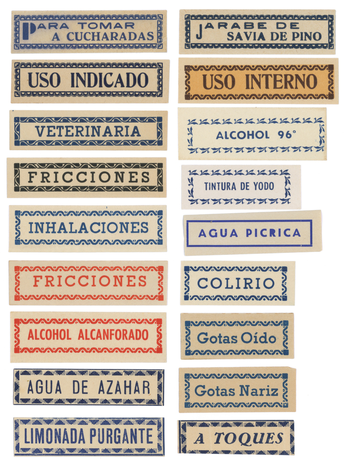
Photo: Lluís Serra. License: All Rights Reserved.
“Para tomar a cucharadas” and “Jarabe de savia de pino”: Neo Futura (Neufville’s name for Futura Black), Grotesca ancha nueva (Gans), and Antigua Mercedes (Neufville’s name for Tages-Antiqua
“Uso indicado” and “Uso interno): Romana estrecha negra (Fundición Tipográfica Nacional)
“Veterinaria” (and also “Fricciones”, “Inhalaciones” etc.): Cleopatra negra (Iranzo)
“Alcohol 96”: Futura (Neufville/Bauer)
“Tintura de Yodo” (and “Alcohol alcanforado”): Futura chupada, Neufville’s name for Futura Condensed
“Agua picrica”: Predilecta (Iranzo’s version of Kristall-Grotesk)
“Limonada purgante”: Grotesca Mercantil (Gans; see Longina)
“Agua de azahar”: unidentified typeface
“A toques”: Bernhard-Kursiv fett (Bauer)
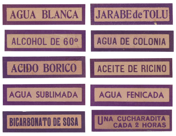
Photo: Lluís Serra. License: All Rights Reserved.
Rows 1–3: Romana estrecha negra (serif) and an unidentified sans
Row 4: Predilecta
Row 5: “Bicarbonato de sosa” is in an unidentified typeface that has several glyphs in common with Roundhead and is also very close to Runic Grotesque (but with asymmetrical T). “Una cucharadita cada 2 horas” is in Venus Bold.
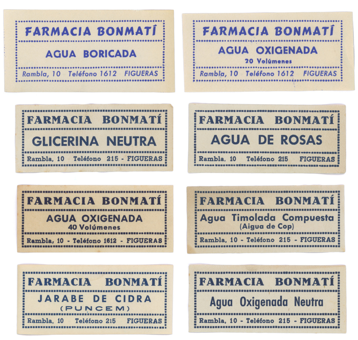
Photo: Lluís Serra. License: All Rights Reserved.
Row 1: Fresko a.k.a. Cartoon with Predilecta
Rows 2–4: Antigua Mercedes, Futura, and Cleopatra. The labels in the last row additionally features Grotesca ancha nueva (“Puncem”) and Futura Condensed.
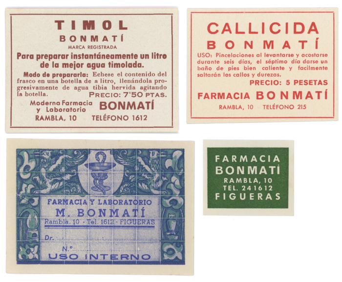
Photo: Lluís Serra. License: All Rights Reserved.
Top left (“Timol”): a local version of Zeitungs-Grotesque (Grotesca ancha by Gans, Grotesca negra by FTN, or Fette Grotesk by Bauer), Venus, Futura chupada negra, Bodoni, and a local version of Copperplate Gothic (Helénica ancha by Gans or Espartana estrecha by FTN)
Top right (“Callicida”): an unidentified wide grotesk, Futura, Venus
Bottom left: both weights of Cleopatra, Futura Italic, Grotesca ancha nueva, and a fine Bowl of Hygieia
Bottom right: Venus and Futura
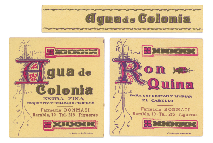
Photo: Lluís Serra. License: All Rights Reserved.
Lithographic labels by J. Garcia printing house, Barcelona. Most text on these is lettering. The address is added in Cleopatra.
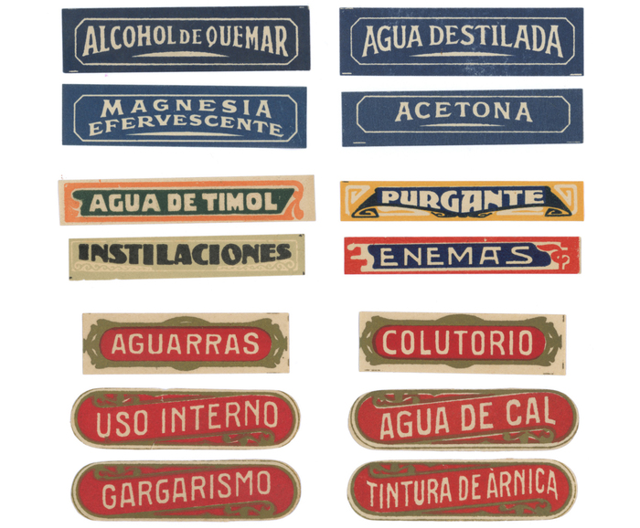
Photo: Lluís Serra. License: All Rights Reserved.
Different styles of lettering
This post was originally published at Fonts In Use