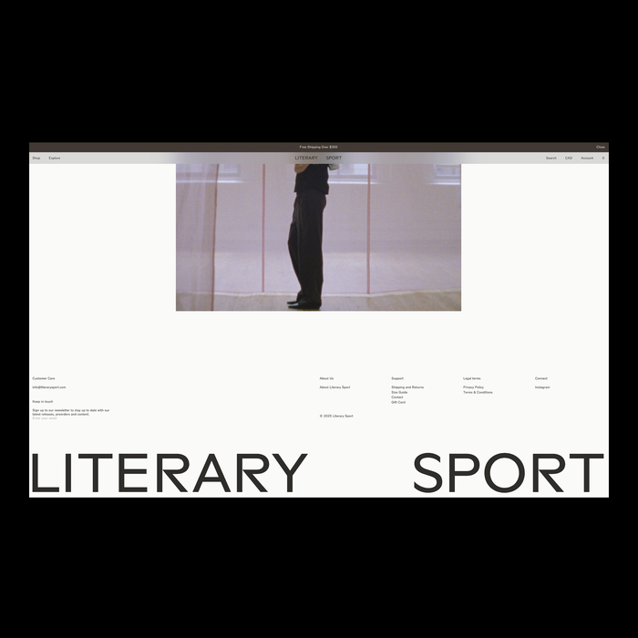
Literary Sport
Source: mouthwash.studio Mouthwash Studio. License: All Rights Reserved.


Visual identity and digital experience for Literary Sport, a label exploring running through culture, reflection, and personal rhythm.
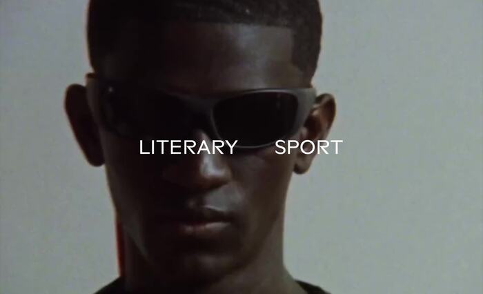
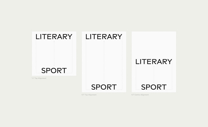
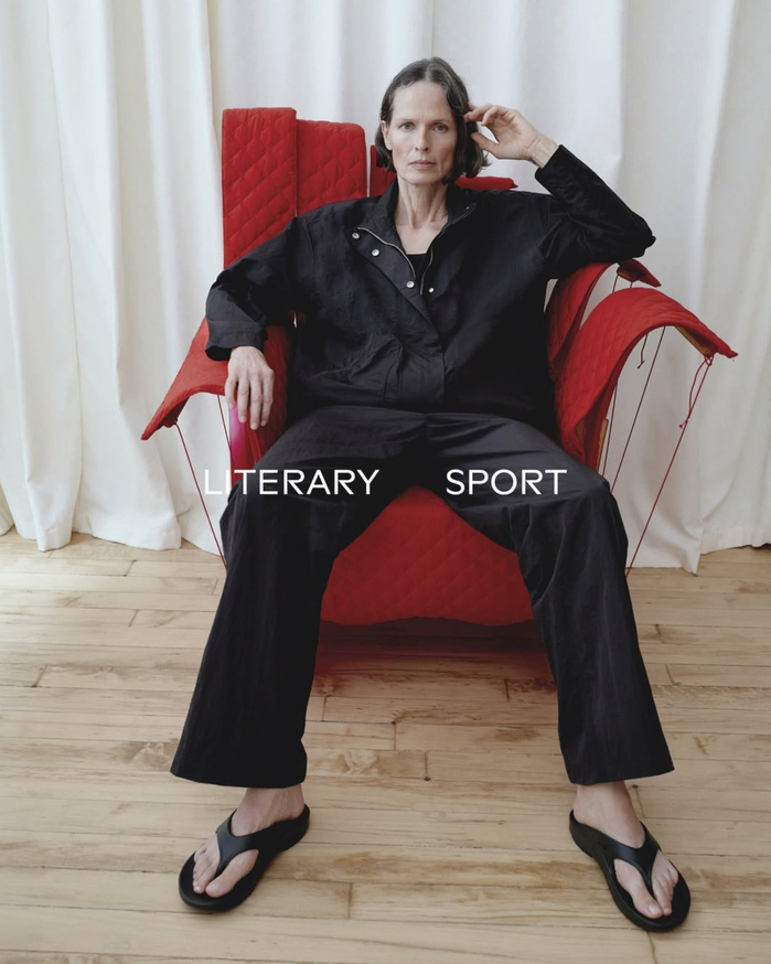
Designed by Mouthwash Studio, the identity is built on the tension between athletic structure and literary sensibility. A geometric logotype introduces a modified version of BST Ritma, featuring a distinctively cut R, establishing a precise yet expressive typographic voice. Subtle spacing and shifts in typographic behaviour reflect rhythm, pause, and movement – echoing the brand’s redefinition of performance beyond metrics and speed.
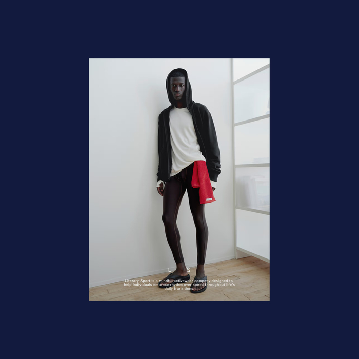
The wider system extends across digital and editorial environments, balancing clarity with moments of quiet disruption. Familiar functional structures are paired with slower, more considered visual pacing, reinforcing the brand’s position between sport, culture, and introspection.
Alongside the logo in modified BST Ritma, the identity uses ABC Rom by Dinamo and Cardo by David Perry.
Source: mouthwash.studio Mouthwash Studio. License: All Rights Reserved.
Source: mouthwash.studio Mouthwash Studio. License: All Rights Reserved.

Source: mouthwash.studio Mouthwash Studio. License: All Rights Reserved.
Source: mouthwash.studio Mouthwash Studio. License: All Rights Reserved.
Source: mouthwash.studio Mouthwash Studio. License: All Rights Reserved.
Source: mouthwash.studio Mouthwash Studio. License: All Rights Reserved.

Source: mouthwash.studio Mouthwash Studio. License: All Rights Reserved.
This post was originally published at Fonts In Use