Lincoln “What a luxury car should be” ads
License: All Rights Reserved.
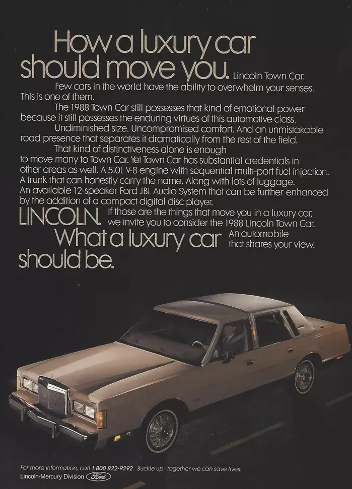
“How a luxury car should move you.”

During the 1980s, Ford’s “Lincoln” brand used an assortment of various Futuras (and derivatives) and Avant Garde.
In the examples from around 1986 shown here, the unusually high x-height is the dead giveaway that this isn’t the original Futura by Paul Renner. Futura Maxi by Photo-Lettering and neo-Mini Futura by Headliners are two derivatives with such a raised waistline. Judging from the finer details, it’s neither of those, though. It’s also pretty close to Century Gothic, but that typeface isn’t a perfect match either. Also, it wasn’t released until 1990. Chances are we’re looking at yet another such variant, possibly a custom creation made for and exclusive to Ford. For the time being, Futura is tagged.
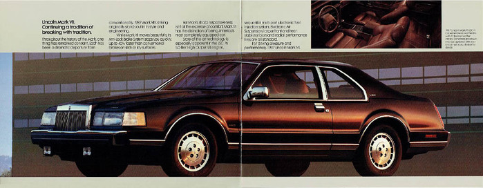
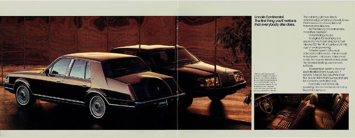
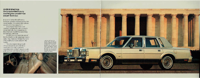
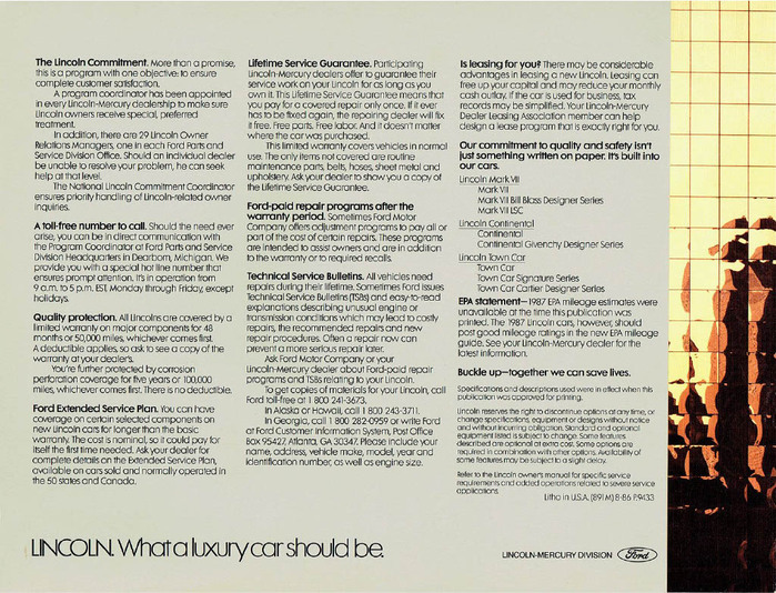
This Futura variant was used for several print advertising campaigns, and the 1987 Lincoln full-line catalog.
Source: www.ebay.com License: All Rights Reserved.
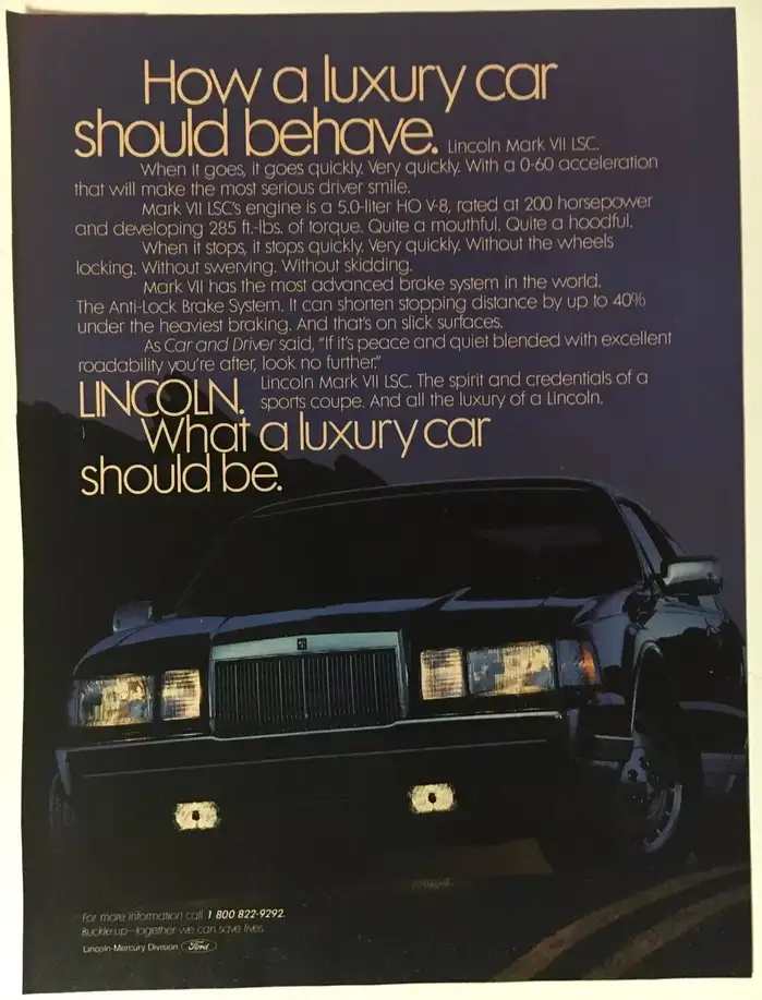
“How a luxury car should behave.”
License: All Rights Reserved.
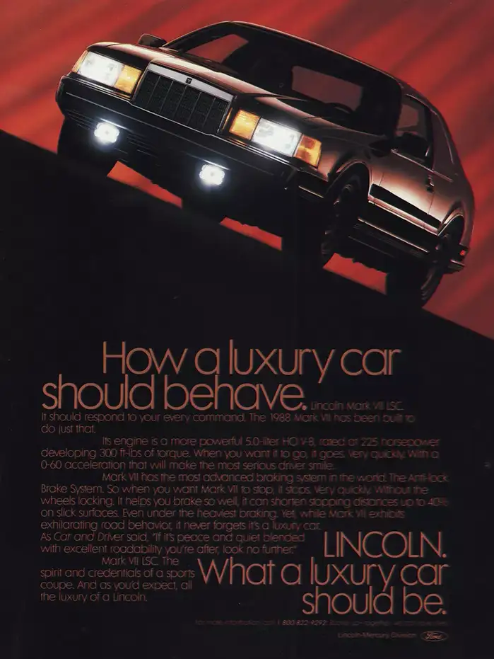
“How a luxury car should behave.”
Source: www.flickr.com Uploaded to Flickr by Alden Jewell. License: All Rights Reserved.
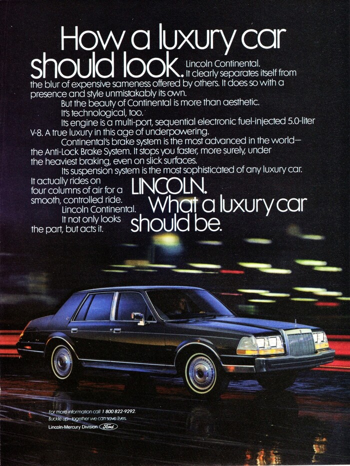
“How a luxury car should look.”
License: All Rights Reserved.
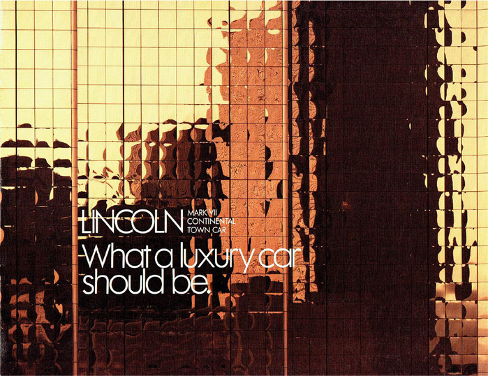
“What a luxury car should be.” – catalog cover
License: All Rights Reserved.
License: All Rights Reserved.
License: All Rights Reserved.
License: All Rights Reserved.
This post was originally published at Fonts In Use