La Claqueta
Mel Comunicació. License: All Rights Reserved.


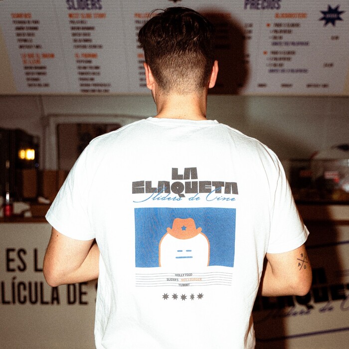
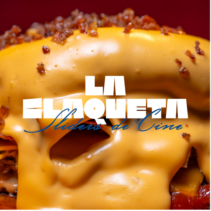
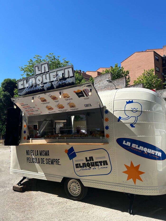
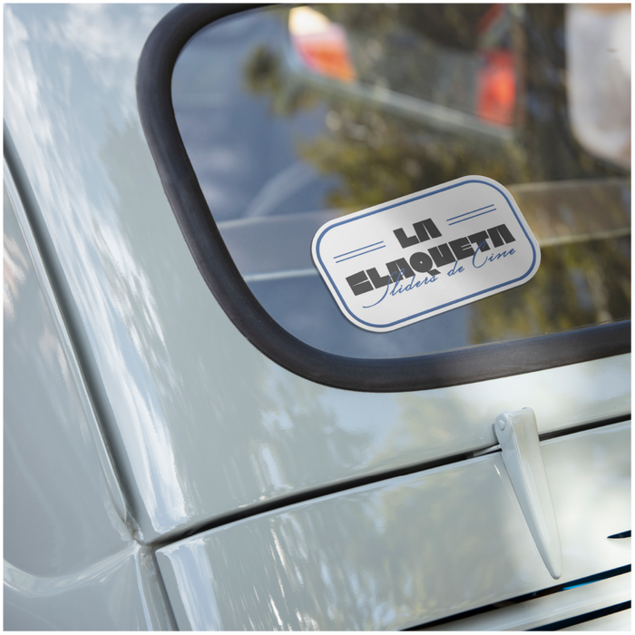
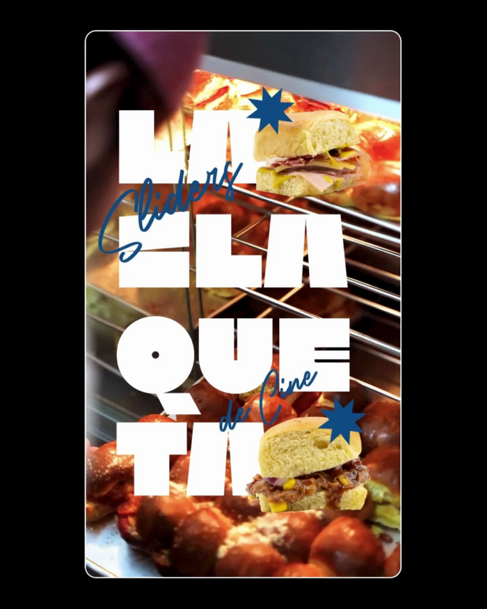
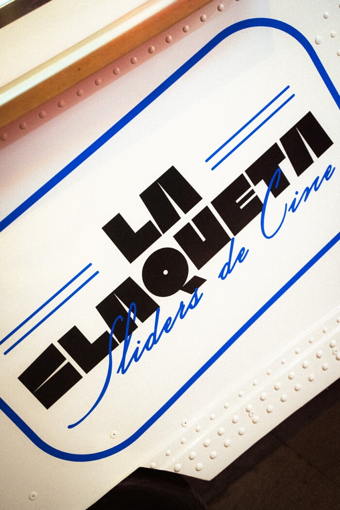
Mel Comunicació designed the visual identity for La Claqueta, a food truck serving delicious sliders in Valencia. The design is built around the “claqueta” (Spanish for clapperboard 🎬), which is used for synchronizing sound and picture on film sets and has become a widely recognized symbol for cinema.
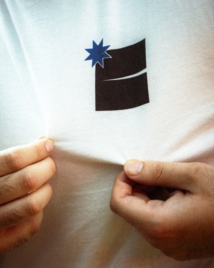
At the centre of this playful identity is the typeface Kiosk by Nguyen Gobber, which features a unique C that visually resembles a clapperboard. This choice not only reinforces the cinematic theme but also cleverly ties the name “La Claqueta” to its cultural significance.
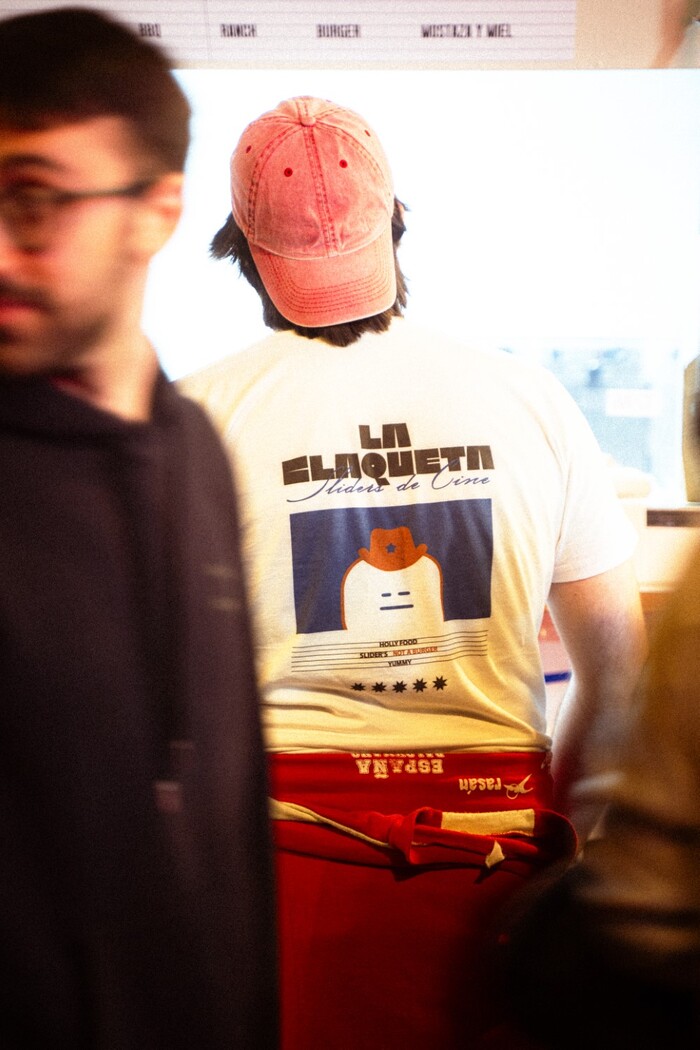
In addition to Kiosk, the identity uses Fallbreeze Script by Maulana Creative to create a dynamic yet cohesive visual language and Hueber by Tim Arnold across different elements of the food truck’s communication, such as their menus and further copy.
Mel Comunicació. License: All Rights Reserved.
Mel Comunicació. License: All Rights Reserved.
Mel Comunicació. License: All Rights Reserved.

Mel Comunicació. License: All Rights Reserved.
Mel Comunicació. License: All Rights Reserved.
Mel Comunicació. License: All Rights Reserved.
Mel Comunicació. License: All Rights Reserved.
Mel Comunicació. License: All Rights Reserved.
This post was originally published at Fonts In Use