Alan Wake 2 video game
https://store.epicgames.com/en-US/p/alan-wake-2. License: All Rights Reserved.

From Wikipedia:
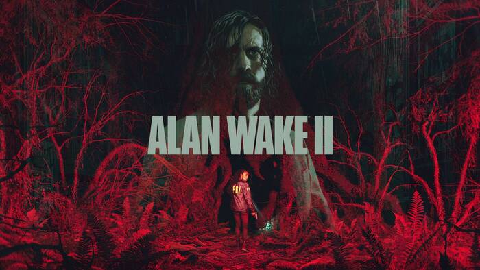
Alan Wake 2 is a 2023 survival horror video game developed by Remedy Entertainment and published by Epic Games Publishing. The sequel to Alan Wake (2010), the story follows best-selling novelist Alan Wake, who has been trapped in an alternate dimension for 13 years, as he attempts to escape by writing a horror story involving an FBI Special Agent named Saga Anderson.
The first thing that stuck out to me is the brand color of Alan Wake 2. It’s a strange washed-out green that is used on all branding, including in-game. It could be a reference to the many dense forests you find yourself in when playing the game, but with how washed out it is, there might be something deeper. Or I could be overthinking it again.
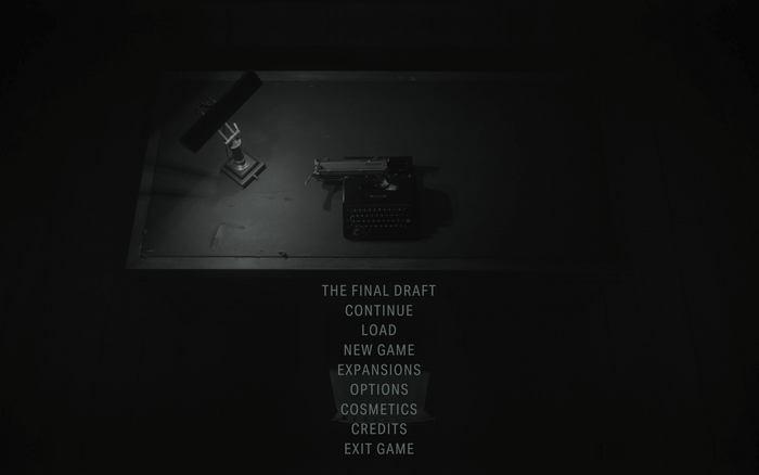
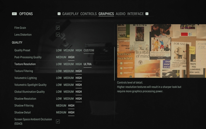
Alan Wake might’ve been gone for 13 years, but he will mostly feel at home when he sees the typography which seems to reuse the first game’s stylings as a basis. The Alan Wake 2 logo is set in Compacta, a condensed bold typeface. Most of the game’s user interface is set in Aktiv Grotesk Condensed Regular, with Bold being used more sparingly. Compacta is reused for the title card in beginning of every chapter.
The official website uses both Aktiv Grotesk and Aktiv Grotesk Extended.
Source: commons.wikimedia.org License: All Rights Reserved.
Game logo
License: All Rights Reserved.
Main menu
License: All Rights Reserved.
Settings menu
License: All Rights Reserved.
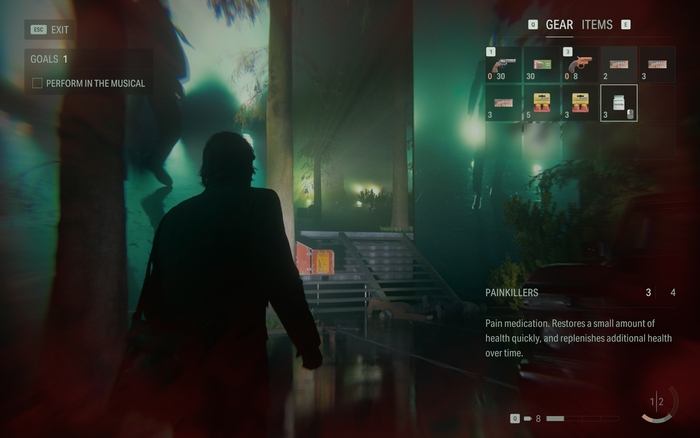
In-game HUD and inventory
License: All Rights Reserved.
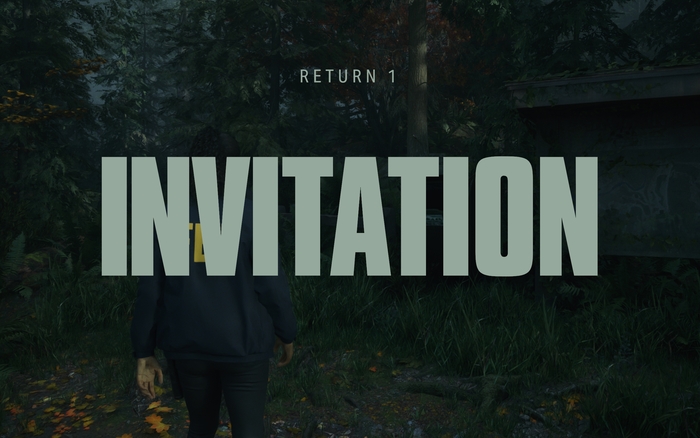
Title card in Saga’s story. Aktiv Grotesk Condensed can be seen with larger spacing between letters
License: All Rights Reserved.
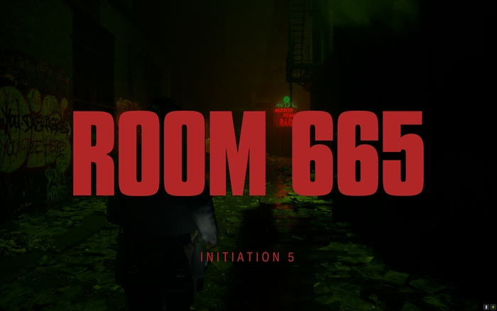
Title card in Wake’s story, this time set in a pinkish red
License: All Rights Reserved.
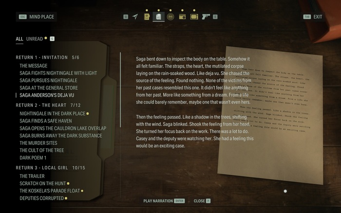
Reading a manuscript page in the Mind Place
License: All Rights Reserved.
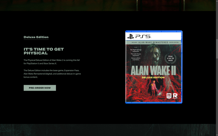
Main page of Alan Wake 2’s website
License: All Rights Reserved.
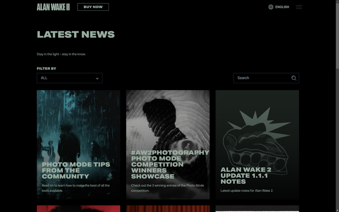
The news section of the website, where updates or community events are announced
This post was originally published at Fonts In Use