Krabbameinsfelagið
Published November 15, 2025
By FontsInUse
Contributed by Jan Maack
Source: www.sendistovan.fo License: All Rights Reserved.

Source: www.sendistovan.fo License: All Rights Reserved.
Source: www.sendistovan.fo License: All Rights Reserved.
Source: www.sendistovan.fo License: All Rights Reserved.
Source: krabbamein.fo License: All Rights Reserved.
Source: krabbamein.fo License: All Rights Reserved.
This post was originally published at Fonts In Use
Source: www.sendistovan.fo License: All Rights Reserved.
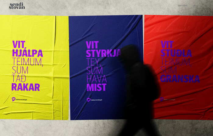
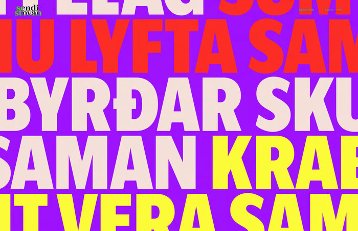
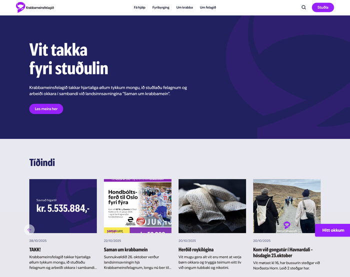
Design agency Sendistovan used IvyEpic in Bold Condensed for headlines and Regular for text for the rebranding of Krabbameinsfelagið, the Faroese Cancer Society (translated):
Krabbameinsfelagið has received a facelift. Simpler and flatter logos, clearer typography, and lighter colors. New name and graphics for the national collection, new website, and new almost everything. Evolution is often better than revolution. Especially within brand design, a brand's design should always keep pace with the times. And now the Cancer Society is new and fresh. But still to blame.
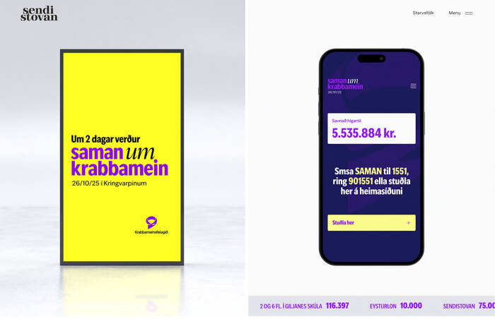
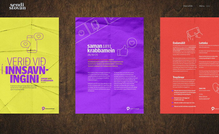
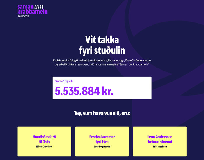
The national fundraising campaign “Saman um krabbamein” (“Together Against Cancer”) was one of the first applications of the updated look.
Source: www.sendistovan.fo License: All Rights Reserved.
Source: www.sendistovan.fo License: All Rights Reserved.
Source: www.sendistovan.fo License: All Rights Reserved.
Source: krabbamein.fo License: All Rights Reserved.
Source: krabbamein.fo License: All Rights Reserved.
This post was originally published at Fonts In Use
Read full story.
WRITTEN BY
FontsInUse
An independent archive of typography.
More from FontsInUse