Kikin branding
Published August 22, 2023
By FontsInUse
Contributed by Mark Butchko
Source: koto.studio Koto. License: All Rights Reserved.


Source: koto.studio Koto. License: All Rights Reserved.

Source: koto.studio Koto. License: All Rights Reserved.

Source: koto.studio Koto. License: All Rights Reserved.
Source: koto.studio Koto. License: All Rights Reserved.

Source: koto.studio Koto. License: All Rights Reserved.
Source: koto.studio Koto. License: All Rights Reserved.

Source: koto.studio Koto. License: All Rights Reserved.

Source: koto.studio Koto. License: All Rights Reserved.
This post was originally published at Fonts In Use
Source: koto.studio Koto. License: All Rights Reserved.
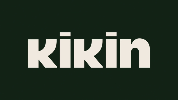
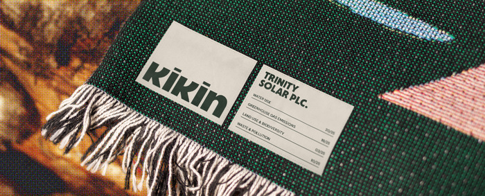
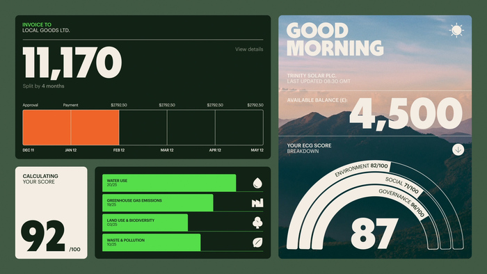
Kikin is a business financier whose goal is to “reward businesses that are good for people and planet”.
Kikin's branding was designed by Koto and makes heavy use of Central Type’s Deacon. It mostly features the Black weight of Deacon, but Bold is also used for smaller sizes. Even the logotype features modified version of Deacon Black with a shortened and flipped k and a squared off and shortened i. Kikin’s website features Graphik as its body type.
Source: koto.studio Koto. License: All Rights Reserved.
Source: koto.studio Koto. License: All Rights Reserved.
Source: koto.studio Koto. License: All Rights Reserved.
Source: koto.studio Koto. License: All Rights Reserved.
Source: koto.studio Koto. License: All Rights Reserved.
Source: koto.studio Koto. License: All Rights Reserved.
Source: koto.studio Koto. License: All Rights Reserved.
Source: koto.studio Koto. License: All Rights Reserved.
This post was originally published at Fonts In Use
Read full story.
WRITTEN BY
FontsInUse
An independent archive of typography.