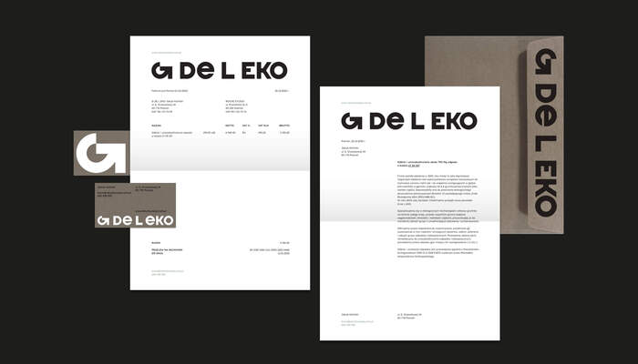
G de L EKO visual identity

Source: www.behance.net License: All Rights Reserved.

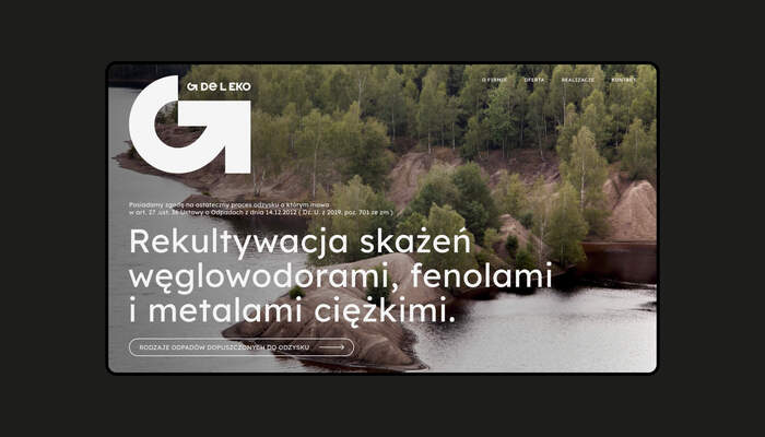
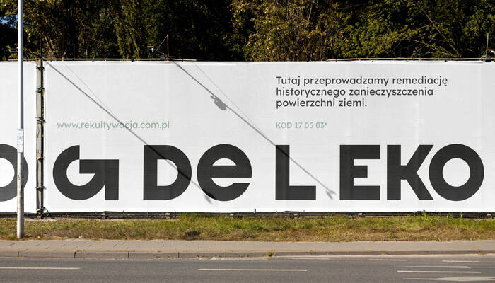
G de L EKO specializes in ecological technologies of land renewal in Poland, especially those contaminated with hydrocarbons, phenols and heavy metals. Their job is to restore the land to the appropriate quality to enable development and urbanization.
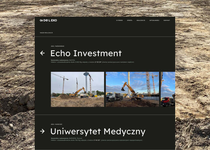
The reclamation service is addressed mainly to larger companies and investors. Our task was to create a new, more adapted design to the client's activity and adapting to new trends - so that the recipient could quickly find the service he needs, which is sometimes complicated due to the specific type of services and terminology used by the company for land reclamation.
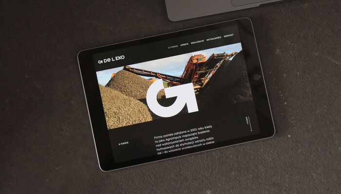
In the project, we focused on emphasizing ecology in the recultivation process. The signet ring is made of the letter G and an arrow, creating a sign associated with the processing of damaged material into usable material. Nevertheless, we also wanted to illustrate the type of activity of the company, i.e. heavy industry. We adjusted the website to the aesthetics of the photos and focused on the transparency of information – it is easy to find here the most important information about the company and waste codes that it can deal with. We used broken black and green and brown referring to the lands and lands closely related to reclamation.
Source: www.behance.net License: All Rights Reserved.
Source: www.behance.net License: All Rights Reserved.
Source: www.behance.net License: All Rights Reserved.
Source: www.behance.net License: All Rights Reserved.
Source: www.behance.net License: All Rights Reserved.
This post was originally published at Fonts In Use