Kem

Source: www.atin.studio Photo: Atin. Atin. License: All Rights Reserved.
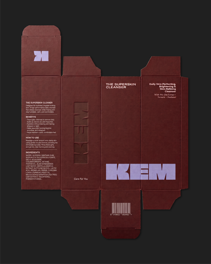
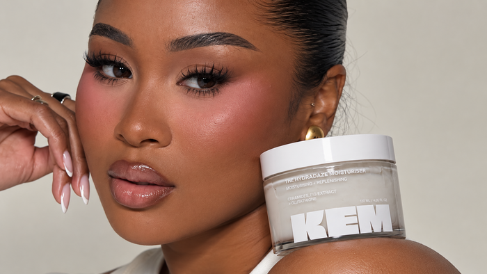
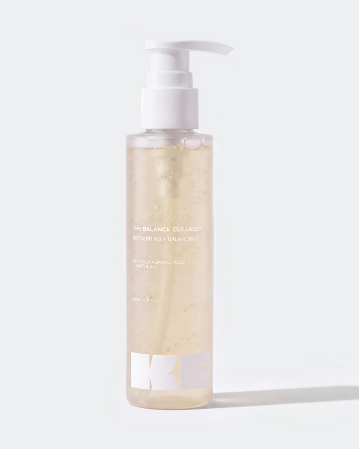
Kem skincare packaging suite engineered by Atin, featuring deep burgundy rigid boxes with typographic architecture set in Obviously Wide Super, Obviously Wide Medium, Nimbus Sans Extended Bold and Adobe Caslon Pro Semibold Italic.

Kem is a London-based biotech personal care brand bridging high-performance clinical science with sensorial beauty routines. Strategic branding agency Atin was commissioned to direct Kem’s complete visual relaunch, developing an end-to-end design system spanning brand identity, structural packaging architecture, digital presence, and comprehensive brand guidelines.
To balance scientific efficacy with tactile luxury, Atin engineered a multi-layered typographic system anchored by contrasting weights of extended grotesques, clinical data sans, and classical editorial accents:
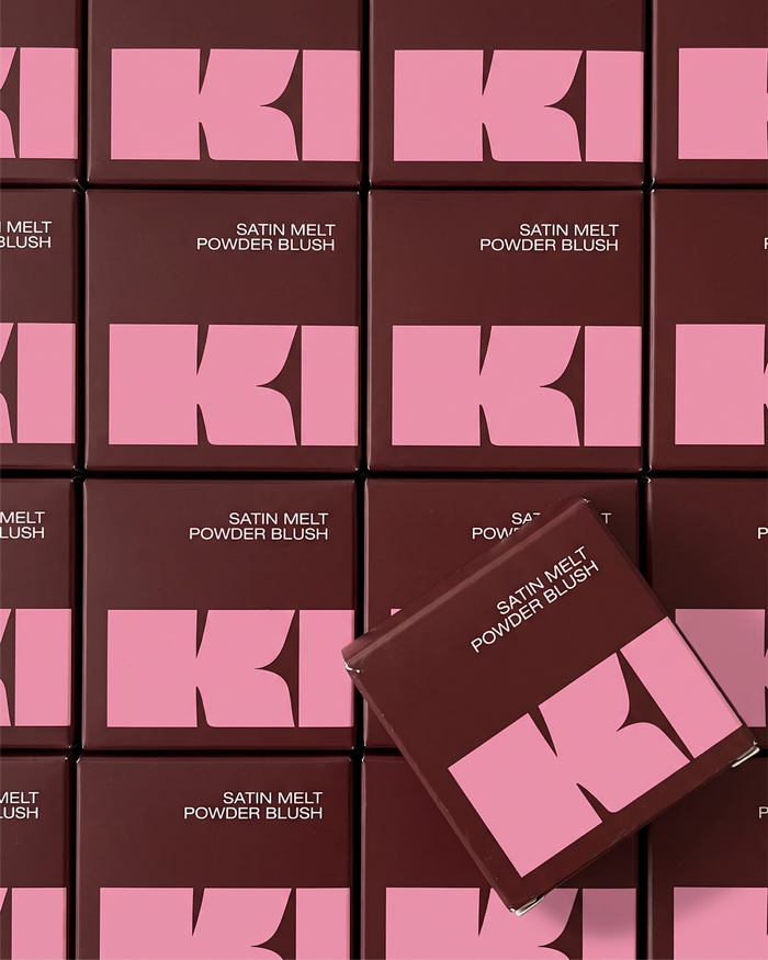
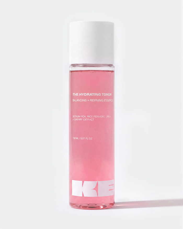
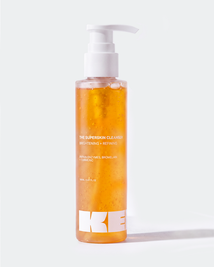
Set in Obviously Wide Super, the primary wordmark commands immediate shelf presence with low-centre-of-gravity, hyper-extended letterforms. The sub-category descriptor for Kem Skin is set in Obviously Wide Black, while Obviously Wide Semibold and Wide Medium drive primary headlines across campaign touchpoints and e-commerce flagships.
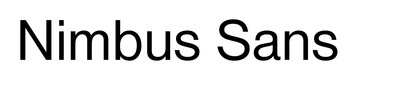
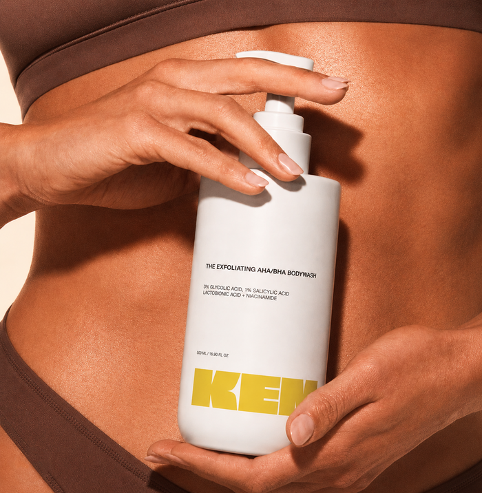
For structural dielines, active ingredient percentages (such as AHA/BHA chemical actives), and formulation tables, Atin deployed Nimbus Sans Extended across Light, Regular, and Bold cuts. Its Swiss modernist proportions ensure clinical legibility on compact cosmetics containers while reinforcing an industrial, laboratory-backed credibility. A custom 12-degree oblique shear was applied to the regular weight for technical subtext emphasis.
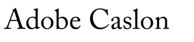
Complementing the architectural weight of the sans serifs, Adobe Caslon (Semibold Italic) is integrated for delicate product romance copy and formulation descriptions, while Biró Script Plus appears across select community-facing touchpoints to inject personal warmth (not shown here).
The packaging architecture pairs deep burgundy tones (“Kem Mousse”) and high-pigment print executions with soft-touch rigid boxes and architectural container silhouettes, engineered for international retail distribution and visual distinction.
Explore the complete brand architecture and packaging system on Atin’s Kem Case Study.
Source: www.atin.studio Photo: Atin. Atin. License: All Rights Reserved.
Source: www.atin.studio Photo: Atin. Atin. License: All Rights Reserved.

Source: www.atin.studio Photo: Atin. Atin. License: All Rights Reserved.

Source: www.atin.studio Photo: Atin. Atin. License: All Rights Reserved.
Kem comprehensive brand identity guidelines and design system architecture by Atin, detailing co-branding frameworks, colour accessibility matrix, and typographic hierarchy set in Obviously Wide for London biotech beauty.

Source: www.atin.studio Photo: Atin. Atin. License: All Rights Reserved.
Source: www.atin.studio Photo: Atin. Atin. License: All Rights Reserved.

Source: www.atin.studio Photo: Atin. Atin. License: All Rights Reserved.
Source: www.atin.studio Photo: Atin. Atin. License: All Rights Reserved.

Source: www.atin.studio Photo: Atin. Atin. License: All Rights Reserved.
Source: www.atin.studio Photo: Atin. Atin. License: All Rights Reserved.
Source: www.atin.studio Photo: Atin. Atin. License: All Rights Reserved.
Source: www.atin.studio Photo: Atin. Atin. License: All Rights Reserved.
This post was originally published at Fonts In Use