Jonathan Grado website
Source: jonathangrado.com License: All Rights Reserved.


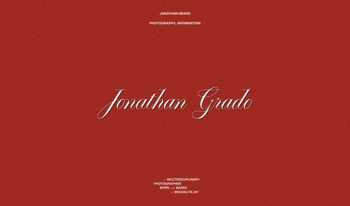
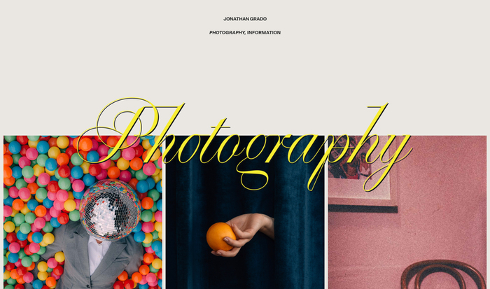
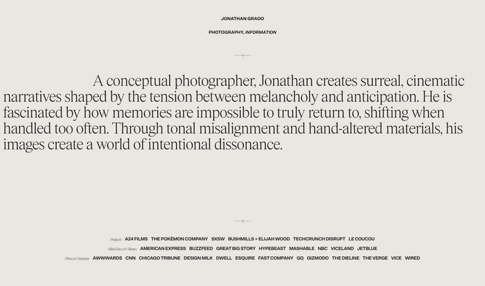
Schick Toikka’s Scto Grotesk A in bold is used for all links and lists, with their Items typeface in light and light italic used for headings and body text. Pangram Pangram’s Playground is used as page titles that show on load and slowly fade out. Photography series use a mix of fonts to show the title of the works.
About the project, from developer Maël Ruffini:
The Jonathan Grado website brings to life the creative journey of photographer and artist Jonathan Grado, the third-generation leader of Brooklyn's renowned Grado Labs. Born and raised in Brooklyn, Jonathan has blended his family's legacy in audio innovation with his passion for multidisciplinary photography. The site features cinematic design that mirrors Jonathan's artistic vision, showcasing his work with brands like Pokémon and A24 Films.
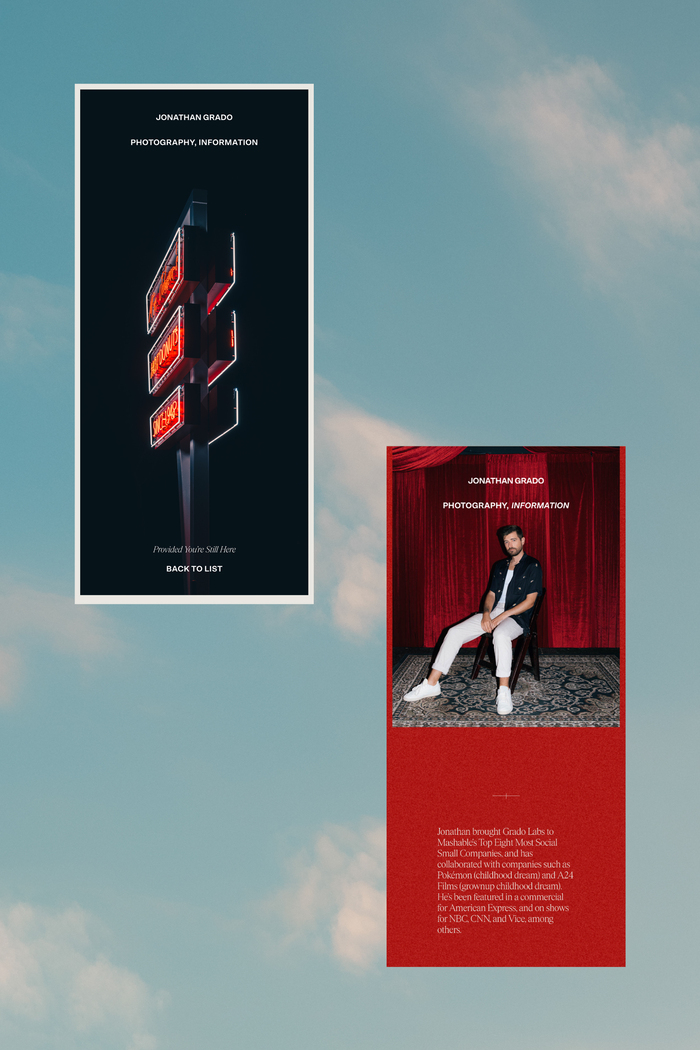
Designed for flexibility, the website uses a modular layout. Smooth transitions immersive visuals guide users through Jonathan's portfolio, highlighting his attention to detail and creative storytelling.
We also integrated subtle text animations and gentle transitions throughout the site. These micro-interactions help guide visitors through the content without distracting from the images or the narrative.
The primary goal was to create a platform that would showcase Jonathan’s work as a photography portfolio, giving prominence to his images and narrative while allowing his work to speak for itself.
Principle design was done by Gaétan Pautler of Concrete Club.
Source: jonathangrado.com Photo: Jonathan Grado. License: All Rights Reserved.
Source: jonathangrado.com Photo: Jonathan Grado. License: All Rights Reserved.

Source: jonathangrado.com Photo: Jonathan Grado. License: All Rights Reserved.

Source: jonathangrado.com Photo: Jonathan Grado. License: All Rights Reserved.
Source: jonathangrado.com License: All Rights Reserved.
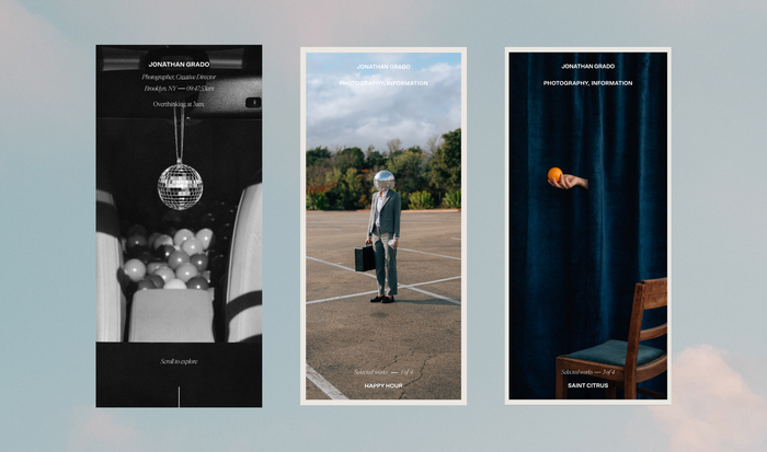
Source: jonathangrado.com Photo: Jonathan Grado. License: All Rights Reserved.
This post was originally published at Fonts In Use