Jarrolds
Source: theclickdesign.com License: All Rights Reserved.


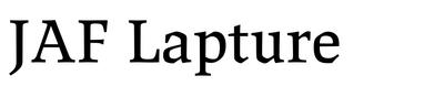
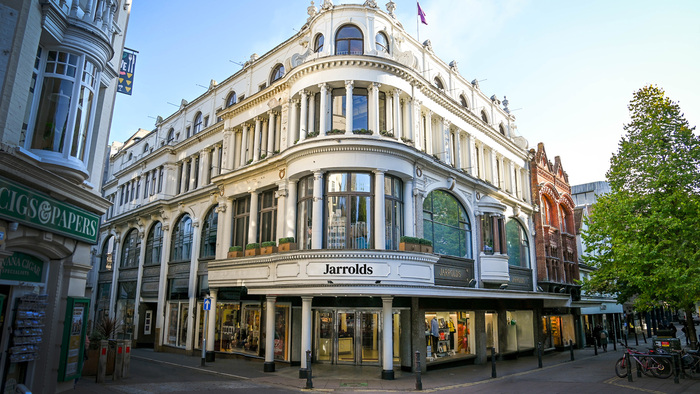
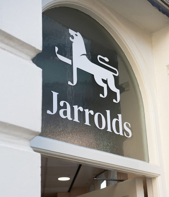
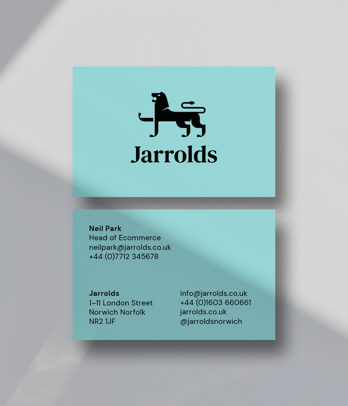
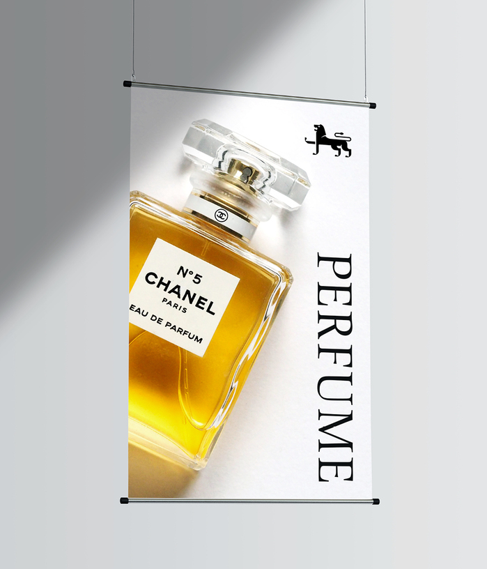
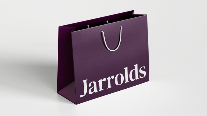
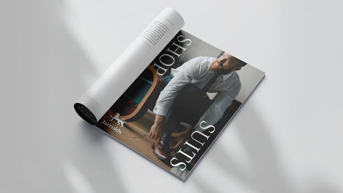
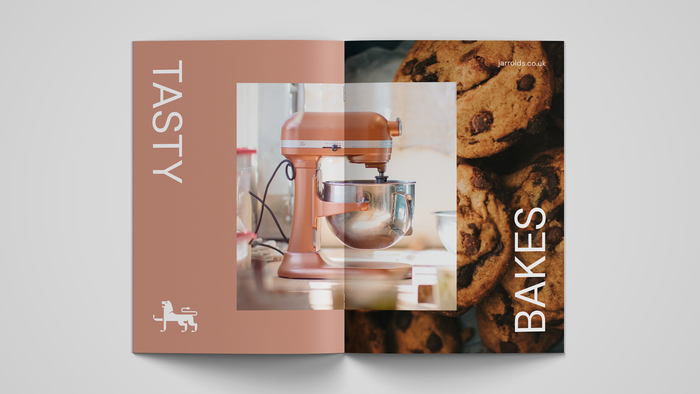
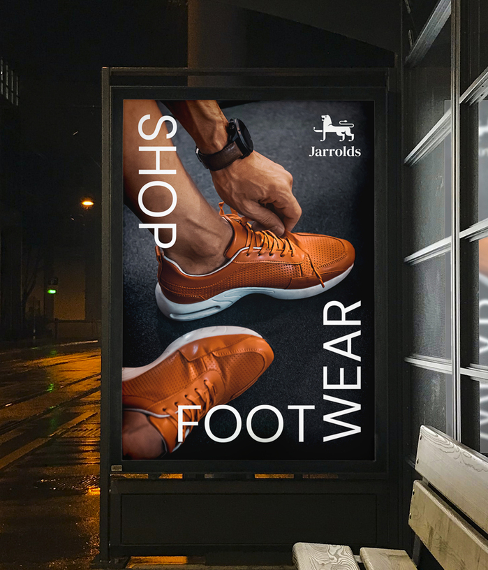
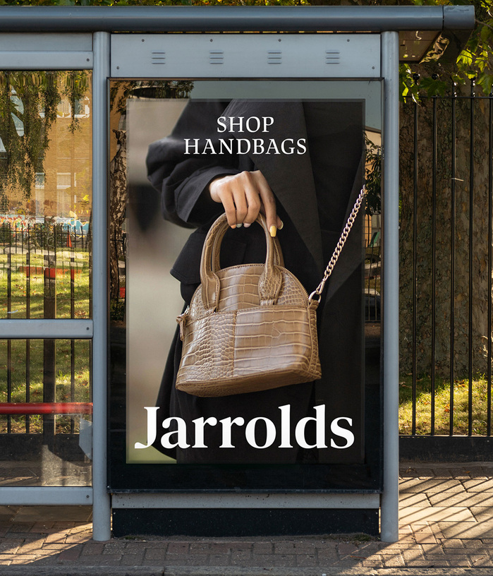
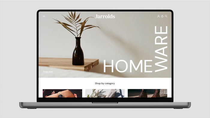
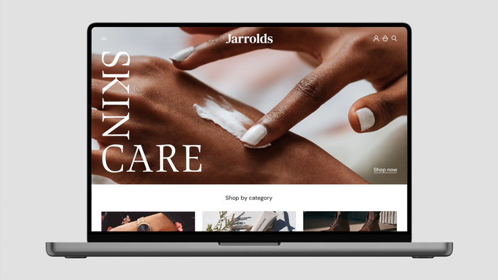
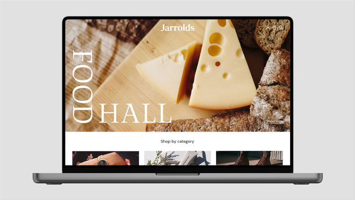
Jarrolds in Norwich is a family-operated department store with a history spanning over 250 years. In 2023, design studio Click refreshed the identity design of the department store. The logotype features DM Serif Text with a custom-drawn J, while other textual components incorporate JAF Lapture and DM Sans:
We’ve introduced two brand typefaces – Lapture is a traditional, luxury and characterful serif and DM Sans provides a neutral, modern and timeless aesthetic. These two typefaces can work in harmony just as well as they can work in isolation from one another. Importantly, they allow for greater brand stretch and the ability to reflect a huge range of products and experiences for all ages, tastes and interests. A mixture of vertical and horizontal axes are used for headline type alignment, a playful element derived from the sideways ‘J’ within the logomark (lion’s right raised leg).
More information on the rebranding can be found on the designers’ website.
Source: theclickdesign.com License: All Rights Reserved.
Source: theclickdesign.com License: All Rights Reserved.
Source: theclickdesign.com License: All Rights Reserved.
Source: theclickdesign.com License: All Rights Reserved.
Source: theclickdesign.com License: All Rights Reserved.
Source: theclickdesign.com License: All Rights Reserved.
Source: theclickdesign.com License: All Rights Reserved.
Source: theclickdesign.com License: All Rights Reserved.
Source: theclickdesign.com License: All Rights Reserved.
Source: theclickdesign.com License: All Rights Reserved.
Source: theclickdesign.com License: All Rights Reserved.
This post was originally published at Fonts In Use