Edizioni Accademia novels (1970s)
Source: www.abebooks.com Tomi di Carta di Michele Bonelli. License: All Rights Reserved.
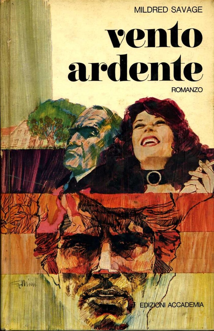
Vento ardente by Mildred Savage, 1973; originally published in English as Parrish in 1958 and translated to the Italian by Ninì Borazzi


In the 1970s, Milan-based publisher Edizioni Accademia used Carousel in the series design of their romanzi, or novels.
Carousel was designed in 1966 by the Letraset studio staff headed by Gary Gillot. It’s distinguished from traditionals Fat Faces by the round e and the single-story g, which make it look a little like an upright cursive. Here it can be seen exclusively in lowercase letters, supported by changing sans serifs used in all caps.

Source: www.abebooks.com Tomi di Carta di Michele Bonelli. License: All Rights Reserved.
La valle del sole by Meyer Levin, 1976; originally published in English as The Settlers in 1972
Source: libriscontati.net License: All Rights Reserved.
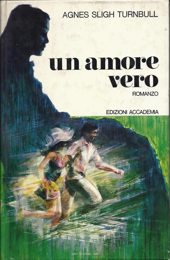
Un amore vero by Agnes Sligh Turnbull, 1972; originally published in English as The Golden Journey in 1955 and translated to the Italian by Velia Mirri

Source: www.libreriapeterpan.it License: All Rights Reserved.
L’impero degli Stanfield by Richard M. Stern, 1975; originally published in English as Stanfield Harvest in 1972 and translated to the Italian by Clara Cavallazzi. The author’s name seems to be in Folio Light with the alternate R.

Source: www.libreriapeterpan.it License: All Rights Reserved.
Un uomo come uragano by Heinz G. Konsalik, 1974; originally published in German as Ein Mann wie ein Erdbeben in 1972. The author’s name appears to be in Forma.
Source: libreriaitinerante.com Libreria Itinerante. License: All Rights Reserved.
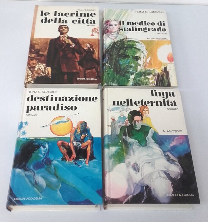
Le lacrime della città, Il medico di Stalingrado, Destinazione paradiso, Fuga nell’eterntà
This post was originally published at Fonts In Use