Jahres-Ausstellung 1902 at Münchener Glaspalast catalog
Source: www.zvab.com Antiquariat Steffen Völkel. License: All Rights Reserved.
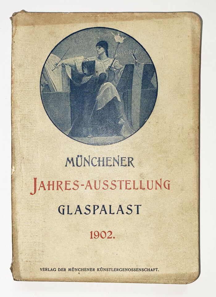
Front cover with an allegory of Historia and a title in Moderne Versalien


Etienne (Schelter & Giesecke) (Sample unavailable)


In 1854, three years after London’s Crystal Palace was completed, Munich proudly opened its own Glaspalast, or Glass Palace. Located in the Old Botanical Garden, it hosted dozens of major art exhibitions until its destruction in a fire in 1931 – a fate that the London model would share a few years later.
Shown here is the cover of the catalog to the annual exhibition of 1902 – and a selection of pages with adverts.
Source: archive.org License: All Rights Reserved.
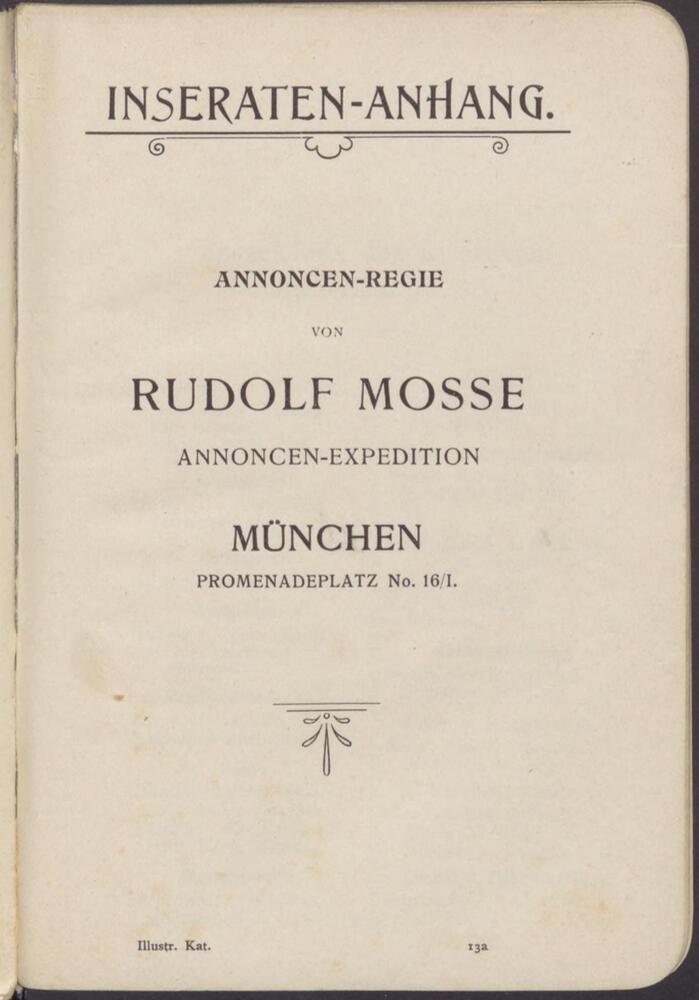
Section page for the appendix with adverts – which were handled by Rudolf Mosse. Römische Antiqua is paired with Angelus-Mediäval. The small type at the bottom is Mediäval-Egyptienne or similar.
License: All Rights Reserved.
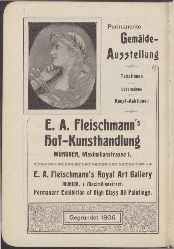
Greif is a condensed companion to Ludwig & Mayer’s Aurora. It’s here used with various alternates, see for example the two forms for g, s, H and M. In this ad for E.A. Fleischmann’s Hof-Kunsthandlung it’s used together with Breite magere Grotesk.
Source: archive.org License: All Rights Reserved.
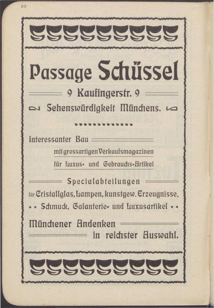
The ad by Passage Schüssel features Eckmann, a typeface that was ubiquitous in German commercial printing in the first decade of the 20th century. It can here be seen with some of the accompanying Schmuck, or ornaments.
License: All Rights Reserved.
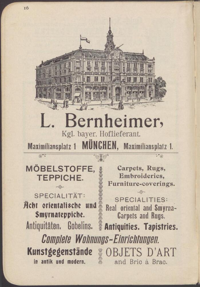
The ad for L. Bernheimer, purveyor to the Royal Bavarian court, mixes several of the aforementioned typefaces, plus Etienne schmal, Schelter & Giesecke’s Etienne, Breite magere Grotesk, a condensed sans (possibly Schelter & Giesecke’s Schmale Steinschrift which originated at Figgins), one of the many German copies of Bradley, and a couple more.
License: All Rights Reserved.
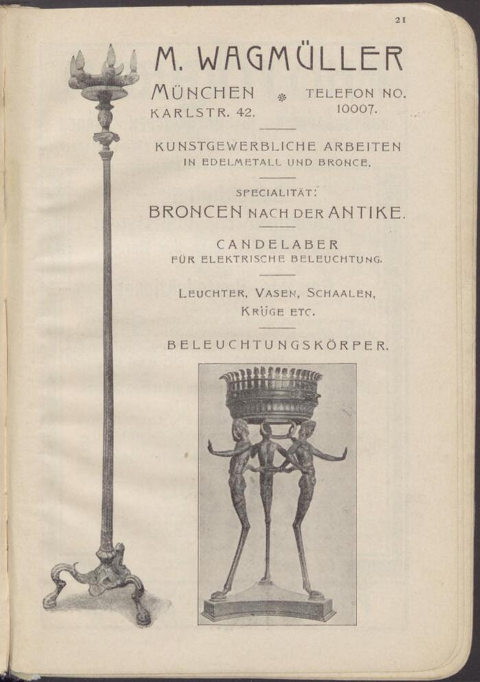
Art dealer M. Wagmüller specified Isis for the name and Römisch for everything else.
Source: archive.org License: All Rights Reserved.
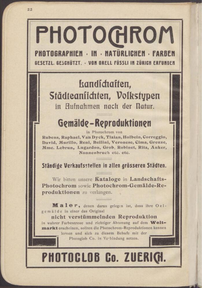
More Eckmann (here with long s (ſ)), Angelus-Mediäval, and Greif, the latter used alongside the wider Aurora – for “Photochrom”, with a CH ligature. “Maler” is in Holsatia.
Source: archive.org License: All Rights Reserved.
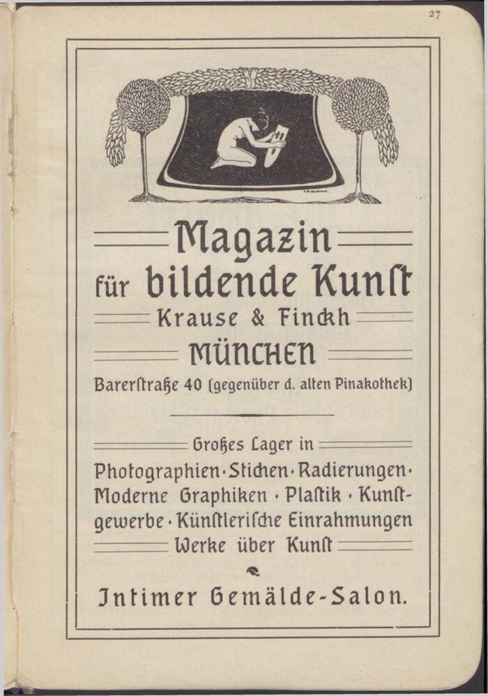
Krause & Finckh promoted their Magazin für bildende Kunst with Georg Schiller’s Neudeutsch.
Source: archive.org License: All Rights Reserved.
Back cover with more Römische Antiqua
This post was originally published at Fonts In Use