Superior Typesetting Co. ad (Inland Printer reprint)

The Inland Printer, published in Chicago, was perhaps the best record of early 20th-century American graphic design. “Specimens” was a regular feature in which printers submitted their best work with the hope to be selected and critiqued by J. L. Frazier, editor of the journal. Alexander S. Lawson remembered it this way:
During his 47-year tenure in assembling “Specimen Review,” J. L. praised his contributors most of the time, but he could be caustic on occasion, blasting shoddy work without hesitation. He was particularly annoyed by stunt typography, coining the term “cockroach typography” to describe some of the excesses in style and legibility which came to his attentive mind.
It was rare, however, that J.L. simply panned a piece of typography out of hand. In almost every instance, he attempted to criticize constructively and with painstaking detail. He had all of the attributes of a first-rate teacher—always seeking to instruct and improve, and of course, to share his love for the world of print with anyone who would listen.
Month after month, Frazier was the recipient of printed material from every part of the United States and from many foreign countries. He carefully selected a number for reproduction. In addition, he commented editorially on 30 to 40 items, discussing them in detail.
In this October 1917 edition, Frazier selected the work of Oscar F. Jackson based in Lansing, Michigan. “Your work is clever.” he said. “The specimens set in the new Publicity Gothic are particularly effective.”
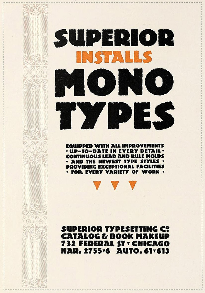
Jackson’s ad for Superior Typesetting Co. is reproduced above, likely in different colors than its original. At first I thought Jackson did some clever custom cut for the overlapping “ST” in “Installs”, but it turns out that ligature was included in Barnhart Bros. & Spindler’s font.
Source: www.flickr.com Scan by Stephen Coles. License: All Rights Reserved.
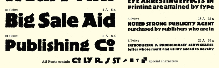
Detail from the Publicity Gothic specimen in Barnhart Bros. & Spindler’s Catalog 23.
Released in 1917 (the same year as this use), Publicity Gothic is one of the first typefaces to emulate the bold, rough-edged “poster” or “block” lettering style sparked by Germany’s Plakatstil movement. It beat the heaviest weight of Berthold’s Block by three years.
This post was originally published at Fonts In Use