Hot Jazz by Hugues Panassié, M. Witmark & Sons
Source: www.baumanrarebooks.com License: All Rights Reserved.


English Caslon Oldstyle (Sample unavailable)

Bryson contributed a post about the first British edition of Hot Jazz, which has a book jacket that exclusively features typefaces by Rudolf Koch. I thought I’ll add the first U.S. edition by M. Witmark & Sons, too.
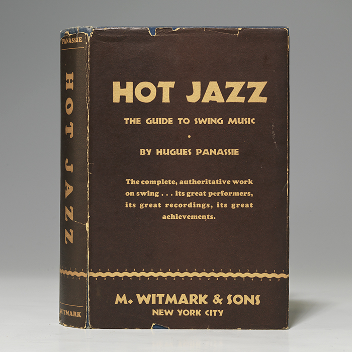
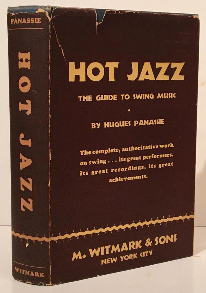
The American dust jacket features another typeface design by Koch. This time it’s Neuland (1923), a coarse all-caps design for which Koch manually cut the punches, resulting in small (and not so small) differences across the ten sizes.
Thanks to Edvinas Žukauskas and Jérôme Knebusch who digitized all individual sizes for their Koch-Grotesk revival (2023), it’s easy to determine the sizes the uncredited jacket designer employed. The main title and the publisher’s name use the 20pt (“Text”) size, and the subtitle, the author’s name and the location are derived from the 12pt “Cicero” size. The two lines in the 20pt design are shown in different sizes – that’s because they were scaled photographically. Identifying the sizes also tells us that the fonts used are the original ones imported from Klingspor: the domestic copy by Baltotype was cut pantographically based on the 28pt design, and thus is identical from one size to another.
The other typeface used for the synopsis and the spine is equally bold, but has nothing to do with Koch whatsoever. It’s Cooper Black.
Source: www.abebooks.com Carpe Diem Fine Books. License: All Rights Reserved.
Front and spine of the book jacket
Source: www.abebooks.com Cross-Country Booksellers. License: All Rights Reserved.
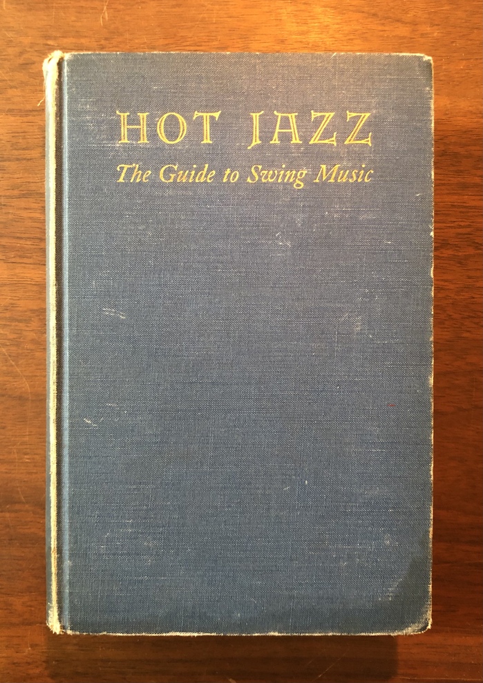
The book cover combines Lichte Erbar-Versalien a.k.a. Monastic with an italic Caslon – possibly English Caslon Oldstyle.
Source: archive.org Internet Archive. License: All Rights Reserved.
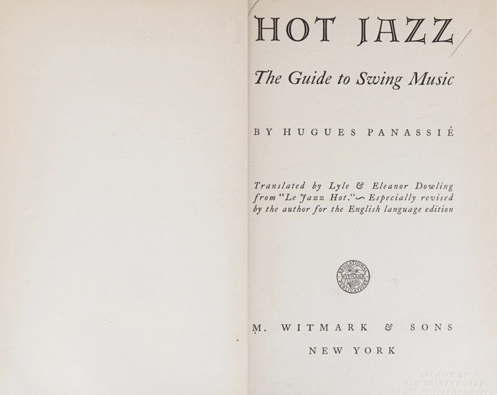
The title page repeats the cover typography and adds text in another Caslon, in italics and roman caps.
Source: archive.org Internet Archive. License: All Rights Reserved.
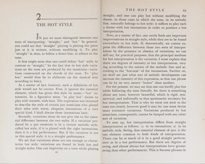
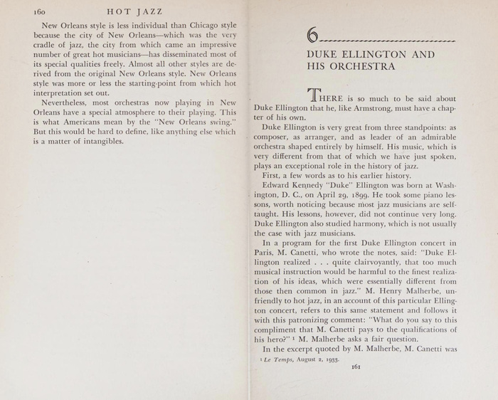
While the chapter numbers use numerals from the aforementioned Lichte Erbar-Versalien, the initials are from another open face: it’s Caslon Openface.
Source: archive.org Internet Archive. License: All Rights Reserved.
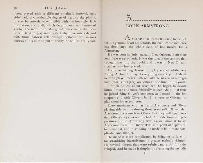
Body text isn’t composed in Caslon, but in a Baskerville – namely the Linotype version.
Source: archive.org Internet Archive. License: All Rights Reserved.
This post was originally published at Fonts In Use