Also sprach Zarathustra by Friedrich Nietzsche, Insel Verlag
Source: archive.org Getty Research Institute. License: All Rights Reserved.

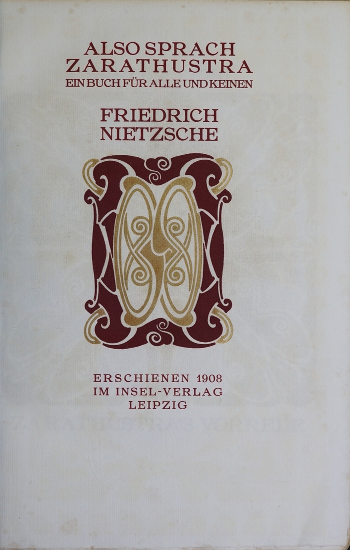
I came across the title page of an edition of Nietzsche’s Also sprach Zarathustra. I stared at it for a few moments and, along with the undeniable Art Nouveau tone, what caught my eye was the typeface used, which I already knew, but couldn’t remember the name of, but which was all too obvious: Zarathustra, drawn by Georges Lemmen.
I then discovered that the typeface was in fact named after the book project for which it was commissioned.
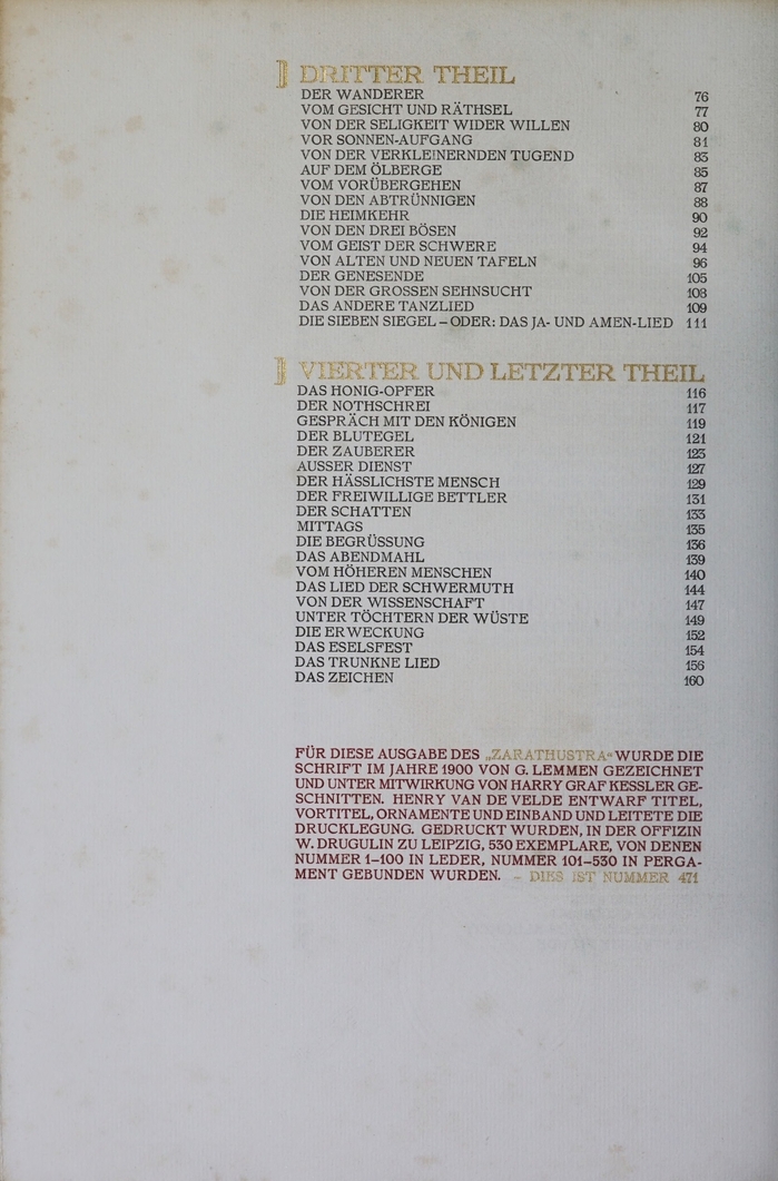
In the copy I found digitized, there is the following colophon on the summary page at the end of the book (see image no. 6; translated from the German):
The typeface for this edition of “Zarathustra” was drawn by G. Lemmen in 1900 and cut with the help of Harry Graf Kessler. Henry van de Velde designed the title, pre-title, ornaments and binding and supervised the printing. 530 copies were printed in the Offizin W. Drugulin in leipzig, of which numbers 1–100 were bound in leather and numbers 101–530 in vellum. — This is number 471
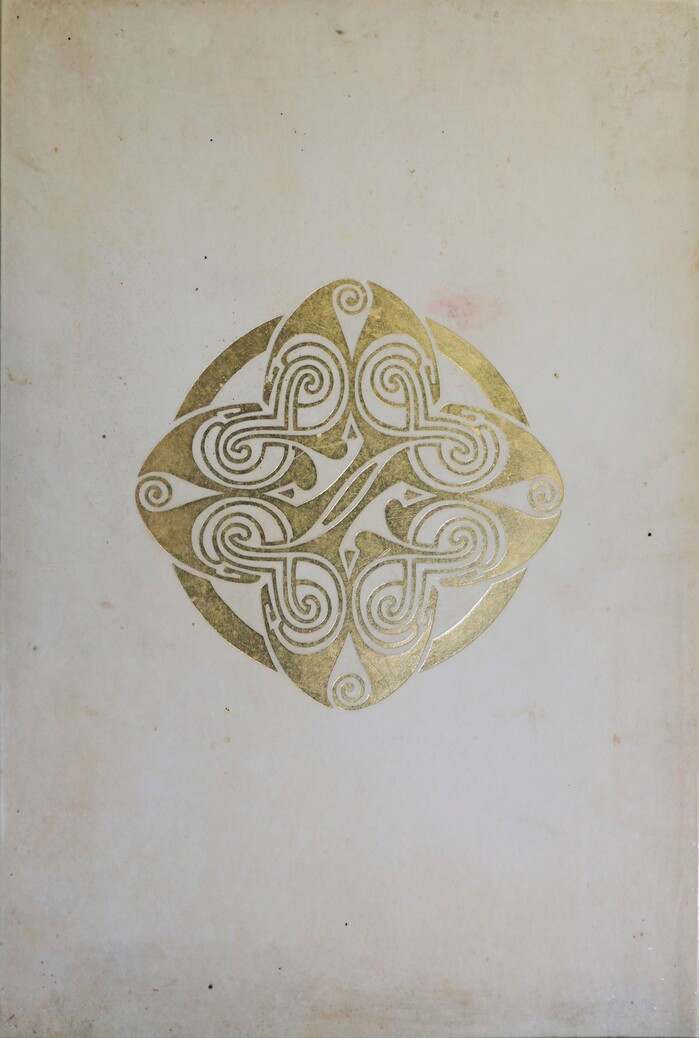
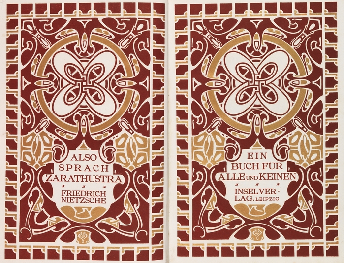
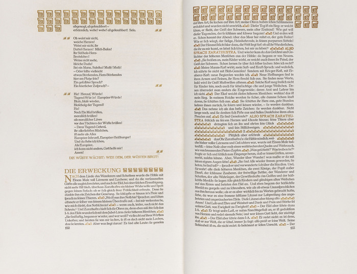
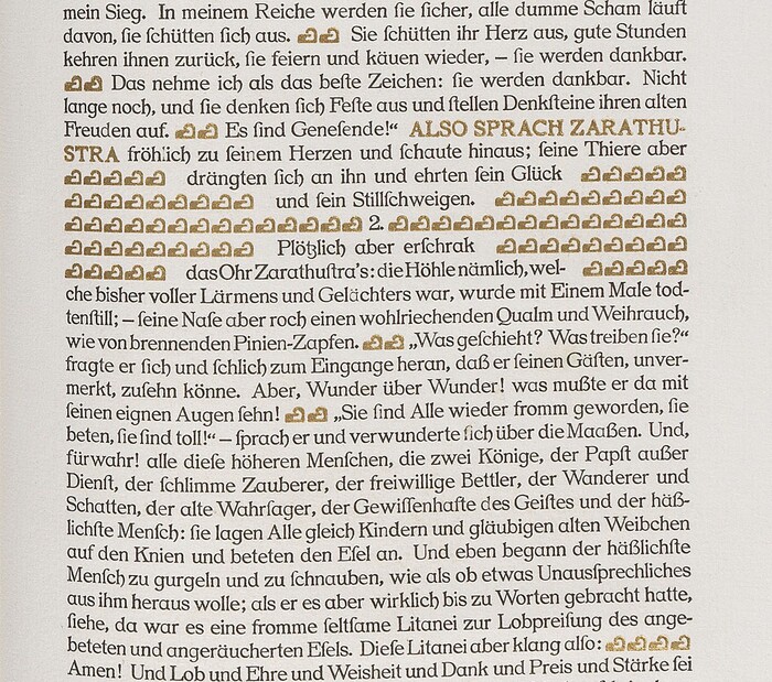
It’s not explicitly written, but it’s quite likely that Van der Velde was also responsible for the design of the book’s interior, since he designed the title page. Moreover, we must admit that only a painter, a designer with a taste for ornament, would have decided to highlight the internal chapters in this way (see image no. 4).
The page has a format close to that of the golden ratio; the text box, however, looks like an architectural column: narrow and with capitals at the top, notably a mark of the artist’s architectural conception and which contributes, with the golden ornaments, to an expression of the work’s vernacular tone. If the rigorous master Tschichold were to leaf through the book, he would say there were numerous typographical errors. But I think it’s a case of typography, not taking a back seat, but becoming more flexible in favor of the idea of “total art” in the object. Just as a chair can be both expression and function.
Here's a short article about the artist, from britannica.com:
Henry van de Velde (born April 3, 1863, Antwerp, Belg.—died Oct. 25, 1957, Zürich, Switz.) was a Belgian architect and teacher who ranks with his compatriot Victor Horta as an originator of the Art Nouveau style, characterized by long sinuous lines derived from naturalistic forms. By designing furniture and interiors for the Paris art galleries of Samuel Bing in 1896, van de Velde was responsible for bringing the Art Nouveau style to Paris. Van de Velde’s most vital contributions to modern design were made as a teacher in Germany, where his name became known through the exhibition of furnished interiors at Dresden in 1897. In 1902 he went to Weimar as artistic adviser to the grand duke of Saxe-Weimar. There, influenced by the philosophy of William Morris and the Arts and Crafts Movement, he reorganized the Kunstgewerbeschule (Arts-and-Crafts School) and the academy of fine art and thus laid the foundations for Walter Gropius’ amalgamation of the two bodies into the Bauhaus in 1919. Like the progressive German designers at the time, van de Velde was connected with the Deutscher Werkbund, and he designed the theatre for the Werkbund Exposition in Cologne in 1914. Despite official appointments in Belgium, van de Velde after 1918 made no further contributions to architecture or design. A valuable extract from his Memoirs (1891–1901) was published in the Architectural Review, 112:143–148 (September 1952).
Source: archive.org Getty Research Institute. License: All Rights Reserved.
Source: www.kettererkunst.de Ketterer. License: All Rights Reserved.
Source: www.kettererkunst.de Ketterer. License: All Rights Reserved.
Source: www.kettererkunst.de Ketterer. License: All Rights Reserved.
Source: archive.org Getty Research Institute. License: All Rights Reserved.
This post was originally published at Fonts In Use