Verde e Bianco Pazzo
Published July 10, 2024
By FontsInUse
Contributed by Oudin Romain
Source: www.instagram.com License: All Rights Reserved.


Source: www.instagram.com License: All Rights Reserved.
Source: www.instagram.com License: All Rights Reserved.
Source: www.instagram.com License: All Rights Reserved.
Source: www.instagram.com License: All Rights Reserved.

Source: www.instagram.com License: All Rights Reserved.
Source: www.instagram.com License: All Rights Reserved.
Source: www.instagram.com License: All Rights Reserved.
Source: www.instagram.com License: All Rights Reserved.
Source: www.instagram.com License: All Rights Reserved.
This post was originally published at Fonts In Use
Source: www.instagram.com License: All Rights Reserved.
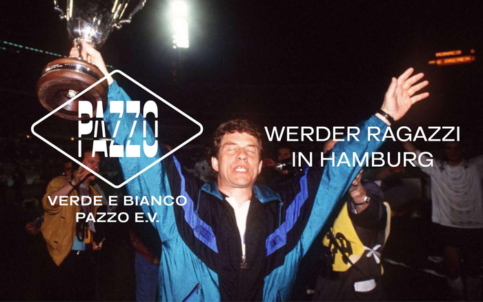
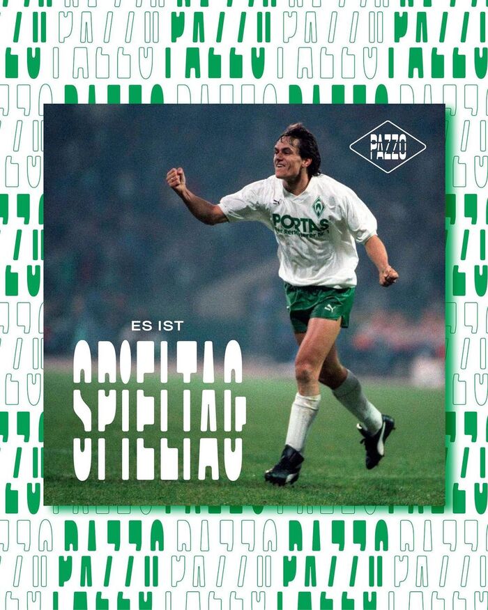
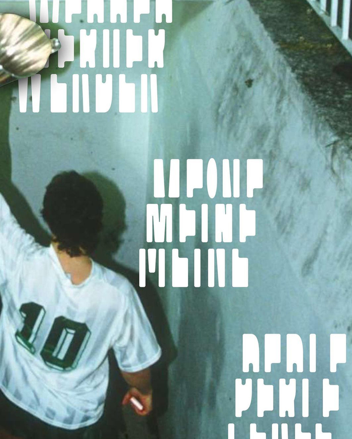
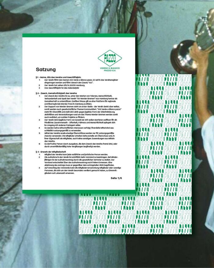
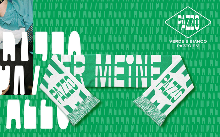
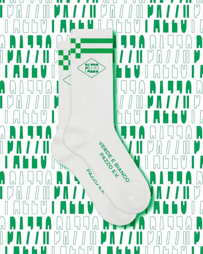
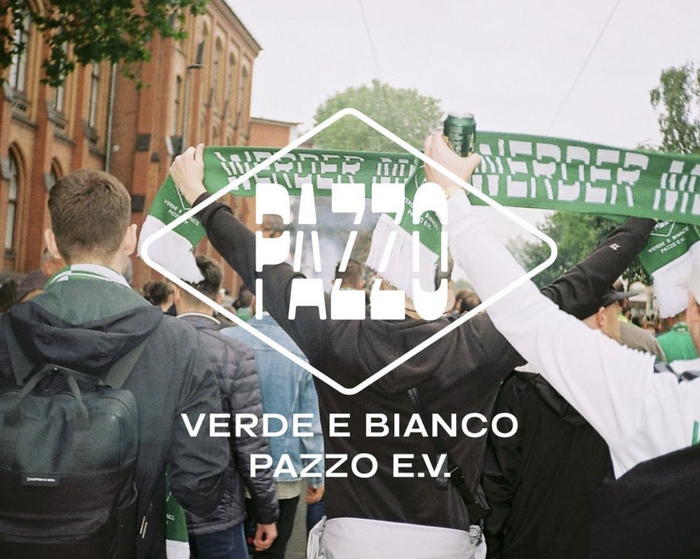
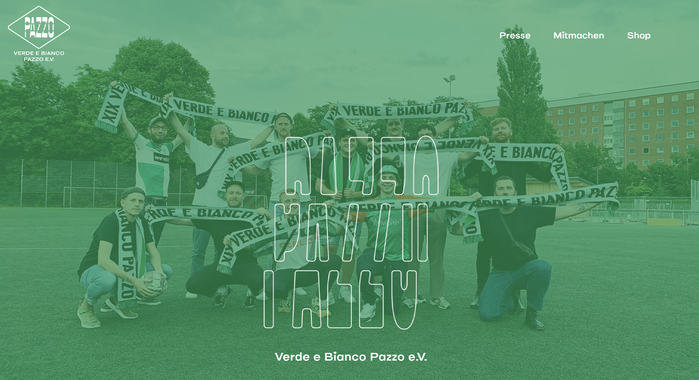
Henry Monse (from studio Karl Anders) created here a cool visual identity and art direction based on a pair of fonts – Vroum Gti (from lift-type) and Elastik (from Benoit Bodhuin) – for Verde E Bianco Pazzo, the biggest Werder Bremen Fanclub in Hamburg. Both Vroum Gti’s upright and “Decalic” styles are used. The latter is an italic where every next segment of a character – bottom, middle and top part – is shifte a bit more to the right, creating a slanted effect.
Source: www.instagram.com License: All Rights Reserved.
Source: www.instagram.com License: All Rights Reserved.
Source: www.instagram.com License: All Rights Reserved.
Source: www.instagram.com License: All Rights Reserved.
Source: www.instagram.com License: All Rights Reserved.
Source: www.instagram.com License: All Rights Reserved.
Source: www.instagram.com License: All Rights Reserved.
Source: www.instagram.com License: All Rights Reserved.
Source: www.instagram.com License: All Rights Reserved.
This post was originally published at Fonts In Use
Read full story.
WRITTEN BY
FontsInUse
An independent archive of typography.