Kontrowersy #1
Published July 9, 2024
By FontsInUse
Contributed by Threedotstype
License: All Rights Reserved.


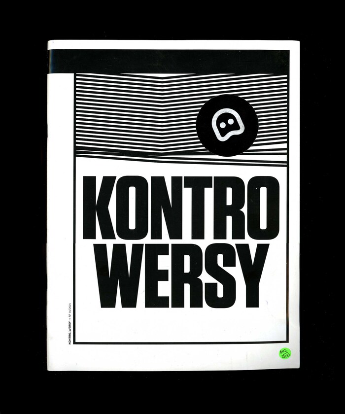
Photo: Threedotstype. License: All Rights Reserved.
Photo: Threedotstype. License: All Rights Reserved.
Photo: Threedotstype. License: All Rights Reserved.
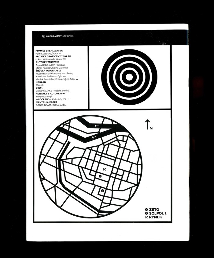
Photo: Threedotstype. License: All Rights Reserved.
This post was originally published at Fonts In Use
License: All Rights Reserved.
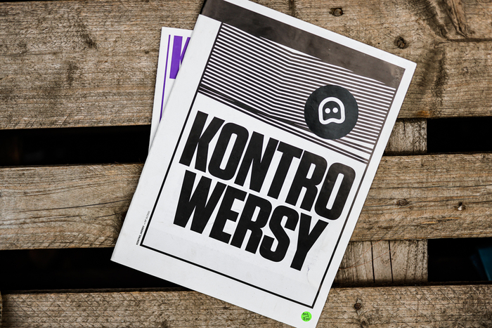
First edition of Kontrowersy magazine about architecture, urban activism and city nostalgia. The layout was developed and designed by Łukasz Walawender. Set in Di grotesk and Janus from Threedotstype. The magazine logo is set in Tungsten from Hoefler & Co. Self-published, printed in a limited edition of 200 numbered copies.
Photo: Threedotstype. License: All Rights Reserved.
Photo: Threedotstype. License: All Rights Reserved.
Photo: Threedotstype. License: All Rights Reserved.
Photo: Threedotstype. License: All Rights Reserved.
This post was originally published at Fonts In Use
Read full story.
WRITTEN BY
FontsInUse
An independent archive of typography.
More from FontsInUse