Harinas La Encarnación
Source: rubioydelamo.com Rubio y Del Amo. License: All Rights Reserved.


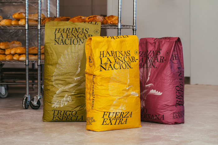
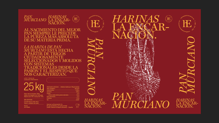
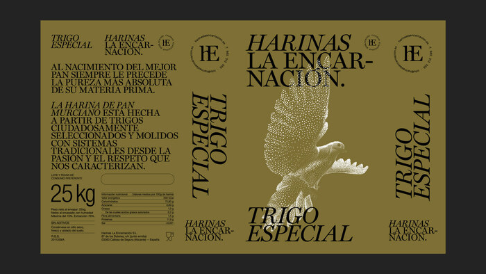
Murcia-based studio Rubio & del Amo designed the visual identity and packaging for Harinas La Encarnación, a Spanish flour producer known for its artisanal quality product. Using Miller Display from Carter & Cone, the design captures a level of elegance rarely seen in such a humble category. The design also includes Helvetica in use on the back for some content and nutritional details.
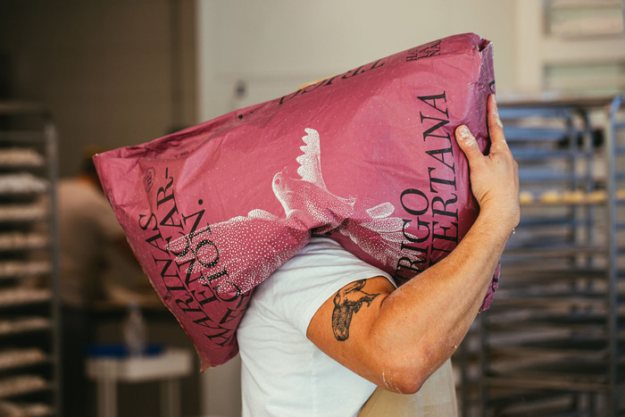
Large, confident typography dominates each bag, paired with a pointillist illustration of a soaring bird—a symbol of tradition and care from the area it is produced. The restrained palette of earthy tones and matte finishes conveys both craft and sophistication.
It’s a perfect marriage of form and function: striking enough to stand tall in a bakery, but completely grounded in typographic precision. Easily among the most beautifully designed flour packages ever produced.
See the entire project on Rubio & del Amo’s site.
Hat tip to Brand New.
Source: rubioydelamo.com Rubio y Del Amo. License: All Rights Reserved.
Source: rubioydelamo.com Rubio y Del Amo. License: All Rights Reserved.
Source: rubioydelamo.com Rubio y Del Amo. License: All Rights Reserved.
This post was originally published at Fonts In Use