Capitu Maciel

Fernanda Oneda / Latina Agência. License: All Rights Reserved.


Our creative process took us down deep paths: research, reading, connection with nature and with those who came before us. Nothing was by chance. Everything sprouted from a place of memory – which for us is the guiding thread of everything.
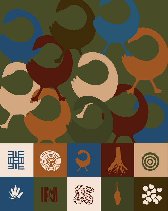
The visual identity of Capitu Maciel is not just an image – it's spirit. It’s a mirror of who she is and a compass for who she wants to be. A past, present and future.
The chosen font was Nd Tupã Nova, a typeface created by a Brazilian designer, Diego Maldonado.
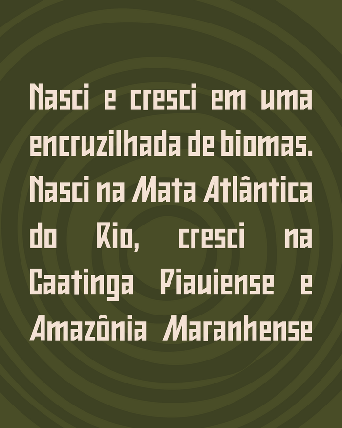
Capitu was born and raised at a crossroads of biomes, where the wind tells stories and the earth whispers ancient wisdom. In her gaze, she carries the feline instinct – a creature that sees in the dark, that feels before it knows. It was this instinct that guided her here, through paths of struggle, beauty and reinvention.
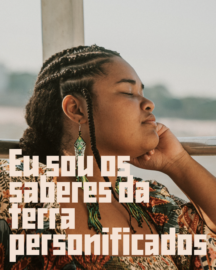
She discovered that ESG can also mean “It’s About People,” that the climate crisis doesn’t affect everyone equally – and that the bodies most affected resemble hers.
With a postgraduate degree in Business Management and an MBA in Social Entrepreneurship, she chose to act with environmental awareness and decolonial language. Her presence transcends worlds: academia, the corporate world, the peripheries, the villages, the quilombos (maroon communities).
Wherever she steps, she sows ancestral future. Wherever she speaks, she echoes other voices, from other times, from other territories.
Because, as Nego Bispo says, she doesn’t believe in beginning, middle, and end – but in beginning, middle, and beginning.
Chapter, thank you for trusting and allowing this narrative to be born together. This is just the beginning of a beautiful, firm, and purposeful path. You are a woman who already represents many—and one day, without a doubt, you will represent Brazil in many places around the world. We see you at the UN, yes – but also in the villages, in the alleys, in the assemblies, and wherever it is necessary to bring voice, ancestry, and a vision of the future.
The project was conceived by Latina Agência. Fernanda Oneda handled the design and art direction. Camila Santana was in charge of the verbal identity.
Fernanda Oneda / Latina Agência. License: All Rights Reserved.

Fernanda Oneda / Latina Agência. License: All Rights Reserved.
Fernanda Oneda / Latina Agência. License: All Rights Reserved.
Fernanda Oneda / Latina Agência. License: All Rights Reserved.

Fernanda Oneda / Latina Agência. License: All Rights Reserved.
This post was originally published at Fonts In Use