Bears in the Park
Photo: francesco dipierro. License: All Rights Reserved.


Bears in the Park (BITP) is an art space that aims to support and develop strategies to the emerging performance scene in Vienna. Through a variety of programs, it creates opportunities, providing art residencies, exhibitions, public events and workshops.
To shape the new identity, we began with the name itself: “Bears in the Park”.
It’s an evocative name that recalls the figure of the bear through a direct, lively, and playful visual language. The idea was to express the personality of these guide-animals through vibrant colors and bold typography.
To emphasize the character of the association, the logo-system plays with three variations, where the name appears on one, two, or three lines. Alongside these variations, the visual identity naturally includes the bears – two of them peeking out from the letters of the logo, creating different scenarios and, above all, a nearly magical interaction between illustration and wordmark.
The logo uses Magiel (designed by Mateusz Machalski), with a customized spacing. The letters link to each other forming solid blocks of color – like trees in the park. The rest of the typography relies on Apfel Grotezk by Luigi Gorlero. Interacting with the pink and the brown, it brings a touch of humor and playfulness.
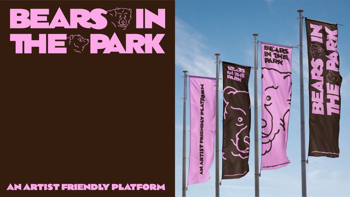
Photo: francesco dipierro. License: All Rights Reserved.
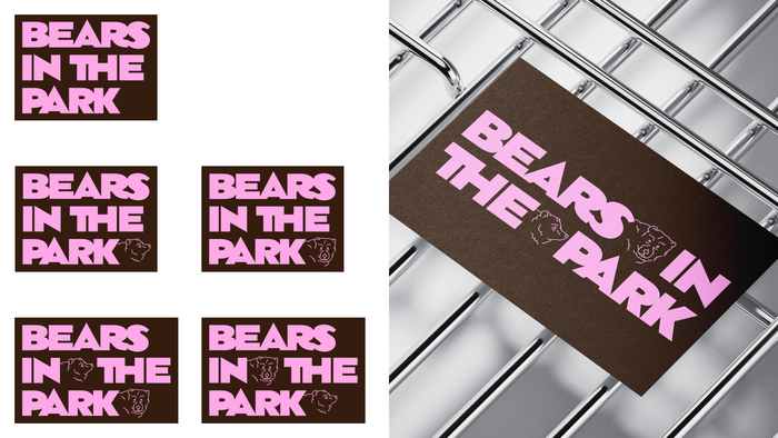
Photo: francesco dipierro. License: All Rights Reserved.
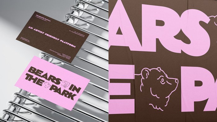
Photo: francesco dipierro. License: All Rights Reserved.
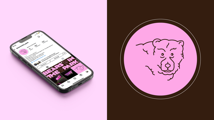
Photo: francesco dipierro. License: All Rights Reserved.
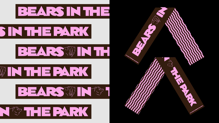
Photo: francesco dipierro. License: All Rights Reserved.
Source: www.instagram.com Photo: francesco dipierro. License: All Rights Reserved.
This post was originally published at Fonts In Use