The Harder They Come album art and movie posters

Source: historical.ha.com Heritage Auctions. License: All Rights Reserved.
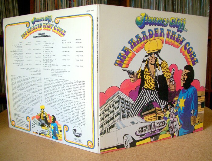
Front cover of the soundtrack album


Alexander of the Herb Lubalin Study Center showed a mostly typographic and entirely black-and-white “Style B” poster made for The Harder They Come. He points out that other promotional posters for the film were done in the blaxploitation style. This post is about the most striking design among those.
The soundtrack album to the Jamaican cult film was released in the United Kingdom in July 1972 by Island Records. A North American release followed in February 1973 on Mango Records. The sleeve design is credited to London-based CCS Associates, with cover art by John Bryant.
The title is rendered in Bottleneck. Tony Wenman’s design for Letraset was brand new at the time: it was issued earlier in 1972, likely inspired by the success of Seymour Chwast’s Art Tone, and most closely following its Boot Black style. The bottom-heavy letterforms were drawn by hand, arranged on an arch, contoured, extruded, and filled with color gradients. Jimmy Cliff’s name got a similarly colorful treatment, with shaded letterforms loosely based on Cooper Black Italic: the initial J obtained a large descending hook, C was streamlined, and the f’s elongated.
This artwork was also used for a poster issued by Island Records to promote the album, and later got adopted for posters made for various re-releases of the film.
Source: filmartgallery.com Film Art Gallery. License: All Rights Reserved.
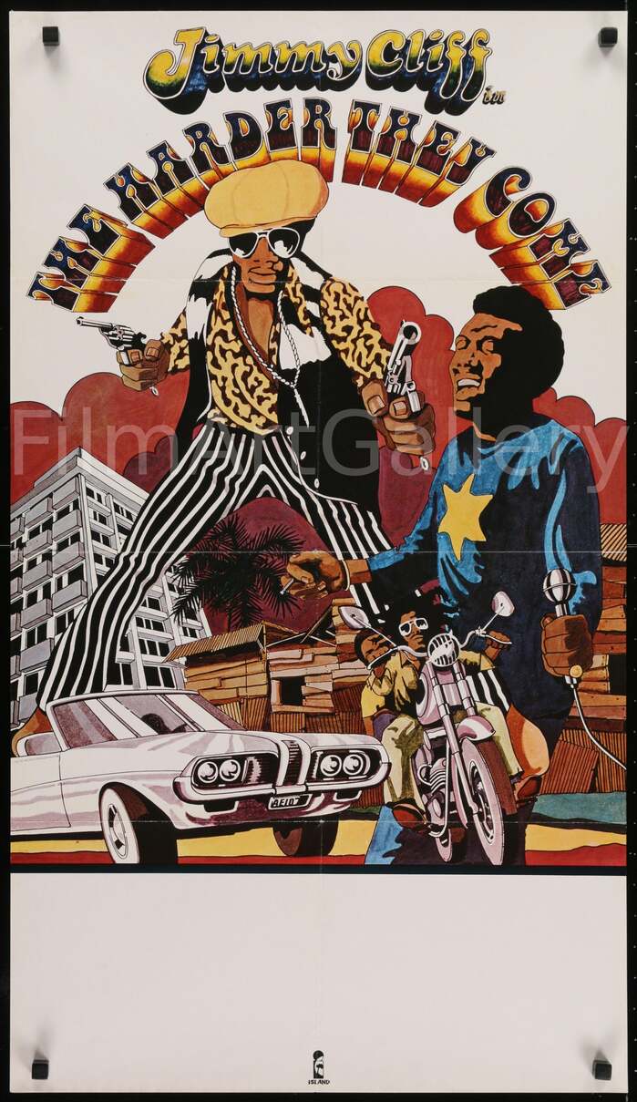
Promotional poster for the soundtrack by Island Records, UK, 1973. The elements of Bryant’s artwork were rearranged for the taller format.

Source: movieposters.ha.com Heritage Auctions. License: All Rights Reserved.
British Quad (30″×40″) poster for a 1977 re-release of the “original uncut version” by Lagoon Associates. Again, the elements of Bryant’s artwork were rearranged, now optimized for the landscape format. Additional text is set in all-caps Franklin Gothic.
Source: filmartgallery.com Film Art Gallery. License: All Rights Reserved.
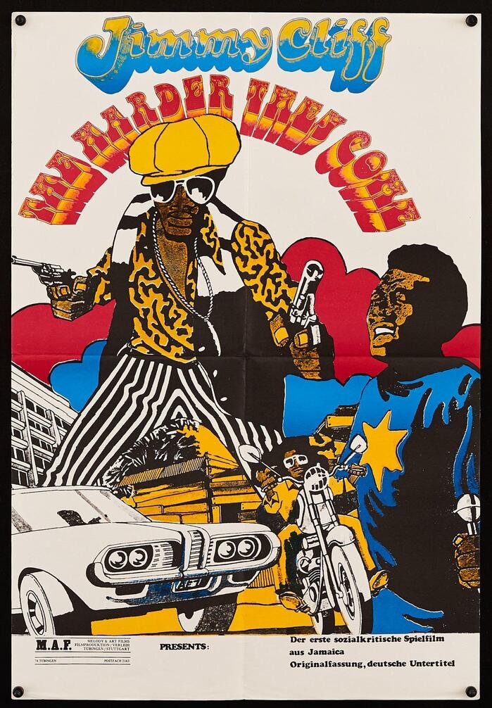
German poster (24.25″×16.5″) for a 1980 re-release by Melody & Art Films, featuring a coarser copy of the original art, with a simpler color scheme – which extends to the lettering. The text added at the bottom uses the upright style of Cooper Black, apparently applied as rub-down type.

Source: historical.ha.com Heritage Auctions. License: All Rights Reserved.
Back cover of the soundtrack album (Mango Records, 1973). Most text is produced on a typewriter, making use of double spacing and several ellipses to justify the last paragraph. “Original Soundtrack Recording” is in unmodified Bottleneck. Credits are set in Univers Condensed and Helvetica.
Source: sinistersaladmusikal.wordpress.com License: All Rights Reserved.
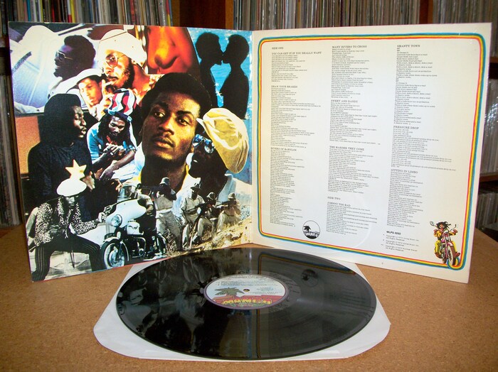
Front and back cover of the gatefold
Source: sinistersaladmusikal.wordpress.com License: All Rights Reserved.
Inner gatefold with a collage of photos and lyrics.
This post was originally published at Fonts In Use