Leipziger Allerlei poster
Published March 23, 2024
By FontsInUse
Contributed by Jascha schwarz
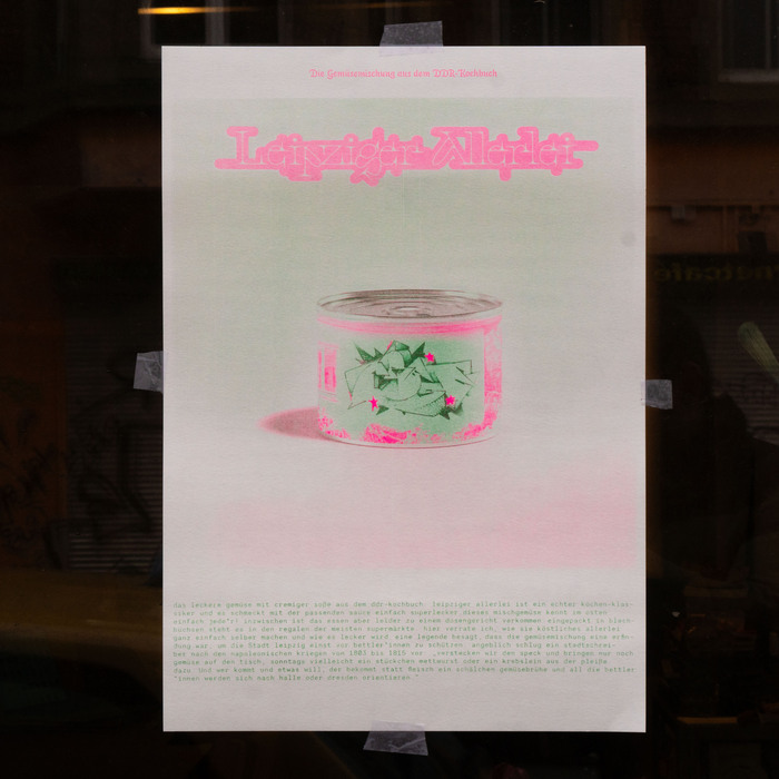
Photo: Jascha schwarz. License: All Rights Reserved.


Photo: Jascha schwarz. License: All Rights Reserved.
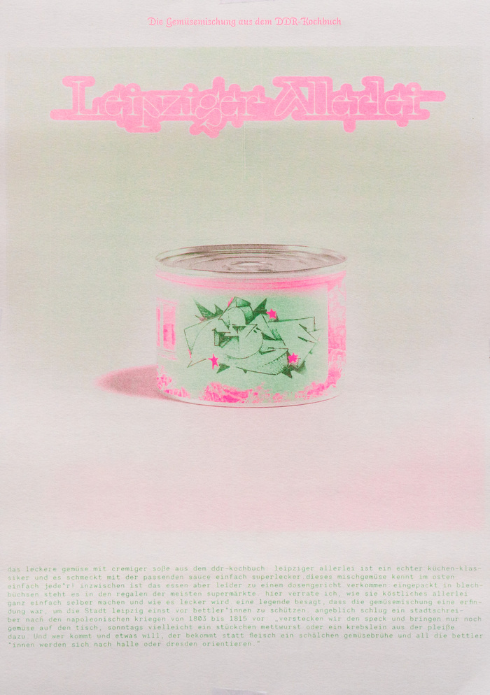
Photo: Jascha schwarz. License: All Rights Reserved.
Photo: Jascha schwarz. License: All Rights Reserved.
This post was originally published at Fonts In Use
Photo: Jascha schwarz. License: All Rights Reserved.
The classic regional dish Leipziger Allerlei is increasingly degenerating into a canned dish from the supermarket around the corner. The word “pea”, an important component of the dish, is sprayed metaphorically. Various printing techniques and papers were used within my book to illustrate the theme even more diversely. Shown here is a riso print made for the book.
Natália Tímea Szabó’s Faglia Serif is beefed up with a thick pink contour. The headline (“the vegetable mix from the GDR cookbook”) is set in Auto Italic 3, the swashiest of the three italic flavors included in Underware typeface. The text at the bottom is set in all-lowercase Necto Mono by Marco Condello.
Photo: Jascha schwarz. License: All Rights Reserved.
Photo: Jascha schwarz. License: All Rights Reserved.
Photo: Jascha schwarz. License: All Rights Reserved.
This post was originally published at Fonts In Use
Read full story.
WRITTEN BY
FontsInUse
An independent archive of typography.
More from FontsInUse