Harald Peter Ström homepage

Source: harald.peter.stream ©2025 Harald Peter Ström. License: All Rights Reserved.


After the long anticipated font update from v0.1 to v0.2, Harald Peter Ström could finally add a CV to his personal website. Before that, the designer of Konst & Teknik used Electric Blue only on his front page. He requested the urgently needed diacritics on Future Fonts right after the release of version 0.1. “Guuuuys, i love this so much but my name doesnt work properly… any chance of a scandi version soon featuring åäö ÅÄÖ ? /peter stroem”
Font Spectrum’s Daniël Maarleveld and Edgar Walthert just have been really busy with other thing to finish the entire set of accents. Just dropping a few Middle European ones, as a patch, did not seem right for everyone else.
Recently, Harald Peter Ström added an animated loader to his CV page which makes use of the transforming abilities of variable fonts. The loader revolves through the weights in a wave motion.
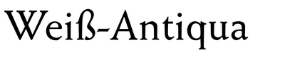
The Index and Work pages use Weiß-Antiqua for everything. The bouncing “2025” device that references the iconic DVD logo screensaver has numerals from ABC Walter Neue.

Source: harald.peter.stream ©2025 Harald Peter Ström. License: All Rights Reserved.
When entering the website, all the pills rotate before they find their horizontal position. The background color changes according to the width of the browser window. If one does note interact with the page, everything gets blurry.

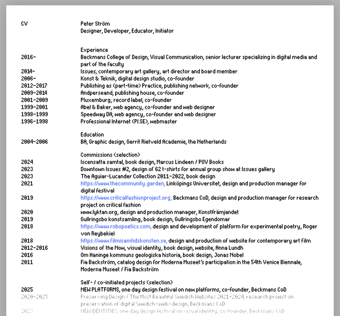
Source: cv.peter.stream ©2025 Harald Peter Ström. License: All Rights Reserved.
The animated GIF was made with a QuickTime screen grab and then made into a GIF with the help of ezgif.com
Source: cv.peter.stream ©2025 Harald Peter Ström. License: All Rights Reserved.
CV page of Peter Ström, entirely set in Electric Blue. The bottom of the page is faded out and gets thicker on scroll – one of the advantages of variable fonts.

Source: index.peter.stream ©2025 Harald Peter Ström. License: All Rights Reserved.
The index with Harald Peter Ström’s work features Weiß-Antiqua (URW’s digitization).

Source: work.peter.stream ©2025 Harald Peter Ström. License: All Rights Reserved.
Another sub-url called work.peter.stream. Weiß-Antiqua is one of the classic typefaces that still looks en vogue thanks to its slightly eccentric details.
This post was originally published at Fonts In Use