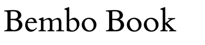
Double Black Diamond by Mads Gobbo and Miles Klee

Source: double--negative.com Mads Gobbo, Nick Greer, and Double Negative. License: All Rights Reserved.
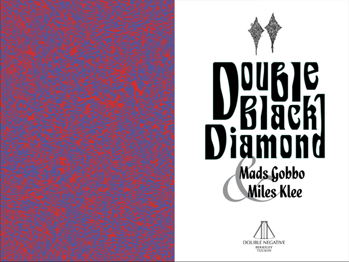
Full cover spread for Double Black Diamond


Double Black Diamond is a collaborative story collection by Mads Gobbo and Miles Klee. The stories are funny and fabulist, drawing influence from the pair’s shared canon of writers like Donald Barthelme, Kelly Link, Steven Millhauser, Mary Robison, Brian Evenson, Rachel Ingalls, Kathryn Davis, George Saunders, and others.
Though the stories present our world as deranged—accurately so—they are never misanthropic, always finding the humor in our abjection. Rather than try to clean up the radioactive waste, they will play in it until their third eye opens and they’re glowing green, just like the forms and fonts of the book’s cover. These mutant greens—derived from the cover art’s background, a satellite image of an algal bloom in the Baltic Sea*—emanate from the title font, Siegfried, a product of the art nouveau era that was popularized again during that style’s revival in psychedelia, and the body font, Roslindale, a chubby but angled serif, that adds an element of playful, pulp horror.
The other primary cover font is Quixley, which many will recognize as the title font of The Phantom Tollbooth. This is the other major strain coursing through the stories, a love of classic children’s literature, especially books where danger and wonder mix. In addition to their role as author, Mads Gobbo illustrated the collection, influenced by the art of Tove Jansson, Shel Silverstein, and Tim Jacobus. These artists have a talent for teasing mystery on the other side of various thresholds—fantastical beasts hiding in the shadows of a forest, an abyss of possibilities where the sidewalk ends, or a curtain of dripping slime—this lattermost image informing the alien frame around the cover text. Quixley is iconic for just this reason, signaling the toll we must pay to enter “the Lands Beyond.”
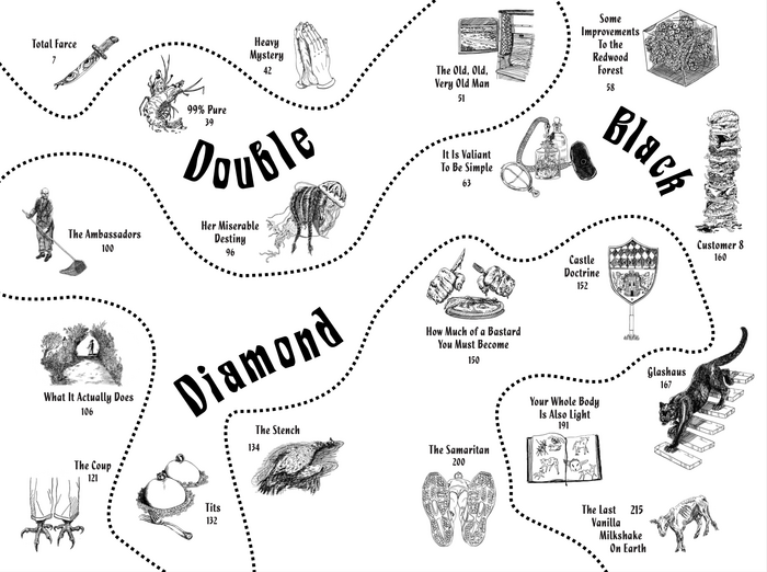
The last sources of inspiration come from a similar retrospection. Prompted by the title’s evocation of classic ski maps, the design returns to kitsch artifacts of the American midcentury. Paul Bacon’s Big Book Look informs the cover text while Milton Bradley board games, especially Chutes and Ladders, inspire the table of contents, which offer a twisting, turning path through Mads’ illustrations.
*) The image was taken by the European Space Agency’s Copernicus Sentinel-2 mission in 2019 and is part of the Observing the Earth database (CC BY-SA 3.0 IGO license).
Source: double--negative.com Mads Gobbo, Nick Greer, and Double Negative. License: All Rights Reserved.
Interior cover and title page of Double Black Diamond
Source: double--negative.com Mads Gobbo, Nick Greer, and Double Negative. License: All Rights Reserved.
Table of contents for Double Black Diamond
Source: double--negative.com Mads Gobbo, Nick Greer, and Double Negative. License: All Rights Reserved.
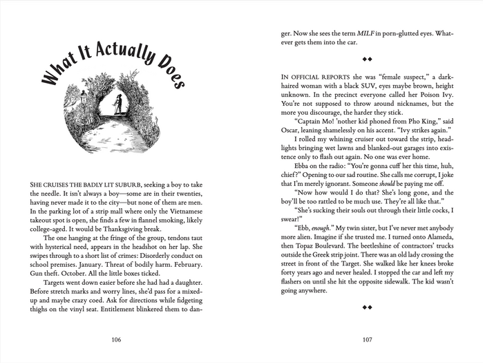
Interior spread from Double Black Diamond
This post was originally published at Fonts In Use