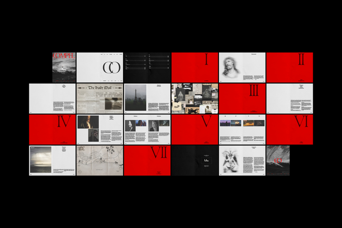
Compel TV series identity
Source: oliviarohner.com License: All Rights Reserved.


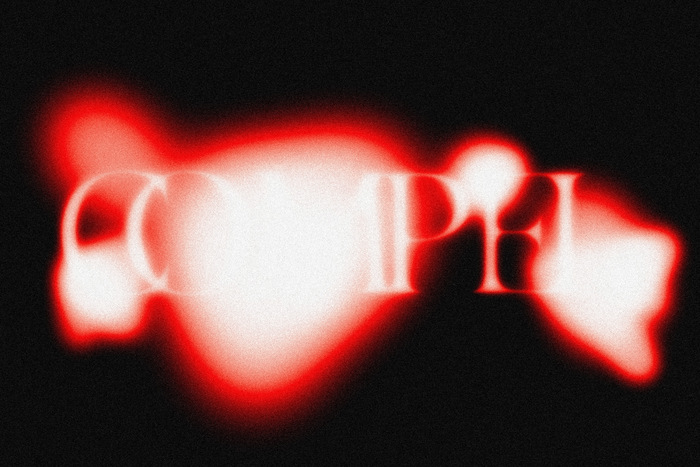
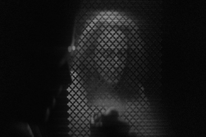
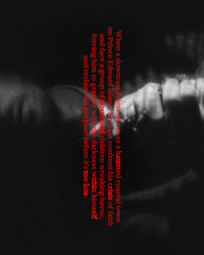
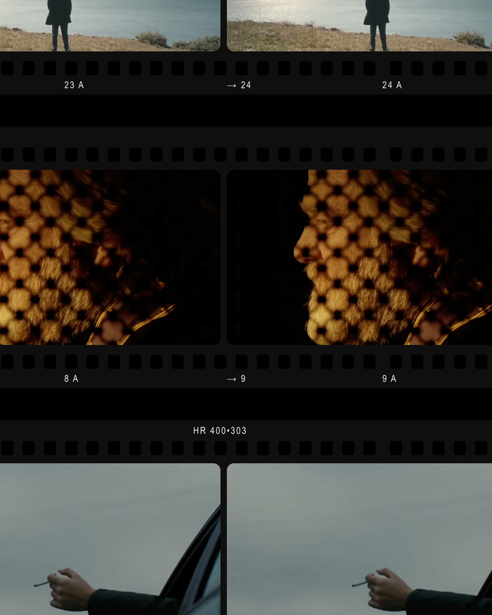
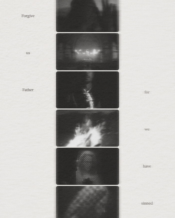
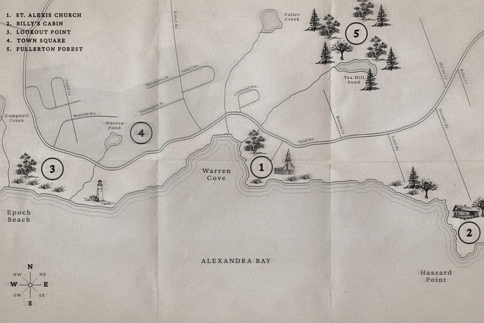
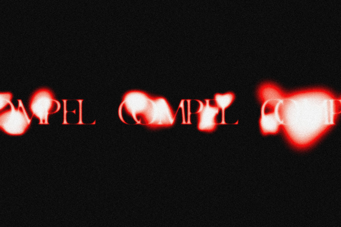
Compel is a short-form horror television series set in Prince Edward Island, Canada. A distinct and compelling brand was developed to support and guide the pitch of the show’s proof of concept, narrative, and creative direction. The visual identity draws from biblical history, typography, and iconography, reinterpreted through a modern lens to reflect the show’s themes of faith, fear, and psychological unrest.
The identity system establishes a visual tension between the sacred and the contemporary, combining austere typography, ritualistic symbols, and stark compositions. Deliverables included a show bible, title graphics, and promotional materials designed to communicate the tone and potential of the series across multiple platforms, effectively establishing the visual foundation for Compel within its speculative world.

Source: oliviarohner.com License: All Rights Reserved.
Source: oliviarohner.com License: All Rights Reserved.
Source: oliviarohner.com License: All Rights Reserved.
Source: oliviarohner.com License: All Rights Reserved.
Source: oliviarohner.com License: All Rights Reserved.
Source: oliviarohner.com License: All Rights Reserved.
Source: oliviarohner.com License: All Rights Reserved.

Source: oliviarohner.com License: All Rights Reserved.
Source: oliviarohner.com License: All Rights Reserved.
Source: oliviarohner.com License: All Rights Reserved.
This post was originally published at Fonts In Use