Full Proof
Source: www.mude.com.au Mude. License: All Rights Reserved.


An identity system for a doughnut venue that looks like a chrome kitchen, and refuses to use the colour pink.
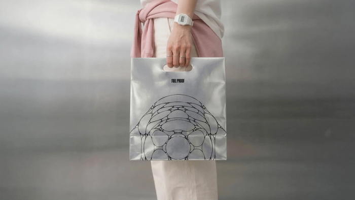
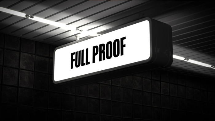
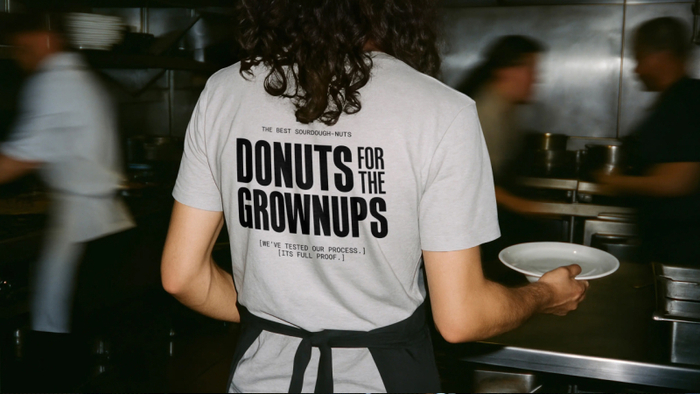
Mude built the brand identity for Full Proof, a sourdough doughnut venue in Potts Point, Sydney. The founders came to us with a brand name built around the idea that their process was impervious to failure, a decade of hospitality experience, and a very clear sense of what they didn’t want to be: the pastel colours, decorative typography, and confectionary energy that the doughnut category defaults to. The brief was to build an identity for a venue that needed to work as a morning commute pitstop and an after-dinner destination in the same space, with the same brand, without either version feeling like a compromise.
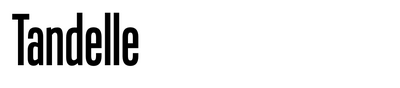
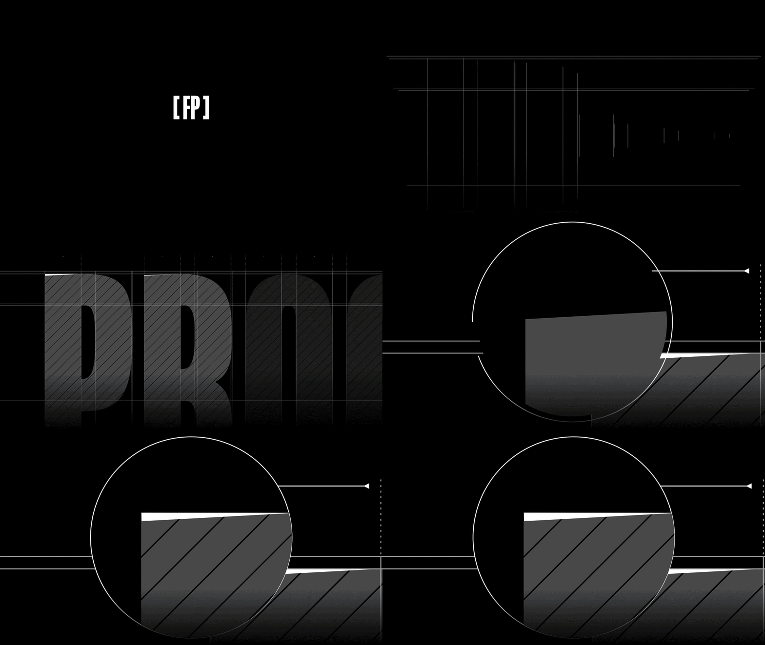
As we refined the identity, the wordmark moved into a customised cut of Tandelle, an ultra-condensed display face with tall vertical proportions.
The original Tandelle letterforms carried softer, rounder terminals that leaned closer to the typeface’s natural character, so we replaced those curves with hard, angular diagonal shears to give the mark a more hard edge. The condensed width means it holds its presence at large scale on signage and posters while staying compact enough to work on menus, cups, and packaging.
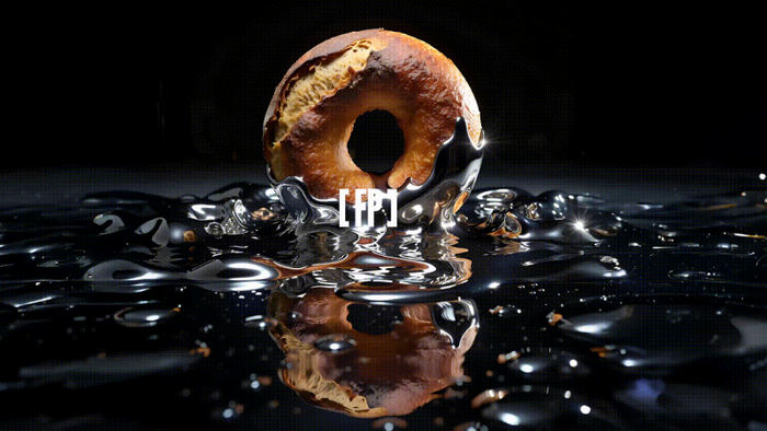
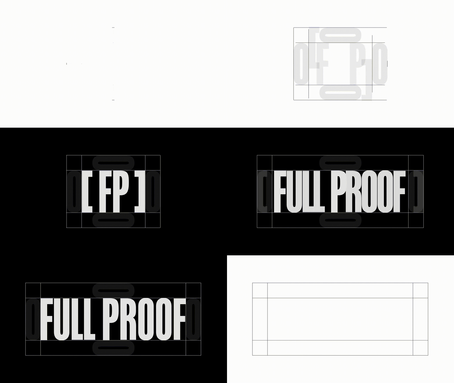
The [FP] lettermark uses square brackets around the initials, which borrows from the technical notation and labelling language that runs through the rest of the identity system. It’s a small systemic detail, but it gives the abbreviated mark a reason to exist beyond just being initials.
Tandelle is the primary, used for headlines and display. It’s a condensed sans-serif with angular, vertical letterforms. Everything about Full Proof’s identity leans tall and upright, and Tandelle makes that structural decision most visible at headline scale.
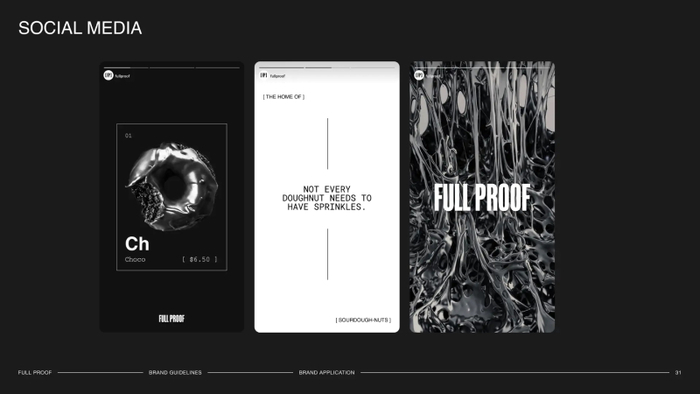
Helvetica sits as the secondary for subheadlines and supporting copy. It was in the system from the Mudeboards stage and stayed because when the display type is doing that much work with its condensed proportions and industrial tone, the secondary needs to get out of the way and let readability take over.
Roboto Mono is the tertiary, used for eyebrows, labels, navigation, and body copy. The monospaced cadence gives running text a measured, technical quality that reinforces the sense of process and precision behind the product. The hierarchy loops from Roboto Mono at the eyebrow through Tandelle at headline scale, down to Helvetica for the subheadline, and back to Roboto Mono for body, which creates a rhythm that holds the system together across touchpoints.
Source: www.mude.com.au Mude. License: All Rights Reserved.
Source: www.mude.com.au Mude. License: All Rights Reserved.
Source: www.mude.com.au Mude. License: All Rights Reserved.

Source: www.mude.com.au Mude. License: All Rights Reserved.
Source: www.mude.com.au Mude. License: All Rights Reserved.
Source: www.mude.com.au Mude. License: All Rights Reserved.
Source: www.mude.com.au Mude. License: All Rights Reserved.
This post was originally published at Fonts In Use