Foxdeli
Source: slowrat.design Slow&Rat. License: All Rights Reserved.

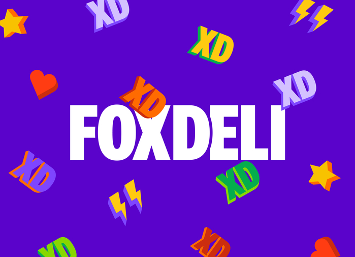
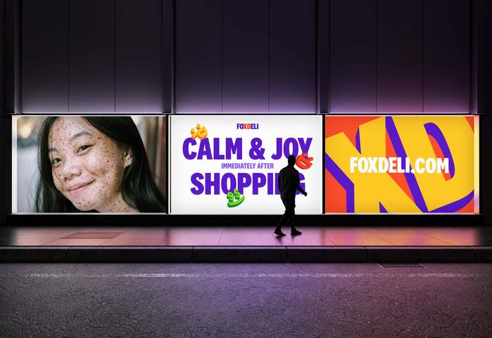
The identity of e-commerce company Foxdeli uses typography to deliver boldness and emotion, perfectly aligning with their mission to bring joy to post-purchase experiences for e-commerce. The logotype is rooted in impactful, all-caps typography, creating a confident, approachable tone. A standout feature is the XD emoticon within “FOXDELI,” emphasized to symbolize happiness and connection—essential elements of the brand’s promise.
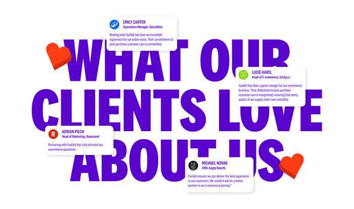
The typography in National 2 Condensed plays a dual role, balancing expressive design with functional clarity. Large-scale, tightly tracked headlines project bold confidence, while generous negative space ensures readability and visual harmony. The logotype’s thoughtful adjustments in kerning and weight amplify its cohesive, striking presence.
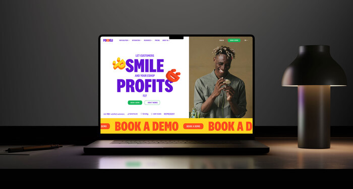
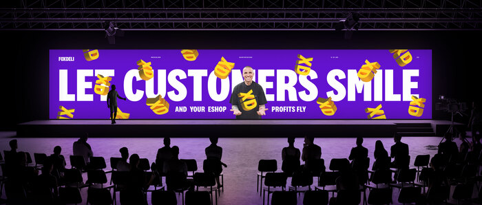
The typography extends across the identity, paired with vibrant compositions and 3D-shadowed elements that reinforce the emotive, layered storytelling of the brand. This typographic system doesn’t just communicate—it engages, aligning seamlessly with Foxdeli’s ethos of amplifying customer satisfaction and e-commerce success.
Source: slowrat.design Slow&Rat. License: All Rights Reserved.
Source: slowrat.design Slow&Rat. License: All Rights Reserved.
Source: slowrat.design Slow&Rat. License: All Rights Reserved.
Source: slowrat.design Slow&Rat. License: All Rights Reserved.

Source: slowrat.design Slow&Rat. License: All Rights Reserved.
This post was originally published at Fonts In Use